Read the statement by Michael Teeuw here.
Weekly Calendar
-
Fill as it too wide? It’s merely following the regions defined within MM. Or do you mean height? At the moment it’s restricted. I can’t follow the regions there because otherwise there’s very little that can fit. So it’s an overlay “on top” of everything else and then I forcibly restrict the height. It’s not a perfect solution and it’s only being done to get the layout right.
As for a ‘step back’, I’m not sure what you mean. You mean going back to what I posted yesterday? Yeah that code didn’t go away (I never get rid of code that way). This right here is literally an exercise. I wanted to see what it would take, how much and whether it can be done. I also needed a hair cut, and this helped with me pulling my hair out at times. :)
-
@Wilco89 yeah, it seems to take up too much real estate on screen.
So a lot of the reflection will be the calendar.
Must be hard to work with he regions available though
-
@KirAsh4 the width won’t be the problem, height will.
When you should use your yesterdays post and set startingtime and EndTime under the title of the appointment, it would be usefull for my mirror, otherwise it will fill my mirror too much.
I Hope you van make that to An module.
(Sorry for typo’s, using my phone with autocorrect (dutch))
-
Geen probleem. Yeah, since I’m just testing things out, I wouldn’t worry too much about what it looks like right now. I won’t make something that won’t work for people. I tend to make it all user configurable anyway, so don’t worry about that part.
-
Also, keep in mind that what you see there is a portion of a full mirror. When I’m at the office, I don’t have a vertical display, so I have to turn things off for it to display right. When I get home later, I’ll take another screen shot and see what it looks like then.
-
@KirAsh4 and I only was giving you opinion, and to help you through this little dilemma!
Im going to sleep now !
-
Opinions/suggestions are good. After all, I am making this for you guys, not just for me. :) Slaap lekker.
-
I haven’t forgotten, it’s just been two rather busy weeks. And I’m recovering from a failed server HD today/this weekend. Yay for backups … not so much fun when it’s terabytes of data. Anyway, I’ll get back this as soon as this mayhem stops, or at least subsides a bit.
-
@KirAsh4 any news about the state of the development ? Thanks a lot for your work!!!
-
I have some code written, but it’s nothing that’s working properly yet. It’s progressing rather slowly. Our office was recently bought out and we’re going through some painful changes that’s keeping everyone busy. I’ll have more time to focus on this once the dust settles.
-
Hi @KirAsh4 , has this developed any further?
The initial screenshots looked great!
-
Hi @KirAsh4 - any news on this one?
-
This was bound to come out publicly eventually … so here goes.
The short answer: no, there has been zip, nada, none, zero progress on this, and here’s why:
My daughter was hit and killed recently and my ability to sit, focus, and think is just about non-existent at the moment. Do I want to get back to this and finish it, sure. Can I? Probably, but I wouldn’t expect that to happen any time in the near future. There is a lot going on mentally and I’m just riding the waves of emotions right now.
If anyone else wants to jump in and tackle this, please do so!
And if no one does, I will eventually get back to it. But for now … no.
-
@KirAsh4
Fuck, I’m so sorry for your loss.Forget this module mate, just concentrate on you.
I can’t even imagine how you’re feeling. My thoughts are with you and your close ones
-
@KirAsh4
I guess no one can really imagine your loss. I hope you can rely on your family and your friends to deal with this tragedy. Take care, man! -
@KirAsh4 just saw your last post in this thread. so sorry for your loss and hope you are well or as well as one can be in that situation. condolences.
-
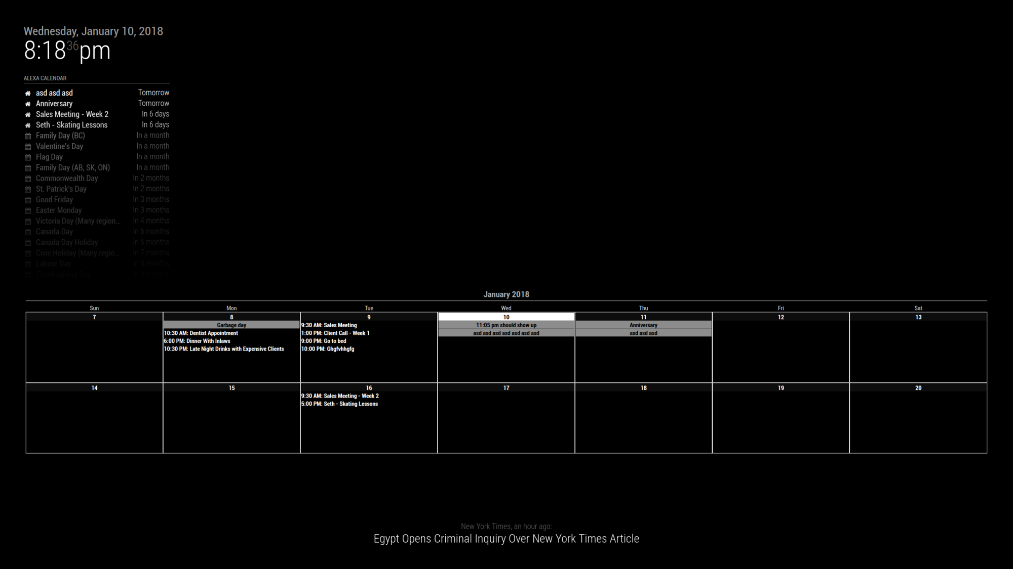
So I hate to drag out an old post from the past but I found this thread when I was looking for exactly this. I looked around and it appears that it was never actually put into place so I took the base code from @kirash4 as well as a fork of it from @dragomirtodorov and have made some changes.
The attached screenshot is the result. I won’t lie, this is about 4 hours of messing with it so I need to go through and clean it up more before I post it, as well as I had to make some changed on the main calendar code that will need to be submitted as a pull request to get that brought in to make it function.
In any case, this is what it is looking like now.

-
@jbrodie That is amazing…exactly what I was looking for. I look forward to seeing this progress into an actual module. It was really the only thing holding me back from setting this up because my wife loves seeing a monthly planner with a lot of detail.
-
Ya we manage a monthly whiteboard, and recently got an Alexa, which I have tied to a google calendar, which ultimately lead to me coming back to making a mirror since I could use this.
There are a ton of things I want to do with this but baby steps to get started. I was thinking about having it scroll through 3 - 4 weeks one week at a time, or page through 2 at a time or something as well. I figured starting out with 2 is a decent view for the up coming, since when it hits Sunday, that will move the current week into the top position on the week and show the next week after. Needs some more testing but will certainly get it up and posted as soon as possible.
-
I’d suggest making it show x amount of weeks, set in the module’s config, x being 1 to 4 weeks.
Hello! It looks like you're interested in this conversation, but you don't have an account yet.
Getting fed up of having to scroll through the same posts each visit? When you register for an account, you'll always come back to exactly where you were before, and choose to be notified of new replies (either via email, or push notification). You'll also be able to save bookmarks and upvote posts to show your appreciation to other community members.
With your input, this post could be even better 💗
Register Login