Read the statement by Michael Teeuw here.
reduce bottom margin
-
hello,
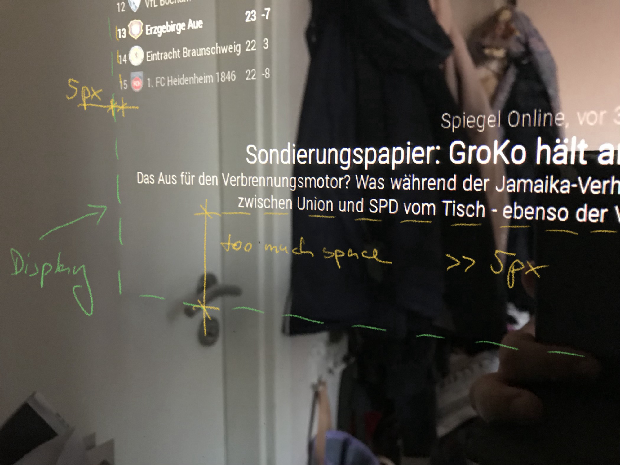
maybe someone can help me.I have already successfully reduced the margins of my MM. But somehow it doesn’t work on the lower side, there is some space left.
I would like to get the news module directly to the bottom of the display.my custom.css:
body {
  margin: 5px;
  height: calc(100% - 10px);
  width: calc(100% - 10px);
  cursor: help;
}

.region.bottom.bar .container .module.newsfeed {
  height: 100px; 		///* height of the module with maximum lines possible */
}
thanks
-
@surger13 said in reduce bottom margin:
/* height of the module with maximum lines possible */
That line looks familiar. ;)
The CSS for the body looks right: 100% - (2 x margin).So what you see is probably an issue with the height of the newsfeed module. Keep in mind that:
- a module will occupy as much space in the region as it needs (and stay at the bottom)
- if you set a height, it will occupy the specific space as set (and fill up that space from top, leaving space at the bottom, if it needs less than set)
It’s probably just that 100px is more than the module needs so there is some space at the bottom. But: In the thread where you got that line from, it was the desired effect that the top of the module and the text within it stay at the same place with space at the bottom to fill in case the text needs more lines.
So these two wishes contradict here. You have to look at your module filled to the max (maximum possible lines) and then figure out the height it needs (maybe less than 100px). Or you remove the height and accept that the module sometimes needs more and its top moves up a bit.
Hopefully I was able to make this somewhat comprehensible.
-
Hello doubleT,
thanks for your answer. You recognized the source correctly, of course.;)
I understood that so far and also wanted the modules (e. g. MMM-Soccer) stop bouncing over the newsmodul. But then I noticed that the lower distance between the news module and the display edge is too big. The distance is at the top, left and right correctly only bottom space is wasted. The „height“ parameter doesn’t seem to work.
By the way, my display is smaller than the mirror.Maybe a picture will make it clearer…

-
Looking at https://github.com/MichMich/MagicMirror/blob/master/css/main.css, you can see that every .module has a margin-bottom: 30px;
Try:
.region.bottom.bar .container .module.newsfeed {
    height: ??px; 		///* height of the module with maximum lines possible */
   margin-bottom: 0px;
}
Have you started your mirror in developer mode and checked out the elements and the settings? If you start it with “npm start” try “npm start dev” instead. You’ll see “Elemente” where you can go through the whole structure (DOM) and see their CSS settings. Changes to those settings are not stored, so you can play around there.
-
margin-bottom: 0pxhad no effect.
But I had an error under Body, there was a comment with special characters, so the height parameter didn’t work. After deleting the comment it now works as desired.
Thanks again for your help @doubleT.
Hello! It looks like you're interested in this conversation, but you don't have an account yet.
Getting fed up of having to scroll through the same posts each visit? When you register for an account, you'll always come back to exactly where you were before, and choose to be notified of new replies (either via email, or push notification). You'll also be able to save bookmarks and upvote posts to show your appreciation to other community members.
With your input, this post could be even better 💗
Register Login