Read the statement by Michael Teeuw here.
MMM-Nest-Status - New module for your Nest thermostats and protect smoke detectors!
-
Hi there,
Just created & released my first MM module - it’s called
mmm-nest-statusand displays your Nest thermostats and protect smoke detectors on your magic mirror. There are a couple of other Nest modules out there, but I found them be either buggy, ugly or unmaintained, so I thought it was time for a brand new module.It shows all states of your thermostats and protects, but also supports multiple view modes, sizes and designs, so there’s a good chance you’ll be able to use it no matter how you’ve set up your mirror.
Check it out here:
[card:michael5r/mmm-nest-status]There are a ton of screenshots in the repo, showing all the different view modes, but here’s a couple of representative ones:
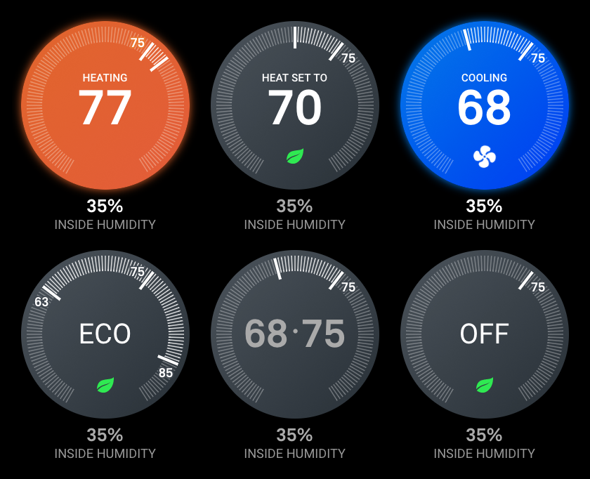
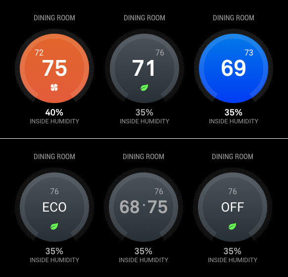
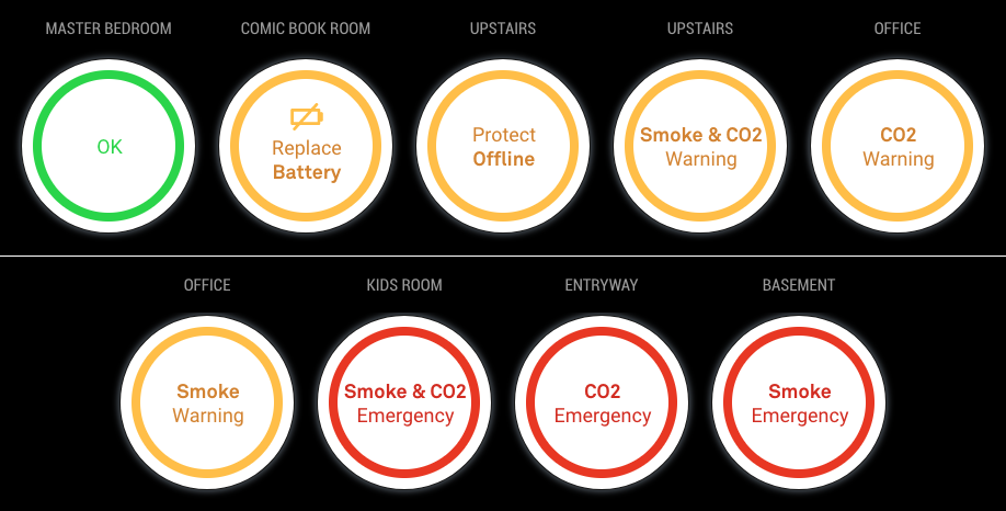
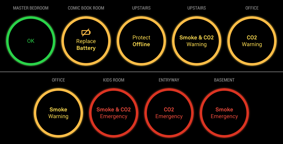
Hope you find it useful!
Michael
UPDATES
12-09-2018: Version 1.2.0
Refactors the data-getting to use the socket system built into the magic mirror project - this will allow my upcomingmmm-nest-camerasmodule to use the same Nest data without having to do multiple calls to the Nest API.12-12-2018: Version 1.3.0
Socket updates, small tweaks.12-27-2018: Version 1.4.0
AddsmotionSleepandmotionSleepSecondsoptions which allow you to suspend this module when no movement has been detected for X number of seconds.12-28-2018: Version 1.4.1
ChangesmotionSleepto tie into the regularsuspendandresumefunctions exposed by MM -
Nicely done. :thumbsup:
-
@michael5r
Beautiful style! -
Great job this is what i have been looking for. I you have a dev account already is there anyway you can get that account to generate the token?
-
@dazza120 Done just done a New Oth as from my limited understanding i would have to reauthorise the other devices of that Oth easier to do a new Oth. Anyway this just cost me 3 Magic Mirror modules as this is a must i would love to be able to shrink the text type down as when my Hue lights start going on they clash :( BRILIANT MODULE Love it!
-
@dazza120 Run the
getToken.shscript in your terminal, and simply skip over the initial steps (where you set up a Nest developer account). It shouldn’t be a problem to use your existing Nest account (I also had one before I started this project). -
@dazza120 said in MMM-Nest-Status - New module for your Nest thermostats and protect smoke detectors!:
@dazza120 Done just done a New Oth as from my limited understanding i would have to reauthorise the other devices of that Oth easier to do a new Oth. Anyway this just cost me 3 Magic Mirror modules as this is a must i would love to be able to shrink the text type down as when my Hue lights start going on they clash :( BRILIANT MODULE Love it!
Thank you :)
Which texts are you trying to shrink?
-
@michael5r hi once again great module, it’s not really the text. I’m on the list display, it goes across the whole screen, I would at least like it to be reduced to the middle/centre so it leaves the weather display on the right that way when my hue lights turn on it doesn’t clash an two when I get more nest protects it doesn’t get into trouble does that make any sense? Once again thanks I saw other modules and I was like nope, saw yours and I had to do it lol 😂
-
@dazza120 said in MMM-Nest-Status - New module for your Nest thermostats and protect smoke detectors!:
@michael5r hi once again great module, it’s not really the text. I’m on the list display, it goes across the whole screen, I would at least like it to be reduced to the middle/centre so it leaves the weather display on the right that way when my hue lights turn on it doesn’t clash an two when I get more nest protects it doesn’t get into trouble does that make any sense? Once again thanks I saw other modules and I was like nope, saw yours and I had to do it lol 😂
Sure - that’s not a problem. For the list view, I’m just using the default
xsmallsize (which gives you a font-size of 15px) from Magic Mirror, but it’s easy to change.If you wish to set it to a smaller size, try adding this to your
custom.cssfile in Magic Mirror:.mmm-nest-status .nest-list.xsmall { font-size: 12px; line-height: 16px; }You can change the font-size and line-height to whatever size you want in order for it to fit.
If that’s still not small enough and you have long names for your Nest Protects, try adding this:
.mmm-nest-status .nest-list.xsmall .name {
    max-width: 100px;
    white-space: nowrap;
    overflow: hidden;
    text-overflow: ellipsis;
}
Again, you can change the
100pxto whatever looks nice on your mirror. -
@michael5r cheers but its not that everything else is solid you know where you have the smoke co2 and temp for the themostat on the right i just need that whole thing pulling a little to the left towards the names of the devices, im failing at explaining myself lol
-
@dazza120 said in MMM-Nest-Status - New module for your Nest thermostats and protect smoke detectors!:
@michael5r cheers but its not that everything else is solid you know where you have the smoke co2 and temp for the themostat on the right i just need that whole thing pulling a little to the left towards the names of the devices, im failing at explaining myself lol
I think you’re talking about about the width of the battery, co2 and smoke cells, right?
Try setting them to this:
.mmm-nest-status .nest-list th, .mmm-nest-status .nest-list td { width: auto; } -
@michael5r Hi yeah thats what i mean but that has shifted it further to the right and only the Nest protect battery stuff i need to move it in the opposite direction finally figure how to take a screen capture lol here is what i mean hue status lower right, the more bulbs you have the worse it will get as it moves up when bulbs are turned on! PS speeds aren’t this slow changed the config file for the speed test and it knocked of a zero so it was a 4 second test lol 0_1544518147439_2018-12-11-084242_1824x984_scrot.png
-
@dazza120 said in MMM-Nest-Status - New module for your Nest thermostats and protect smoke detectors!:
@michael5r Hi yeah thats what i mean but that has shifted it further to the right and only the Nest protect battery stuff i need to move it in the opposite direction finally figure how to take a screen capture lol here is what i mean hue status lower right, the more bulbs you have the worse it will get as it moves up when bulbs are turned on! PS speeds aren’t this slow changed the config file for the speed test and it knocked of a zero so it was a 4 second test lol 0_1544518147439_2018-12-11-084242_1824x984_scrot.png
It looks like the module is in the
middle_centerorbottom_barposition, though - which is why it it takes up the entire width of the page. Shouldn’t it be usingbottom_left? -
@michael5r said in MMM-Nest-Status - New module for your Nest thermostats and protect smoke detectors!:
bottom_left
Yes you the man, i swear i did that and the MM just showed me a black screen changed it back to default and it worked. But that was it it looks good i might have to bring some modules back well at least compliments lol
-
Love the module. (and I tried them all)
2 humble requests:
-
Any way to add a transparency setting to the entire graphic so that an underlying background pic can partially show through? (Can that be done via custom.css?)
-
Can you add a “initial polling delay” config option? (similar to what is in the weather forecast module). My use case is a vertical monitor where I have two instances of the module loaded. One in top-right (Upstairs) and one in bottom right (Downstairs). Nest recommends polling of not more than once per minute with separate device per hour and token limits. I set up each instance of the module to use a different token, but as you can only set the ‘updateInterval’ it’s a challenge to get the two modules to stagger the calls. (And I think this is why i was getting “null” response displayed after a while… )
1 observation: when using the “alignment” option, both text and graphics are justified according to the setting. This is OK for “center” and even looks OK for “left”, but it does look odd for “right” where the thermostat graphic itself is flush right of the allocated space (e.g., top-right), but the title text is also right justified (.e.g., Upstairs) and not aligned with the graphic itself. IMHO the text above and below the graphic would look best centered with the graphic, and then the whole block is “aligned” according to the setting chosen.
Again…great work.
-
-
@max64 said in MMM-Nest-Status - New module for your Nest thermostats and protect smoke detectors!:
Love the module. (and I tried them all)
2 humble requests:
-
Any way to add a transparency setting to the entire graphic so that an underlying background pic can partially show through? (Can that be done via custom.css?)
-
Can you add a “initial polling delay” config option? (similar to what is in the weather forecast module). My use case is a vertical monitor where I have two instances of the module loaded. One in top-right (Upstairs) and one in bottom right (Downstairs). Nest recommends polling of not more than once per minute with separate device per hour and token limits. I set up each instance of the module to use a different token, but as you can only set the ‘updateInterval’ it’s a challenge to get the two modules to stagger the calls. (And I think this is why i was getting “null” response displayed after a while… )
1 observation: when using the “alignment” option, both text and graphics are justified according to the setting. This is OK for “center” and even looks OK for “left”, but it does look odd for “right” where the thermostat graphic itself is flush right of the allocated space (e.g., top-right), but the title text is also right justified (.e.g., Upstairs) and not aligned with the graphic itself. IMHO the text above and below the graphic would look best centered with the graphic, and then the whole block is “aligned” according to the setting chosen.
Again…great work.
- Certainly - add this to your
custom.cssfile and the dial becomes transparent:
.mmm-nest-status .thermostat .circle {
    background: transparent !important;
}

.mmm-nest-status .thermostat .dial-classic .dial-circle {
    fill: transparent !important;
}
The
!importantmeans that this will also apply when the thermostat is heating or cooling (eg. it will no longer have the blue or orange background). If you only wish for the grey version of the dial to be transparent, remove the!important.If you’re using the
classicmode of the thermostat, setting the styles above means you get a nice colored glow when the thermostat is heating or cooling: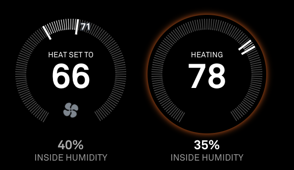
-
It’s already there - for some reason I just forgot to add it to the documentation. Just add
initialLoadDelaywith whatever value you want to your configuration. The value is inms, so if you want a 1 minute delay, set the value to be60000. -
In regards to your observation - that’s a legit bug, thanks for spotting it! The
alignmentsetting should only apply to the graphic itself, not the text inside it. I have pushed an update that fixes it, so if you pull the latest version of the module from github, it should be fixed.
It’s an interesting usecase you have - I hadn’t even thought about using 2 instances of the module to have separate thermostats displayed on the screen in separate locations.
The reason you’re getting the
nullresponse is because of this:
https://developers.nest.com/guides/api/data-rate-limits(I’ve updated the module to display a more helpful error message when that happens.)
Anyway … it’s not a good idea to make 2 separate calls to the Nest API to get the data (that gives you even more of a chance to get that
nullerror), so check out the latest version (1.3.0) I just pushed - if you use the sametokenin both module instances, they’ll only do 1 call to the Nest API and use the sockets to update both thermostats at the same time :thumbs_up:Thanks for the comments!
-
-
Btw, for those of you with Nest cameras as well, I’ve just published a new module called
mmm-nest-cameraswhich shows your camera streams on the mirror as well.When both of my Nest modules are installed on the same mirror and you use the same Nest
tokenfor both, they’ll share data streams to avoid unnecessarily pinging the Nest API.Check it out here:
[card:michael5r/mmm-nest-cameras] -
The right alignment text is perfectly centered over the dial. And the transparent background looks very very good.
Switched the token to the same for both modules and set the updateInterval to 1.5 minutes on both also. No null yet… Using your socket method there’s really no reason to use initialLoadDelay to stagger the API calls.
Many thanks.
-
Is Nest Lock status next on your agenda?
-
@max64 said in MMM-Nest-Status - New module for your Nest thermostats and protect smoke detectors!:
Is Nest Lock status next on your agenda?
I’d love to, but, unfortunately, Nest doesn’t provide API access to their security system.
It seems silly - I mean, at the very least providing the current status (home, home guarding, away guarding) seems like it should be a no-brainer, but for now it’s a no-go.
Hello! It looks like you're interested in this conversation, but you don't have an account yet.
Getting fed up of having to scroll through the same posts each visit? When you register for an account, you'll always come back to exactly where you were before, and choose to be notified of new replies (either via email, or push notification). You'll also be able to save bookmarks and upvote posts to show your appreciation to other community members.
With your input, this post could be even better 💗
Register Login