Read the statement by Michael Teeuw here.
MMM-CalendarExt2
-
@Sean said in MMM-CalendarExt2:
@cskenney said in MMM-CalendarExt2:
I also want to change the background-color and possibly the (font) color.
Sorry for the late reply. At weekends, I rarely am in front of computer.
You can define class in your CSS. then assign it into your transfrom code.transform: (event) => { if (event.title.search("Recycle") > -1) { event.icon = "mdi:recycle" event.className = "CLASS_RECYCLE" // in your css/custom.css, define color and bgcolor for this class }, return event },I figured that out about an hour ago and was coming back to the forums to revise my post. Thanks for confirming what I did works!
-
@scuppasteve said in MMM-CalendarExt2:
@Sean That worked perfectly . How would you go about making the slot event background not be a black gradient? I just want the whole thing to be transparent.
You can adjust the background color in the CSS file.
Since you already defined the eventName: “CHORES_CAL” you can use it in CSS.
syntax:
background-color: rgba(red, green, blue, alpha);alpha: 0~1 (0:transparent, 1:opaque)
Try this in your CSS file.
.CX2 .event.CHORES_CAL {
	background-color:rgba(0,0,0,0);
	}
I believe that will make the background transparent for all the events in that eventName class.
-
@Sean said in MMM-CalendarExt2:
@jani-karna
- Slightly narrow event’s width is intentional to avoid margin of error on calculation. It is hardcoded. But if you want to modify it by yourself,
https://github.com/eouia/MMM-CalendarExt2/blob/a5d509ada997034f91e0790ad72e87512cb24c60/CALEXT2_Slot.js#L250
eventDom.style.width = width - 15 + "px"Change
15to what you want.Worked perfectly, thank you!
- Slightly narrow event’s width is intentional to avoid margin of error on calculation. It is hardcoded. But if you want to modify it by yourself,
-
@Sean said in MMM-CalendarExt2:
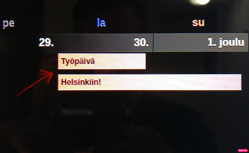
Can I also shrink the gap between events vertically somehow?
Tell me more exact details? Even a picture will help.
What I mean with gap between events is this:

-
@jani-karna

Hmmm… in Original CSS, there was no huge gap. It would be only 2px. I think you probably have modified CSS by yourself, but I don’t know what you changed. Sorry, can’t help you. -
@Sean said in MMM-CalendarExt2:
Hmmm… in Original CSS, there was no huge gap. It would be only 2px. I think you probably have modified CSS by yourself, but I don’t know what you changed. Sorry, can’t help you.
Thats fine, I’ll figure it out.
In the upcoming calendar, I have location or additional information in the events and their font is too big. Can I somehow make it smaller? Here’s a pic, the last row being the additional information:

-
@jani-karna
https://github.com/eouia/MMM-CalendarExt2/wiki/4.-Styling
EacheventhaseventSub(and its sub-elementseventLocationandeventDescription). By default, agenda(upcomingandcurrent) views would revealeventSub, so, you can use that CSS selector to specify. -
@Sean said in MMM-CalendarExt2:
@jani-karna
https://github.com/eouia/MMM-CalendarExt2/wiki/4.-Styling
EacheventhaseventSub(and its sub-elementseventLocationandeventDescription). By default, agenda(upcomingandcurrent) views would revealeventSub, so, you can use that CSS selector to specify.Missed that styling part… :grimacing_face: got it working, thank you again!
-
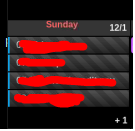
Hello again. is there a way to scroll the events when there are so many on a single day with displaying the (+x).

Thanks.
-
@code999
no. i was tried scrolling in my older CALEXT but too burden to rpi. -
@code999
Instead, you can sort and filter the order of events to be shown. -
Did CalendarExt in Weeks (or Month) view automatically adjust the height of the day to accommodate the events?
I swear if there was only one or two events for a day (in a given week), the whole row was shorter. -
@ChickenBeard
Not adjusted automatically. you can set the height of the slot manually. -
@Sean said in MMM-CalendarExt2:
Not adjusted automatically. you can set the height of the slot manually.
Is it CX2 .slot ?
-
@ChickenBeard
if you mean some table views (month, week), setslotMaxHeightof view configuration.
https://github.com/eouia/MMM-CalendarExt2/wiki/2c4.-View:week,-month -
@Sean okay. it would be great to have though. not seeing the events is not good. limited space on the screen so i cant just make more room because then i will lose a full week from the month view.
thanks. -
@Sean could you help me do that anyway? lol
i would really like it to do that.
Thanks. -
-
@Sean make the events under a date that is not showing scroll.
I am trying to figure it out but I have no coding knowledge at all so I just randomly change things and see what it does but I am not getting anywhere doing that at all.

-
@code999
To show more events in a cell, just set biggerslotMaxHeight. And shrinking the font-size and height of event element could be help.But anyway, Usual MagicMirror Screen has not so enough space to show many events with Table Views(
monthandweekview). Even normal Desktop calendar programs like Google Calendar MS-Office or Apple Calendar couldn’t show too many events in a cell.Maybe you can make show 5 or 6 events in a day cell. But What about 7 events or 8 events? It could not be solved at last.
Auto-scroll could be the ideal solution, but RPI has not enough power to maintain so many scrolling effects. (Maybe RPI4 could have enough power but many ppl also are using even RPI0)
However, you want it, useMMM-CalendarExtinstead. It has that feature but will be very slow.Another possible approach would be to filter and/or to sort events to show. Some of the events will not be more important than others to show in that view. You can filter unimportant events not to show, Or at least, you can sort them to hide.
Hello! It looks like you're interested in this conversation, but you don't have an account yet.
Getting fed up of having to scroll through the same posts each visit? When you register for an account, you'll always come back to exactly where you were before, and choose to be notified of new replies (either via email, or push notification). You'll also be able to save bookmarks and upvote posts to show your appreciation to other community members.
With your input, this post could be even better 💗
Register Login