Read the statement by Michael Teeuw here.
MMM-CalendarExt2
-
Great Module!! I started customizing a CSS file to enhance the display. I was able to do everything I wanted to do except one mod. I’m trying to make the calendar title font larger on each of 2 calendars, but can’t seem to find where this property is set. Looking for help with this.
Thx Norb
-
@nschertz I don’t know, but you can learn the css settings by using the developers window
see
https://forum.magicmirror.builders/topic/14862/help-with-a-couple-css-issues?_=1650761970911 -
@sdetweil Thanks. That redirect was very helpful. Problem solved.
-
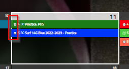
I’ve added a border around today’s date in the month view but I can’t seem to figure out how to adjust the actual events to not overlap the left border. Anyone know how to do this?

-
How do i get an extra colium for week numbers? Today its in the field for monday in my calendar.How do i specify this in css?
I have the weeksmark added. But unsure how to resolve this into its own colum. Any one have a surgestion? -
@fedale use MMM-CalendarExt3.
ext2 is no longer supported
-
@sdetweil okay thanks. I did not know that.
-
How can I make the calendar show more than two lines of text for each event?
I’ve had start and end times set up, but that would leave room for a few letters and it would look like:
‘08:00-09:30 Ext…’Then I’ve used this:
.CX2 .weekSlot .event:not(.fullday) .eventMain {
height: auto;
flex-wrap: wrap;
flex-grow: 0;
overflow: visible;
}and it allowed me to have time in one row, and text in another, however if the text alone is more than what could be fit in a single row, again I get 3 dots instead of having the box adjust to the size of the text.
It would look like this:
‘08:00-09:30
Extended line of t…’Also, whenever I have two enlarged boxes in the same day, the second one would partially go over the previous one, as if the previous one wasn’t enlarged.
Any ideas how I could solve these two issues?
-
@justbob I’d switch to CX3agenda, to be honest. Much better.
-
@justbob
That module doesn’t be designed like that. Of course, a heavy tweak of CSS could be the solution, but not recommended.First, unpretty.
Second, The purpose of the module is to glance at outlines at once. Multi lines are not so easy to scan. I recommend transforming the title abbreviately or using color/symbol to distinguish the points rapidly.
Third, technically not so easy to align the event cells with different lines(heights) in the same row. To accomplish it, that will inevitably waste space. So I haven’t designed so.
