That looks fantastic! Would you be able to share your module list and your custom css?
Read the statement by Michael Teeuw here.
Best posts made by spwood100
-
RE: My Family Info Board
-
Tour de France Module
Would be great to develop a module for the upcoming tour de france similar to the NFL ones and the one that was developed for the Olympics last year. My simple workaround will be to do an iframe showing the leader board and also have a news feed looking for news about the tour. Would be a great module though if anyone has any skills
Latest posts made by spwood100
-
RE: MMM-Scrobbler CSS
@SoleLo , that would be something to do with the relative sizes of the modules. You would probably need to play about with some custom css to get these to not overlap, something I am still struggling with on my screen from time to time.
Some excellent posts in the forum on css though:
You could also post in the CSS help section?
https://forum.magicmirror.builders/category/31/development
Cheers
-
RE: MMM-Scrobbler CSS
@SoleLo , add the following into the module config
header:
So for example
module: ‘MMM-Scrobbler’,
position: 'top_right',
header: 'insert your text here'
  config: {
Should work, let me know if it doesnt
-
RE: Using MM as a SmartDisplay for my Living room
@j-e-f-f said in Using MM as a SmartDisplay for my Living room:
doubt you’d find that useful
Would you be able to show how to align the current weather towards the clock on the left? That would be fantastic … great information board!
-
RE: My Family Info Board
That looks fantastic! Would you be able to share your module list and your custom css?
-
Tour de France standings
Hi All
Has anyone thought of creating a tour de-france module, similar to the other sports results modules that exist, i.e. the F1 module? Could show the team placings, rider placings? Unfortunately I have no skills in coding but if I did I definately would look into building it. -
RE: MMM-Scrobbler CSS
Thanks @PtrBld for you lightning quick turn around of this one and to @j-e-f-f for the extra advice, much appreciated
-
RE: MMM-Scrobbler CSS
Works like a dream with just a few “nuances” such as if you have it on the right side of the screen with the meta data to the right of the image, the meta data disappears off the screen and I suspect the same with the left. Otherwise its really good … thanks so mch!!!
-
RE: MMM-Scrobbler CSS
You are an absolute legend, let me pull the latest version and I will test and let you know
-
RE: MMM-Scrobbler CSS
That would help wouldnt it :-)
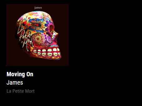
How it currently displays:

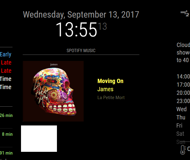
How it would be useful to have the option to diplay

I have seen other examples where this has been achieved but not sure how its done. If its possible to have different display options in the app settings that would be awesome !
Thanks for your help
-
MMM-Scrobbler CSS
I am developing a family wall board with a number of modules but the one I am struggling with at the moment is the excellent MMM-Scrobbler by @PtrBld . I have seen some examples where people have got the art work to align to the side of the meta data for album, track and artist. I have tried playing around with the custom css and can make the art work bigger and smaller as well as making the space for the text bigger and smaller but I am struggling on how to make the art work align fully to the left and right of the text.
Any ideas or suggestions??
Cheers