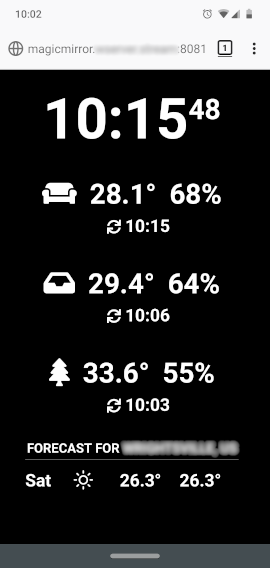
@sdetweil Thanks for the suggestions. The browser options didn’t seem to work for me, but the viewport CSS did. I couldn’t use your file as-is, but was able to borrow from it to add to my custom CSS.
I ended up adding custom sizes for each element – one of the things I was trying to avoid – but it was the only workable solution I could come up with for now.
I was wondering if the CSS transform: scale(x); might be a solution for scaling the whole layout, but I’m not sure what element to apply it to. Maybe someone who is more knowledgeable can comment.
I know that the body margin, height, and width all need to be adjusted, not just the font size, so it would need to accommodate for that.
Here’s my custom CSS if anyone’s interested:
body {
	margin: 6vw;
	height: calc(100% - 12vw);
	width: calc(100% - 12vw);
	font-size: 9vw;
	line-height: 9vw;
}

.small {
	font-size: 9vw;
	line-height: 9.5vw;
}

.medium {
	font-size: 6vw;
	line-height: 6.5vw;
}

.large {
	font-size: 36vw;
	line-height: 36vw;
}

header {
  font-size: 6vw;
  line-height: 6vw;
  padding-bottom: 2vw;
  margin-bottom: 3vw;
}

.module {
  margin-bottom: 12vw;
}