Description:
Yet another COVID-19 tracker. This one adds sparklines (small graphs).
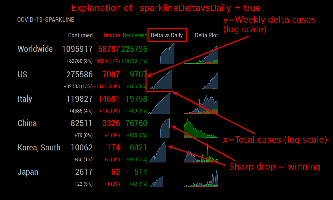
4-April-2020: Added Weekly change vs. Total Cases plot (sparklineDeltavsDaily), see this idea put forth by minutephysics in “https://www.youtube.com/watch?v=54XLXg4fYsc”
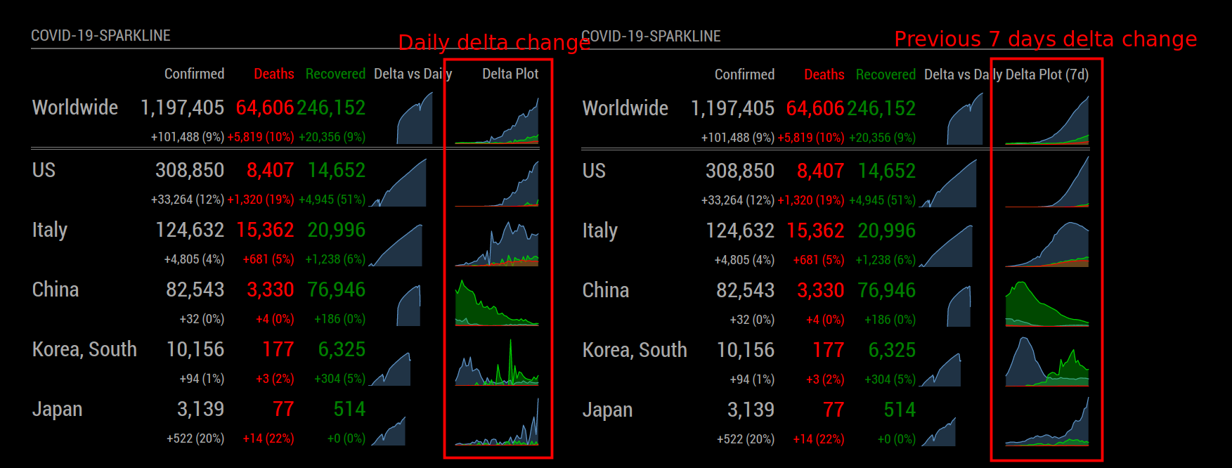
5-April-2020: Added ability to show n days in delta plot (showDeltaPlotNDays), also merged Brian Hepler’s numeric delimiter option.
For the latest info please see the project readme.md file.
Credits:
This is a combination of MMM-COVID19 and MMM-COVID-19. I liked Jose’s clean look, but I liked how Sean used the github data source (the same data Johns Hopkins is using). So I used Sean’s library and Jose’s GUI and added the tiny plots.
I also discovered highcharts.js while working on this; this is an incredible piece of work. (Also see MMM-GoogleFit’s use of this lib.)
Thanks Brian Hepler for adding delimiters to the data, makes it much easier to read. See option showDelimiter.
Source:
I’m not a web developer.
https://github.com/skelliam/MMM-COVID19-SPARKLINE
Development:
If you see something wrong, please fix it and make a pull request. I can’t promise that I’ll be actively maintaining this or responding to queries.
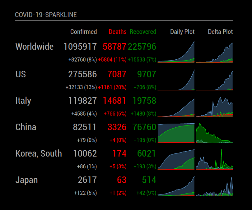
Screenshot:
Delta Cases vs Total Cases Screenshot:
See option sparklineDeltavsDaily.
Last n days in delta plot screenshot
The option showDeltaPlotNDays will sum the previous (n) days and smooth out the delta plot, this has an effect of phase-shifting the data to the left in time, but it also helps eliminate noise. I love how the South Korea data below clearly shows two distinct curves – one indicating that their peak growth has come and gone, but a new curve showing peak growth of recoveries. This data is beautiful! :)