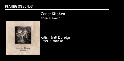
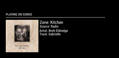
I checked that out but didn’t see where I could edit the layout. (n00b)
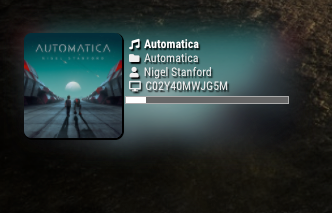
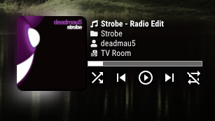
Looking at the sonos.css code, it basically does the same thing. Zone and Source are at the top, Artist and Track are on the right. I’d like to make it so that all four are on the side of the Cover Art, which IMO looks cleaner, takes up less space on the screen.

sonos.css
.sonos ul {
  list-style-type: none;
  padding: 0;
  margin: 0;
}
.sonos ul .name,
.sonos ul .art {
  display: inline-block;
  vertical-align: middle;
}
.sonos ul .name {
  padding: 0px .25em;
}
.sonos ul .art img {
  height: 100px;
}
.sonos ul .type,
.sonos ul .room {
  font-size: 50%;
  padding: .25em .5em;
}
.sonos ul .song {
	padding: 0px 0px;
	position: relative;
}
.sonos ul.flip {
  direction: rtl;
}
