Read the statement by Michael Teeuw here.
BG Animation with CSS
-
Small work accident. The result is a BG animation with CSS only. :face_with_tears_of_joy: :face_with_tears_of_joy: :face_with_tears_of_joy: :face_with_tears_of_joy:
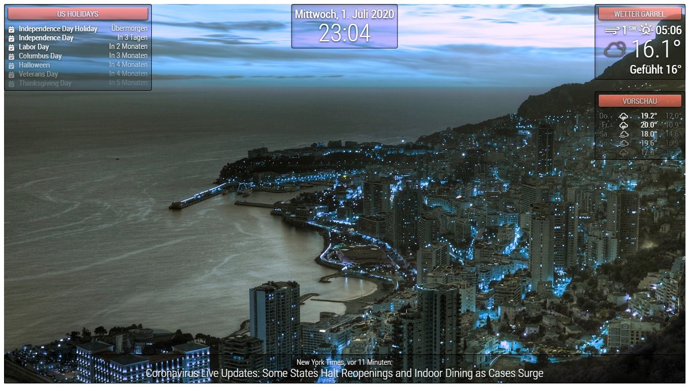
body { margin: 10px; position: absolute; width: calc(100% - 20px); height: calc(100% - 20px); margin-bottom: -10px; font-size: 20px; font-weight: 500; line-height: 1.5; color: #606060; background: url("bg/bg7.jpg"); background-blend-mode: hard-light; -webkit-animation: hue-rotate 10s linear infinite; animation: hue-rotate 10s linear infinite; } html { cursor: default; overflow: hidden; background: linear-gradient(233deg, #e56420, #c22525, #3d9c31, #37bbde); } header { text-align: center; font-size: 20px; padding:8px; border-radius: 5px; outline: none; border: none; background-image: linear-gradient(#28D2DE 0%, #1A878F 100%); color: #FFF; text-transform: uppercase; text-shadow: #000 0px 1px 5px; border: 1px solid #000; opacity: 0.7; box-shadow: 0 8px 6px -6px rgba(0, 0, 0, 0.7); border-top: 1px solid rgba(255, 255, 255, 0.8) !important; } .dimmed { color: #FFF; } .normal { color: #FFF; } .bright { color: #FFF; } .module { font-size: 20px; padding:8px; font-weight: 400; border-radius: 5px; box-shadow: inset 4px 6px 10px -4px rgba(0, 0, 0, 0.3), 0 1px 1px -1px rgba(255, 255, 255, 0.3); background: rgba(0, 0, 0, 0.2); outline: none; border: none; border: 1px solid black; color: #6E6E6E; text-shadow: #000 0px 1px 5px; } @keyframes hue-rotate { from { -webkit-filter: hue-rotate(0); -moz-filter: hue-rotate(0); -ms-filter: hue-rotate(0); filter: hue-rotate(0); } to { -webkit-filter: hue-rotate(360deg); -moz-filter: hue-rotate(360deg); -ms-filter: hue-rotate(360deg); filter: hue-rotate(360deg); } } @-webkit-keyframes hue-rotate { from { -webkit-filter: hue-rotate(0); -moz-filter: hue-rotate(0); -ms-filter: hue-rotate(0); filter: hue-rotate(0); } to { -webkit-filter: hue-rotate(360deg); -moz-filter: hue-rotate(360deg); -ms-filter: hue-rotate(360deg); filter: hue-rotate(360deg); } } -
Great idea. I would set the animation duration much longer but it looks great.
If I were you I would include all of this onto the MMM-fast-css module.
I would also add possibilities for arrangement of the modules.
Another user has posted an example of the modules in grid display. Could also be implemented as an option in the module couldn’t it? -
@lavolp3 have u tried this on a 4k screen. animations are really slow there.
-
@sdetweil Tomorrow I will test all the monitors in the house with it. It runs smoothly on the Pi and on the laptop. I have not yet tried it on the TV.
-
@lavolp3
I will adapt it further and then add it to the module. The arrangement of the modules will be resolved via the config. What I will do is install the day and night switches that change the designs. -
@Piranha1605 cool. I have 55 in tv, 4k, and one animation that is troublesome box-shadow inset only on one edge
-
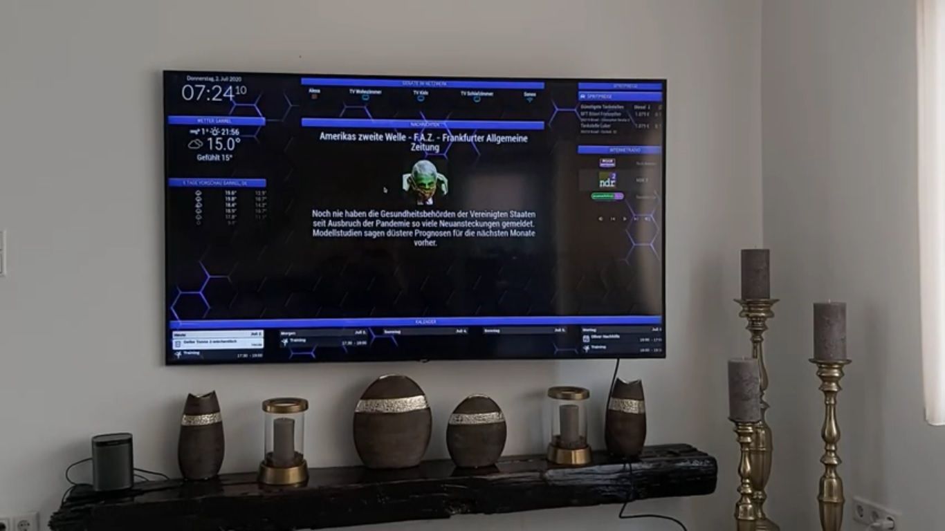
I just tested it in the living room. It runs smoothly if you set the time to 5s. The problem is now the discussion with my wife why I now work on the large TV in the living room every evening. :)
-
@Piranha1605 said in BG Animation with CSS:
Small work accident. The result is a BG animation with CSS only. :face_with_tears_of_joy: :face_with_tears_of_joy: :face_with_tears_of_joy: :face_with_tears_of_joy:
html { cursor : default; overflow : hidden; } body { margin : 10px; position : absolute; width : calc(100% - 20px); height : calc(100% - 20px); margin-bottom : -10px; font-size : 20px; font-weight : 500; line-height : 1.5; color : #FFF; background : url("bg/bg11.jpg"); width : 100%; height : 100vh; background-size : cover; background-blend-mode : hard-light; animation : hue-rotate 10s linear infinite; } header { text-align : center; font-size : 20px; padding : 8px; border-radius : 5px; outline : none; border : none; color : #FFF; text-transform : uppercase; text-shadow : 0 1px 5px #000; border : #000 solid 1px; opacity : 0.7; box-shadow : 0 8px 6px -6px rgb(0, 0, 0, 0.7); border-top : 1px solid rgb(255, 255, 255, 0.8) !important ; } .dimmed { color : #FFF; } .normal { color : #FFF; } .bright { color : #FFF; } .module { font-size : 20px; padding : 8px; font-weight : 400; border-radius : 5px; box-shadow : 4px 6px 10px -4px rgb(0, 0, 0, 0.3) inset, 0 1px 1px -1px rgb(255, 255, 255, 0.3); background : rgb(0, 0, 0, 0.2); outline : none; border : none; border : black solid 1px; color : #6E6E6E; text-shadow : 0 1px 5px #000; } @keyframes hue-rotate { from { filter : hue-rotate(0); } to { filter : hue-rotate(360deg); } } -
Unrelated to the animation, but how do you do those borders around your modules? In your post, is it the .module settings ?
UPDATE: I added to my css and it worked, cool! Been trying to find this for a while. Thanks for helping!
.module {
font-size: 20px;
padding:8px;
font-weight: 400;
border-radius: 5px;
box-shadow: inset 4px 6px 10px -4px rgba(0, 0, 0, 0.3), 0 1px 1px -1px rgba(255, 255, 255, 0.3);
background: rgba(0, 0, 0, 0.2);
outline: none;
border: none;
border: 1px solid black;
color: #6E6E6E;
text-shadow: #000 0px 1px 5px;}
-
@Piranha1605 Late to this party but MAN your background looks really awesome!
-
Hello
I applied the css, great
Except that my screen is small, I have to put it in portrait mode when I do this:
the whole image goes into a spin
thanks for the help
Bonjour
J’ai appliqué le css , génial
Sauf que mon ecran et petit , je dois le mettre en mode portrait quans je fais ceci :
https://forum.magicmirror.builders/topic/9707/save-performance-when-rotating-screen-e-g-on-raspberry-pi/12?page=2toute l’image part en vrille
Merci pour l’aide
Hello! It looks like you're interested in this conversation, but you don't have an account yet.
Getting fed up of having to scroll through the same posts each visit? When you register for an account, you'll always come back to exactly where you were before, and choose to be notified of new replies (either via email, or push notification). You'll also be able to save bookmarks and upvote posts to show your appreciation to other community members.
With your input, this post could be even better 💗
Register Login