Read the statement by Michael Teeuw here.
Weatherunderground - currently - hourly - daily - configurable
-
Working now ;)

-
@RedNax:
@anatius said in Weatherunderground - currently - hourly - daily - configurable:@wjdw87
this.forecastText = this.forecastText.replace(/(.*\d+)(C)(.*)/gi, "$1°C$3");
around line 937 in MMM-WunderGround.js should do the trickdo you have change this also?
-
@ostfilinchen Now i have, and thanks to @anatius for this!
-
@RedNax
Thanks for the great module!
I’ve fairly heavily modified it to my own preferences and soI don’t want to roll to the latest versions. I’m getting alerts that there’s a new version available and would like to not have those alerts displayed as I don’t wish to update and lose my changes. Is there a way to not have the version update alerts but still get the weather-related alerts? I’m not familiar enough with the MM infrastructure to figure this one out.
Thanks again for the great work!
Ren -
Hello developer @RedNax
Your module update is nice but please don’t waste so many place with the new layout.
Please shrink the space between the lines.
-
@lolobyte I’m sorry to hear you’re not happy with the layout. Could you be a bit more precide on the nature of your issue? Are the icons too large, too much information… A screenshot with arrows would be nice.
Thanks!
-
@RedNax the space between the lines in the forecasttable is too big an the Currentweather icon is also to big. My Set was 30% size of the Currentweather icon. With this size it looks good
-
-
@RedNax can you please make the color Icons smaller? The Currentweather icon is too big with 100% size. With this icon size, the Module Uses too many space on the mirror.
A other way, is to make it scalable by custom.css.
What Do you think about this?
-
@ostfilinchen Better now?
-
@RedNax yeah. Now it’s perfect. Great job!
-
-
@lolobyte He changed the size of the color icon. So the Module now looks good on the mirror. If the size isn’t good for your mirror, you can change it in your custom.css
-
-
@lolobyte yes. Just Do it. I’m happy now
-
@ostfilinchen Niiiiice!
@RedNax : Thank you. Good job. It looks now very good again.
-
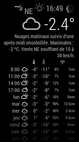
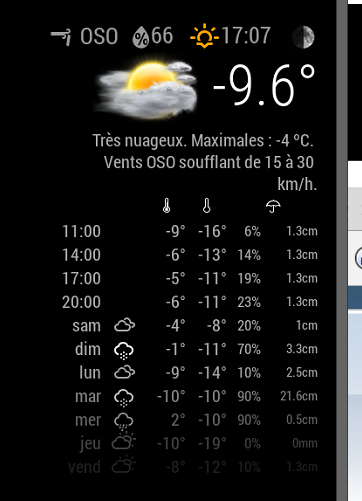
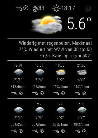
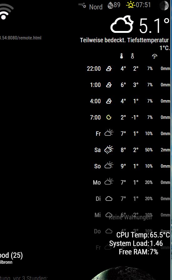
I think I found a little bug… using coloricon: true, the main icon is in color, but not the small ones… and the first 3 row got no icons…
-
@PointPubMedia said in Weatherunderground - currently - hourly - daily - configurable:
I think I found a little bug… using coloricon: true, the main icon is in color, but not the small ones… and the first 3 row got no icons…
Oddly enough I’m here for the same reason LOL I was trying to figure out …
The main ‘icon’ is an actual img… the smaller ones are actual icons… so when you updated you got the actual images… the icons are standard and have to be ‘colorized’… soo…
Add this to your custom.css file and enjoy :).wi-sunrise { color: #ffd700; } .wi-sunset { color: #ffa500; } .wi-day-sunny { color: #ffff00; } .wi-night-showers { color: #55acee; } .wi-degrees { color: #415; } .wi-rain { color: #55acee; } .wi-showers { color: #55acee; } .wi-night-showers { color: #55acee; } .wi-night-alt-cloudy-windy { color: #aaa; } .wi-night-cloudy { color: #aaa; } .wi-cloudy { color: #aaa; } .wi-day-cloudy { color: #aaa; } .wi-cloudy { color: #aaa; } .wi-cloudy-windy { color: #aaa; } .wi-showers { color: #55acee; } .wi-thunderstorm { color: #ff00ff; } .wi-snow { color: #fff; } .wi-fog { color: #999; } .wi-night-clear { color: #fff; } .wi-night-rain { color: #55acee; } .wi-night-thunderstorm { color: #ff00ff; } .wi-night-snow { color: #fff; } .wi-sunrise { color: #ffd700; } .wi-sunset { color: #ffa500; } .wi-day-sunny { color: #ffff00; } .wi-night-showers { color: #55acee; } .wi-degrees { color: #415; } .wi-rain { color: #55acee; } .wi-showers { color: #55acee; } .wi-night-showers { color: #55acee; } .wi-night-alt-cloudy-windy { color: #aaa; } .wi-night-cloudy { color: #aaa; } .wi-cloudy { color: #aaa; } .wi-day-cloudy { color: #aaa; } .wi-cloudy { color: #aaa; } .wi-cloudy-windy { color: #aaa; } .wi-showers { color: #55acee; } .wi-thunderstorm { color: #ff00ff; } .wi-snow { color: #fff; } .wi-fog { color: #999; } .wi-night-clear { color: #fff; } .wi-night-rain { color: #55acee; } .wi-night-thunderstorm { color: #ff00ff; } .wi-night-snow { color: #fff; } -
Got the same issue…

The first 4 got no icons…
-
Make a git pull and it will work
Hello! It looks like you're interested in this conversation, but you don't have an account yet.
Getting fed up of having to scroll through the same posts each visit? When you register for an account, you'll always come back to exactly where you were before, and choose to be notified of new replies (either via email, or push notification). You'll also be able to save bookmarks and upvote posts to show your appreciation to other community members.
With your input, this post could be even better 💗
Register Login

