Read the statement by Michael Teeuw here.
BG Animation with CSS
-
@sdetweil Tomorrow I will test all the monitors in the house with it. It runs smoothly on the Pi and on the laptop. I have not yet tried it on the TV.
-
@lavolp3
I will adapt it further and then add it to the module. The arrangement of the modules will be resolved via the config. What I will do is install the day and night switches that change the designs. -
@Piranha1605 cool. I have 55 in tv, 4k, and one animation that is troublesome box-shadow inset only on one edge
-
I just tested it in the living room. It runs smoothly if you set the time to 5s. The problem is now the discussion with my wife why I now work on the large TV in the living room every evening. :)
-
@Piranha1605 said in BG Animation with CSS:
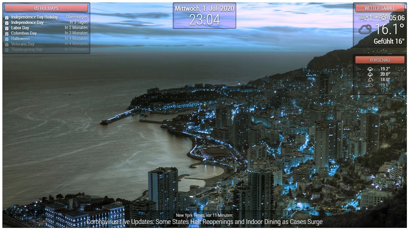
Small work accident. The result is a BG animation with CSS only. :face_with_tears_of_joy: :face_with_tears_of_joy: :face_with_tears_of_joy: :face_with_tears_of_joy:
html { cursor : default; overflow : hidden; } body { margin : 10px; position : absolute; width : calc(100% - 20px); height : calc(100% - 20px); margin-bottom : -10px; font-size : 20px; font-weight : 500; line-height : 1.5; color : #FFF; background : url("bg/bg11.jpg"); width : 100%; height : 100vh; background-size : cover; background-blend-mode : hard-light; animation : hue-rotate 10s linear infinite; } header { text-align : center; font-size : 20px; padding : 8px; border-radius : 5px; outline : none; border : none; color : #FFF; text-transform : uppercase; text-shadow : 0 1px 5px #000; border : #000 solid 1px; opacity : 0.7; box-shadow : 0 8px 6px -6px rgb(0, 0, 0, 0.7); border-top : 1px solid rgb(255, 255, 255, 0.8) !important ; } .dimmed { color : #FFF; } .normal { color : #FFF; } .bright { color : #FFF; } .module { font-size : 20px; padding : 8px; font-weight : 400; border-radius : 5px; box-shadow : 4px 6px 10px -4px rgb(0, 0, 0, 0.3) inset, 0 1px 1px -1px rgb(255, 255, 255, 0.3); background : rgb(0, 0, 0, 0.2); outline : none; border : none; border : black solid 1px; color : #6E6E6E; text-shadow : 0 1px 5px #000; } @keyframes hue-rotate { from { filter : hue-rotate(0); } to { filter : hue-rotate(360deg); } }
-
Unrelated to the animation, but how do you do those borders around your modules? In your post, is it the .module settings ?
UPDATE: I added to my css and it worked, cool! Been trying to find this for a while. Thanks for helping!
.module {
font-size: 20px;
padding:8px;
font-weight: 400;
border-radius: 5px;
box-shadow: inset 4px 6px 10px -4px rgba(0, 0, 0, 0.3), 0 1px 1px -1px rgba(255, 255, 255, 0.3);
background: rgba(0, 0, 0, 0.2);
outline: none;
border: none;
border: 1px solid black;
color: #6E6E6E;
text-shadow: #000 0px 1px 5px;}
-
@Piranha1605 Late to this party but MAN your background looks really awesome!
-
Hello
I applied the css, great
Except that my screen is small, I have to put it in portrait mode when I do this:
the whole image goes into a spin
thanks for the help
Bonjour
J’ai appliqué le css , génial
Sauf que mon ecran et petit , je dois le mettre en mode portrait quans je fais ceci :
https://forum.magicmirror.builders/topic/9707/save-performance-when-rotating-screen-e-g-on-raspberry-pi/12?page=2toute l’image part en vrille
Merci pour l’aide