Read the statement by Michael Teeuw here.
[MMM-ValuesByNotification] Display the payloads of notifications with titles and icons
-
Description:
Need a MagicMirror² module which is able to display information which is send by a other module like MMM-MQTTbridge or MMM-CommandToNotification?
The information is provided as a simple message or as an JSON-Object?
You want to re-format the message before displaying it or want to select single values within the JSON-Object?
You need more than one instance and do want to style the instances different?
Do you want to style the elements or change displayed icons based on thresholds?
Do you want some elements to only be visible if a certain profile is active?Then this is the module you need!
BUT i think i created a monster. The configuration can be very tricky!
Screenshots:
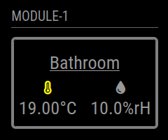
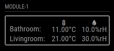
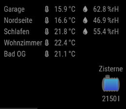
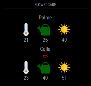
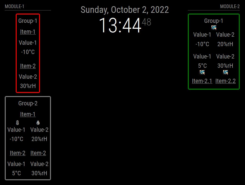
Download:
Download
[card:Tom-Hirschberger/MMM-ValuesByNotification]
Version 0.1.6
- bumped version of jsonpath-plus library to 10.3.0
Version 0.1.5
- bumped version of jsonpath-plus library to 10.1.0
Version 0.1.4
- it is possible to set the
reuseCounton group level now
Version 0.1.3
- added a postinstall script which creates a copy of the imported JSONPath library cause MagicMirror only imports files with ending
jsand notcjsto fix JSONPath
Version 0.1.2
- bumped jsonpath-plus library to version 10.0.1
- do not log every received notification anymore
- be more verbose if debug is enabled and the value format fails
Version 0.1.1
- Reverted the jsonpath-plus dependency upgrade (used version is 5.1.0 now) cause version 7.2.0 only worked with the newest MagicMirror version (2.24.0)
- fixed a bug which caused empty values to be converted to html and causing a exception in this process
- introduce a
debugconfig flag which causes some more information being printed to console if enabled
Version 0.1.0
- Each time a value is reused the values html elements get two classes added. The one configured with the new config option
reusedClass(default: “reused”) and the config option prefixed by a “-” and the count of reuses. - Updated the jsonpath-plus dependency to version 7.2.0. As this required a change to the import of the module this is a breaking change.
Version 0.0.10
- Introducing a feature to define own functions to transform the values (
valueTransformers). Added a example to values documentation - Changed the way titles, values and units are converted the html elements
- Added a new option called
unitSpaceto prefix the unit with a non-breakable space
Special thanks to @BKeyport for contribution
Version 0.0.9
- fixed a bug which caused selected JSON values with value
0being interpreted as not existing and replaced bynaValue
Version 0.0.8
- fixed a bug which caused values not being formatted if values before format are not of type String
- fixed a bug which caused newline replacement called even if no
valueFormatwas set
Version 0.0.7
- added new option
valueNaPositionswhich defines the positions of title, value, unit and icon of the value elements ifnaValueis used - added support to override
valuePositionsby threshold configurations (will overridevalueNaPositions, too!)
Version 0.0.6
- only the first element of a jsonpath result is used now
- if html is added as value which contains more than one html element they are wrapped in a
spannow
Version 0.0.5
- added support of Iconify icons
- all CSS definitions are now prefixed with the modules main class (MMM-ValuesByNotification)
Version 0.0.4
- fixed handling of new line characters in notifications; new lines will be replaced now before handling the values (default is a single space, see newlineReplacement option)
- fixed classes not bubbling up correctly
- added a flowercare example
Version 0.0.3
- if searching the value with “jsonpath” fails the “naValue” will be set now
- added a new option “formatNaValue” which controls if the naValue should be formatted as the regular are
Version 0.0.2
- Only classes which are added by thresholds are now set to higher (wrapper) elements if “letClassesBubbleUp” is set to “true”
Version 0.0.1
- Display values received as payload of notifications either as String or JSON Object
- Select single values with Jsonpath within the JSON objects
- Re-format the values with javascript functions (see valueFormat option)
- Group the values in items and groups and add titles and/or icons to the wrappers
- Re-order the elements in the wrappers based on position definition strings
- Filter elements based on the current active profile (MMM-ProfileSwitcher)
- Add classes or change icons based on thresholds reached by the values
-
@wishmaster270 soooo I gave a deep reading at your readme, but I am not quite sure whether I can already insert my MQTT based power meter with your first release or not? :slightly_smiling_face:
-
@Cr4z33
Hi,
the short answer: Yes it can, maaayyyybee?
Does your powermeter send the data via MQTT already?
Do you have the MMM-MQTTbridge module configured to connect to your MQTT broker, subscribe for the topic(s) and send the data via notification?
How does the data look like? Is it plain text or is it a JSON object?
If it is JSON how is the data structured and which values do you want to display? -
@wishmaster270 said in [MMM-ValuesByNotification] Display the payloads of notifications with titles and icons:
Does your powermeter send the data via MQTT already?
Yes
Do you have the MMM-MQTTbridge module configured to connect to your MQTT broker, subscribe for the topic(s) and send the data via notification?
Nope, but I will set it up as soon as I finish posting this reply! :thumbs_up_light_skin_tone:
How does the data look like? Is it plain text or is it a JSON object?
I’ve got Zigbee2MQTT running in a Docker and if I look at its logs it shows lines like
Zigbee2MQTT:info  2022-10-04 15:45:08: MQTT publish: topic 'zigbee2mqtt/BTicino F20T60A', payload '{"device":{"applicationVersion":0,"dateCode":" \u000020180829\u0000\u0000\u0000\u0000\u0000","friendlyName":"BTicino F20T60A","hardwareVersion":1,"ieeeAddr":"0x000474000089a3e4","manufacturerID":4129,"manufacturerName":" Legrand\u0000\u0000\u0000\u0000\u0000\u0000\u0000\u0000\u0000\u0000\u0000\u0000\u0000\u0000\u0000\u0000\u0000\u0000\u0000\u0000\u0000\u0000\u0000","model":"412015","networkAddress":16238,"powerSource":"Mains (single phase)","softwareBuildID":"016\u0000\u0000\u0000\u0000\u0000\u0000\u0000\u0000\u0000\u0000\u0000\u0000\u0000\u0000 \u0002\u0000\u0001\u0000 \u0002\u0000\u0002\u0000!\u0012\u0000\u0000\u0000\u0000  \u0003\u0000\u0010\u0002\u0001\u0004\u0000\u0018\u0002\u0000  !","stackVersion":64,"type":"Router","zclVersion":2},"linkquality":90,"power":645,"power_alarm":null,"power_alarm_active":true,"power_alarm_active_value":2}'

Zigbee2MQTT:info  2022-10-04 15:45:10: MQTT publish: topic 'zigbee2mqtt/BTicino F20T60A', payload '{"device":{"applicationVersion":0,"dateCode":" \u000020180829\u0000\u0000\u0000\u0000\u0000","friendlyName":"BTicino F20T60A","hardwareVersion":1,"ieeeAddr":"0x000474000089a3e4","manufacturerID":4129,"manufacturerName":" Legrand\u0000\u0000\u0000\u0000\u0000\u0000\u0000\u0000\u0000\u0000\u0000\u0000\u0000\u0000\u0000\u0000\u0000\u0000\u0000\u0000\u0000\u0000\u0000","model":"412015","networkAddress":16238,"powerSource":"Mains (single phase)","softwareBuildID":"016\u0000\u0000\u0000\u0000\u0000\u0000\u0000\u0000\u0000\u0000\u0000\u0000\u0000\u0000 \u0002\u0000\u0001\u0000 \u0002\u0000\u0002\u0000!\u0012\u0000\u0000\u0000\u0000  \u0003\u0000\u0010\u0002\u0001\u0004\u0000\u0018\u0002\u0000  !","stackVersion":64,"type":"Router","zclVersion":2},"linkquality":90,"power":610,"power_alarm":null,"power_alarm_active":true,"power_alarm_active_value":2}'
If it is JSON how is the data structured and which values do you want to display?
I want to display the power value.
-
@Cr4z33
Should be no problem:MMM-MQTTbridge/dict/mqttDictionary.js:
var mqttHook = [
  {
    mqttTopic: "zigbee2mqtt/BTicino F20T60A",
    mqttPayload: [
      {
        payloadValue: "",
        mqttNotiCmd: ["POWERMETER"],
        mqttPayload: ""
      },
    ],
  },
];

var mqttNotiCommands = [
  {
    commandId: "POWERMETER",
    notiID: "POWERMETER_VALUES",
  },
];

module.exports = { mqttHook,  mqttNotiCommands};
config.js:
		{
			module: "MMM-ValuesByNotification",
			position: "top_left",
			config: {
                                updateInterval: 60,
                                reuseCount: 5,
				groups: [
					{
						items: [
							{
								notification: "POWERMETER_VALUES",
								itemTitle: "Power",
								values: [
									{
										valueUnit: "W",
										jsonpath: "power",
									},
								]
							},
						]
					},
				]
			},
		},
Will look like:

You may want to configure the updateInterval and/or reuseCount to your needs.
-
@wishmaster270 thank you it worked at first try!
Now I can go on with some aesthetic changes like icons, etc. :D
-
Just tested a view things.
If you like you can use font awesome icon instead of the title:{ module: "MMM-ValuesByNotification", position: "top_left", config: { updateInterval: 60, reuseCount: 5, groups: [ { items: [ { notification: "POWERMETER_VALUES", //itemTitle: "Power", values: [ { classes: "power", valueIcon: "fa fa-bolt", valueUnit: "W", jsonpath: "power", }, ] }, ] }, ] }, },custom.css:
.vbn .valueIcon.power {
  color: orange;
}
-
@wishmaster270 thanks I applied that instead.
Anyway to add some offset to the module to be aligned with the other modules on the left?
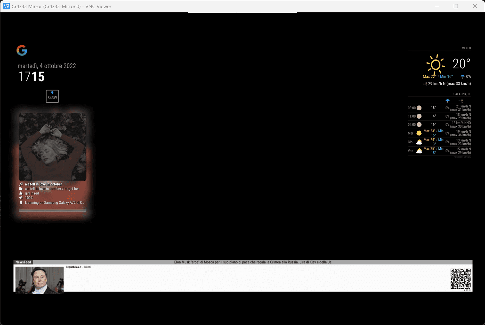
-
@Cr4z33
sorry i do not understand exactly what you mean -
@wishmaster270 I wanted to move your module way more to the left so to align it with my other modules (Google Assistant, clock and Spotify).
However nevermind as I opted to have your module on top instead. ;)
-
@wishmaster270 sorry for bothering you again… :grinning_face_with_sweat:
What if I want no border?
Would I have to edit the module’s CSS or can I just add something to custom.css?
-
@Cr4z33
No problem.
Simply add.vbn .groupWrapper { border-style: none; padding: 0px; }to your custom.css
Ps.: Try to never ever edit any files in the module directory (except mentioned in the documentation) as you will get problems with updates in the future otherwise!
-
@wishmaster270 exactly what I wanted thanks!
-
@Cr4z33
If you still want to move the content to the left you can try something like the following in your custom.css:.vbn .groupWrapper { border-style: none; padding: 0px; margin-left: 20px; } .vbn .groupsWrapper, .vbn .groupWrapper, .vbn .itemsWrapper, .vbn .valueWrapper { justify-content: left; align-items: unset; } -
Hey, Tom - Trying to use this module to decode the json output by my weatherstation - Like https://forum.magicmirror.builders/topic/17396/json-request-module
What I’m getting from Command to notification module is:
WEATHERLINK {"data":{"did":"001D0A71573B","ts":1675287003,"conditions":[{"lsid":434637,"data_structure_type":1,"txid":1,"temp": 47.4,"hum":52.8,"dew_point": 31.0,"wet_bulb": 38.4,"heat_index": 46.4,"wind_chill": 47.4,"thw_index": 46.4,"thsw_index":null,"wind_speed_last":2.00,"wind_dir_last":31,"wind_speed_avg_last_1_min":2.62,"wind_dir_scalar_avg_last_1_min":6,"wind_speed_avg_last_2_min":2.81,"wind_dir_scalar_avg_last_2_min":358,"wind_speed_hi_last_2_min":5.00,"wind_dir_at_hi_speed_last_2_min":340,"wind_speed_avg_last_10_min":1.43,"wind_dir_scalar_avg_last_10_min":36,"wind_speed_hi_last_10_min":5.00,"wind_dir_at_hi_speed_last_10_min":336,"rain_size":1,"rain_rate_last":0,"rain_rate_hi":0,"rainfall_last_15_min":0,"rain_rate_hi_last_15_min":0,"rainfall_last_60_min":0,"rainfall_last_24_hr":0,"rain_storm":0,"rain_storm_start_at":null,"solar_rad":null,"uv_index":null,"rx_state":0,"trans_battery_flag":0,"rainfall_daily":0,"rainfall_monthly":0,"rainfall_year":1750,"rain_storm_last":4,"rain_storm_last_start_at":1674798601,"rain_storm_last_end_at":1675000860},{"lsid":434634,"data_structure_type":4,"temp_in": 79.4,"hum_in":20.5,"dew_point_in": 35.5,"heat_index_in": 77.4},{"lsid":434633,"data_structure_type":3,"bar_sea_level":30.125,"bar_trend":-0.013,"bar_absolute":29.660}]},"error":null}yes, the weather station dumps a mess. :)
my current config for the values by notification is just the basics, but should be grabbing the “hum” value for testing:
		{
			module: "MMM-ValuesByNotification",
			position: "top_left",
			header: "Module-1",
			config: {
				groups: [
					{
						items: [
							{
								notification: "WEATHERLINK",
								itemTitle: "Item-1",
								values: [
									{
										valueTitle: "Value-1",
										jsonpath: "hum",
									},
								]
							},
						]
					},
				]
			},
		},
I get initally “NA” as a value, then it flips to “Undefined”
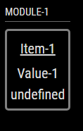
Any clue on what I’m doing wrong, or is the feed from the weather station needing more of a massage to be useful?
thanks!
-
@BKeyport Hi,
i formatted your output to understand the JSON structure you are using:{ "data": { "did": "001D0A71573B", "ts": 1675287003, "conditions": [ { "lsid": 434637, "data_structure_type": 1, "txid": 1, "temp": 47.4, "hum": 52.8, "dew_point": 31.0, "wet_bulb": 38.4, "heat_index": 46.4, "wind_chill": 47.4, "thw_index": 46.4, "thsw_index": null, "wind_speed_last": 2.00, "wind_dir_last": 31, "wind_speed_avg_last_1_min": 2.62, "wind_dir_scalar_avg_last_1_min": 6, "wind_speed_avg_last_2_min": 2.81, "wind_dir_scalar_avg_last_2_min": 358, "wind_speed_hi_last_2_min": 5.00, "wind_dir_at_hi_speed_last_2_min": 340, "wind_speed_avg_last_10_min": 1.43, "wind_dir_scalar_avg_last_10_min": 36, "wind_speed_hi_last_10_min": 5.00, "wind_dir_at_hi_speed_last_10_min": 336, "rain_size": 1, "rain_rate_last": 0, "rain_rate_hi": 0, "rainfall_last_15_min": 0, "rain_rate_hi_last_15_min": 0, "rainfall_last_60_min": 0, "rainfall_last_24_hr": 0, "rain_storm": 0, "rain_storm_start_at": null, "solar_rad": null, "uv_index": null, "rx_state": 0, "trans_battery_flag": 0, "rainfall_daily": 0, "rainfall_monthly": 0, "rainfall_year": 1750, "rain_storm_last": 4, "rain_storm_last_start_at": 1674798601, "rain_storm_last_end_at": 1675000860 }, { "lsid": 434634, "data_structure_type": 4, "temp_in": 79.4, "hum_in": 20.5, "dew_point_in": 35.5, "heat_index_in": 77.4 }, { "lsid": 434633, "data_structure_type": 3, "bar_sea_level": 30.125, "bar_trend": -0.013, "bar_absolute": 29.660 } ] }, "error": null }The
humvalue is part of the first element with index0of theconditionsobject which is part of thedataobject.
This results in a more advancedjsonpath…{ module: "MMM-ValuesByNotification", position: "top_left", header: "Module-1", config: { groups: [ { items: [ { notification: "WEATHERLINK", itemTitle: "Item-1", values: [ { valueTitle: "Value-1", jsonpath: "data.conditions[0].hum", }, ] }, ] }, ] }, },This config works out of the box ;-)
Edit:
If the order of the elements of conditions varies you can use
jsonpath: "data.conditions..hum"This one selects the hum value of any element of
conditions. -
@wishmaster270 Brilliant. Thank you. JSON is still quite the mystery to me sometimes. :)
-
One last thing - where in the CSS do I adjust the font size for the module? I want it to use the MM “Large” font, as it’s on a wall display across from my desk. Can’t seem to find it.
-
@BKeyport
Hi, great that it works now.
There are two different ways of how to change the font-size.
Either by using theclassesoption and addlargeto the element you want the font-size to be changed. i.e.:{ module: "MMM-ValuesByNotification", position: "top_left", header: "Module-1", config: { groups: [ { items: [ { notification: "WEATHERLINK", itemTitle: "Item-1", values: [ { classes: "large", valueTitle: "Value-1", jsonpath: "data.conditions..hum", }, ] }, ] }, ] }, },The main problem with this solution is that the font-size of the
valueTitleand thevalueitself is changed.Or you can use
custom.cssto do the job:.MMM-ValuesByNotification .vbn .groupTitle, .MMM-ValuesByNotification .vbn .itemTitle, .MMM-ValuesByNotification .vbn .value, .MMM-ValuesByNotification .vbn .valueTitle { font-size: var(--font-size-large); line-height: 1; }In this example the font-size of all titles and the value is changed. I use the
font-size-largeCSS variable of themain.cssfor this job. -
Thanks again, man. :)
I might not have to work up my own module to get the notifications. 🤣
Hello! It looks like you're interested in this conversation, but you don't have an account yet.
Getting fed up of having to scroll through the same posts each visit? When you register for an account, you'll always come back to exactly where you were before, and choose to be notified of new replies (either via email, or push notification). You'll also be able to save bookmarks and upvote posts to show your appreciation to other community members.
With your input, this post could be even better 💗
Register Login