Read the statement by Michael Teeuw here.
Throwing down the gauntlet
-
@jproehl custom.css
.newsfeed div.light.small.dimmed { color: #e54a1b; font-size: 9px; } -
@strawberry-3.141 said in Throwing down the gauntlet:
custom.css
I found myself squinting to read the source of the newsfeed in its default, dimmed state, so I jumped all over this. Now, with your css entry, and a little adjustment on my part, I now have my
font-size:at 18px and itscolor:set to #99F.Every time I think my mirror is perfect, you make it better.
genuflectingWe are not worthy!Many thanks, many times. :thumbsup_tone2:
-
@strawberry-3.141 said in Throwing down the gauntlet:
.newsfeed div.light.small.dimmed {
color: #e54a1b;
font-size: 9px;
}
Great, works like a charm! Thanks again! -
@strawberry-3.141 Hi: Can you point me to a reference where I can learn how to determine the precise terms to use for doing this? For example, how do you determine that “div.light.small.dimmed” was the proper parameter to enter to change the text I was after?
-
@jproehl it’s not super simple to find out what to write in the css if you are not familiar with css and javascript since most of that is names specified by the coders of the magic mirror and the modules,
If it’s not specified in the module documentation you can look in the modules .js file and search for the text
classNameafter that is usually specified one or more classes that will determine the appearance of what is being displayed.The className should also be visible if you look at the html code in the browser.
-
@broberg Okay, I’ll poke around in the codes. Thanks!
-
This post is deleted! -
@jproehl curious if you ever solved #2? i got the same issue with the icons showing up under the current
-
@jbeck615 Hi: That problem went away when I fixed a missing close bracket “}” in the custom.css. So, if you are getting the extra icon line in your current conditions display for the same reason I was, check to make sure that all of the entries in custom.css are of the form:
.“modulename” .“className” {
“parameter”: “value”;
}A concrete example of this is:
.clock .time {
color: #99F;
}One of my entries was missing that very last bracket. When I fixed that, the icon line went away and all the subsequent parameters that I was trying to change in the custom.css file also got changed.
I suspect that when that syntax error showed up the rest of the custom.css file was not processed and the parameter on which I left off the bracket and all the subsequent ones were never included.
Hope this helps! Good luck.
-
@jproehl thank you. ill do some deeper vetting. thanks!
-
@jbeck615 if you post your css here we can help to spot the issue
-
This post is deleted! -
@strawberry-3.141 oh my thank you SO much for offering. i hate asking for help but let me tinker with it for a couple of days and if no luck i will take you up on the offer. LOVE this community. thank you again for even offering!
-
I thought you might like to know that I had some success with the custom.css file without asking for your help. I did do some looking around in the module .js file and the Developers Tools. I was careful not to change anything. I was looking for clues on what changes specific parts of a module. (e.g. table, text, align, padding, margin, etc…)
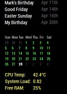
I wanted to be able to move the calendar_monthly module to the left margin. I also wanted to constrain the module to a specific width so that it wouldn’t expand when another module stretches the region they both occupy. And just for good measure, I threw in some color. So, using the the css information that you’ve already given me for other modules, and the information I got from looking in the module.js file and Developers Tools, I did this.

With this
}

.calendar_monthly table {
  width: initial;
  float: left;
}

.calendar_monthly td {
  text-align: left !important;
}

.calendar_monthly calendar-table {
  text-align: left !important;
}

.calendar_monthly {
  width: 200px;
  color: #6f6;
}
“I’m smart! I can do things!” (Fredo Corleone - The Godfather II)
-
This post is deleted! -
@strawberry-3.141 So I can definitely post the css coding but my pi takes some time to start up some days it seems… anyway what I was ultimately trying to do was, using wunderground, get rid of the last column as you and Mykle1 showed above and get the icon for current to look realistic/color but keep the forecast icons as generic icons. so the way i attempted this was incorporate all of the edits you all provided above. then i repeated wunderground twice in the modules, one to show current and the color icon (realistic icon) and a second time just to show forecast but with generic icons. however when i stack them both in top right thats where i get the unwanted icons. if i put current wunderground in the top center then they go away. thoughts? i can provide css if needed for sure. thanks for even looking!  image url)
 -
@Mykle1 thanks for sharing! the width of the monthly calendar was bothering me and i was going to research later anyway!
-
@johnnyboy said in Throwing down the gauntlet:
is that why you put the ! important there?
No sir, I do believe that this is the entry that constrains the module to 200 pixels ( and the color)
.calendar_monthly { width: 200px; color: #6f6; } -
@jbeck615 said in Throwing down the gauntlet:
thanks for sharing! the width of the monthly calendar was bothering me and i was going to research later anyway!
Cool. I’ve found answers that way too, before I even had the question
-
@jbeck615 said in Throwing down the gauntlet:
then i repeated wunderground twice in the modules,
You would have to repeat wunderground twice in the config.js file, not the modules, for starters
Hello! It looks like you're interested in this conversation, but you don't have an account yet.
Getting fed up of having to scroll through the same posts each visit? When you register for an account, you'll always come back to exactly where you were before, and choose to be notified of new replies (either via email, or push notification). You'll also be able to save bookmarks and upvote posts to show your appreciation to other community members.
With your input, this post could be even better 💗
Register Login