Read the statement by Michael Teeuw here.
multiple modules in a region
-
I have my basic program up and running. I’ve been coding and testing it on my Mac.
I have calendar_ext3 and mmm_wallpaper working. I want to start moving things around and editing to make it more like the dakboard (to make the wife happy). this would be pictures on the left third of the screen and a calendar taking up the right 2/3rds. like I said, I have them working but anticipating some deep custom.css work.
wallpaper in its default location is “fullscreen_below” and cal_ext3 is “lower_third”. the pictures take up the whole screen and the calendar is on top of that minus the area on top that looks like its defined by what is needed for the top_left and top_right modules.
I have a few questions to start with at this point: so far I can only get the calendar to work in full screen. is there an option to change this to a region? or do I need to find another module? I was thinking I could park it in the top_left and then do the css editing to get it to extend down the bottom of the screen.
second: I have the calendar working on the lower_third. I wanted to try to move the other small default modules up into the top bar(clock and 2 weather instances) and have them running across the top and then place the calendar in the top center and then use the css to stretch it down and to the right all the way. is this possible?
I started with the modules to the top bar. that worked but it defaults to stacking them downward at the center which then shrinks the calendar down too. can I have them spaced evenly left to right along the screen? think essentially it put them all in a column and I want them all in a row.
-
@roth_nj calendarext3 does not honor the region positions. there is just not enough space to do all that.
regions as youve seen are a stack. top down.
there was a discussion in the last couple weeks wanting to do side by side
https://forum.magicmirror.builders/topic/18020/2-modules-side-by-side/6?_=1696902063543
-
hi sam. first off, thanks for the reply and all the work you do on this. I’ve been in it for about 2 weeks now and reading all kinds of threads getting myself familiar with it and see your posts all over the place trying to help
can you eleborate on what you mean by “doesn’t honor the regions”?
I can post a couple screen grabs but you’ll have to be patient. the forum limits posts/pics per post cause I just registered.
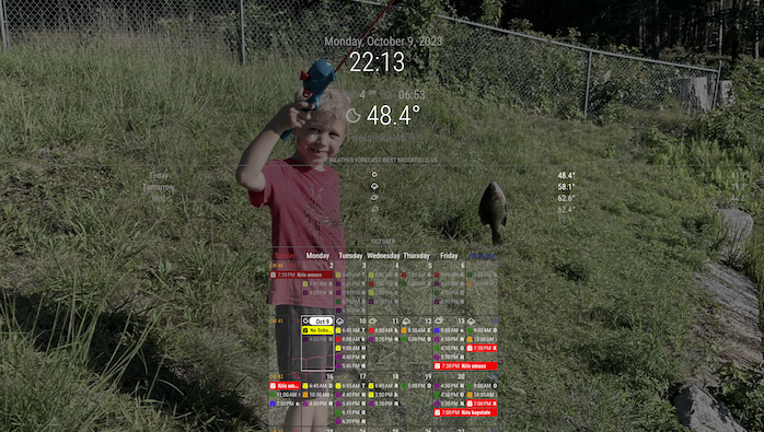
the first pic there I have the clock/weather/weather spread out across the top and the second they are all stacked in the left. the pic and calendar stay the same and the calendar ends up on top of the weather modules on the left
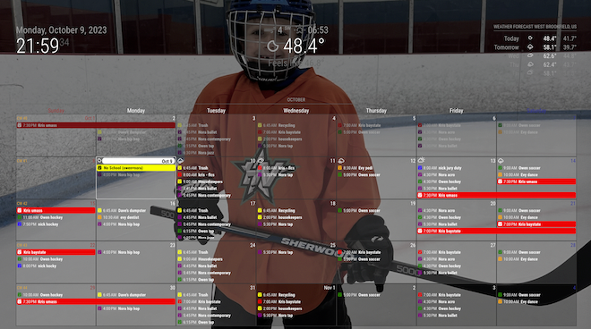
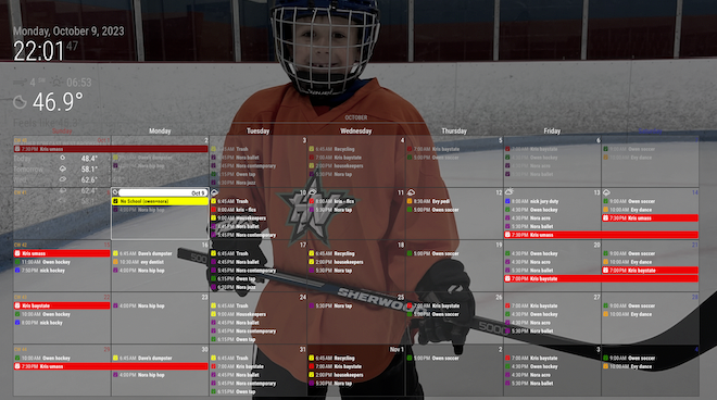
-
in these 2 pictures I have the clock/weather/weather stacked together. in the first one, they are in the top_left region and the calendar is in the top_center. in the second the 3 are in the top_bar and the calendar is in the top_center. the only reason why I’m asking what you mean with it not honoring the region’s, is to me it looks like its both moving around in them and sizing appropriately to respect other modules [depending on where they are].
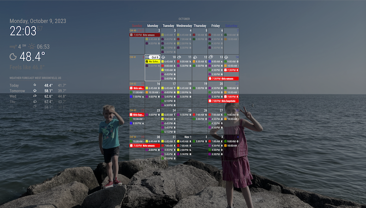
-
@sdetweil that being said, with a bit of CSS changes, you can get the calendar to grow quite a bit.
I set mine to top_center, and use the following CSS to make it take up most of my center region and adjust it’s colors, cell sizes, etc…
/* CalendarExt3 */
.CX3 {
  --celllinecolor: #666;
  --cellbgcolor: rgba(0, 0, 0, 0.5);
  --cellheaderheight: 25px;
  --cellfooterheight: 2px;
  --defaultcolor: #FFF;
  --eventheight: calc(var(--fontsize) + 4px);
  --totalheight: calc(var(--eventheight) * var(--maxeventlines));
  --displayEndTime: none;
  --displayWeatherTemp: none;
  font-size: var(--fontsize);
  color: var(--defaultcolor);
  line-height: calc(var(--eventheight));
  min-width: 950px;
}
With a little bit of work, and not putting anything in the right regions, you get the 2/3rds 1/3rd effect of Dakboard.
-
@roth_nj
If you have a sketch (even with a hand), I may help you. -
Is this similar to what you wanted? (DAKBoard style)
.region.top.left {
  width: calc(25% - 60px);
  backdrop-filter: blur(10px) brightness(60%) grayscale(30%) drop-shadow(4px 4px 10px black);
  padding: 20px;
  border-radius: 20px;
  height: calc(100vh - 160px);
}

.region.top.right {
  width: calc(75% - 20px);
}

.region.center {
  display: none;
}

.module.MMM-CalendarExt3 .module-header {
  font-weight: bold;
  font-size: 300%;
  color: white;
  line-height: 100%;
  border-bottom: none;
}
I use only 3 regions.
top_lefttop_right, andfullscreen_below. -
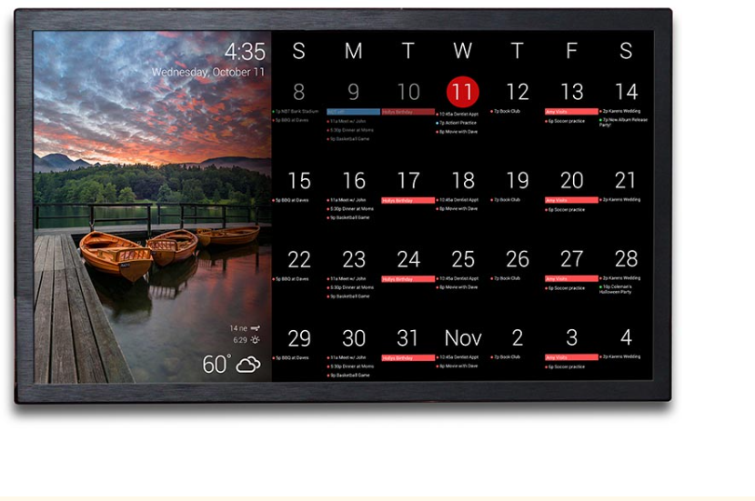
this is the dakboard calendar that my wife wants. ive shown here several others (examples of both from dakboard and MM) and she likes this layout the best. i do agree its pretty clean looking. as stated before, it is essentially photos on the left 1/3rd and a calendar on the right 2/3rds in landscape view with some light modules on top of the pictures. im sure youve seen the pic floating around a lot.
ive searched and read a lot on this and thats why i was stepping down the route of trying to get the modules into certain regions then going to try to mode with the css.
-
heres an idea: can a script be written that runs 2 instances of MM into 1 display at the same time? one being 1/3 of the screen and the other being the rest (or other 2/3rds)? then one instance of MM can run pictures fullscreen and the other can run the calendar full screen as well on its partition?
also, sorry if theres a few different dicussions going on at the same time now. with having to wait for posts to get approved theres a bit of a lag and its probably getting messy keeping thought streams straight now
-
@roth_nj
There is no way to do so.
However, I think mimicking DAKBoard style to MM with some CSS juggling. -
@roth_nj said in multiple modules in a region:
with having to wait for posts to get approved
I am the one that reviews and approves posts… until you get a reputation of 2 or above…
rep is increases if someone likes your post(s). generally because you contributed something.
-
that looks good and gives me an idea of something to try…
are there any other modules that post pictures to a region instead of full screen?
-
@roth_nj said in multiple modules in a region:
are there any other modules that post pictures to a region instead of full screen?
you can try them…
i spent a lot of time on MMM-ImagesPhotos in fullscreen to get the aspect ratios correct as neither of the built in CSS settings (cover/contain) work properly (imho)
https://github.com/sdetweil/MMM-ImagesPhotos , but you can try it in other positions
-
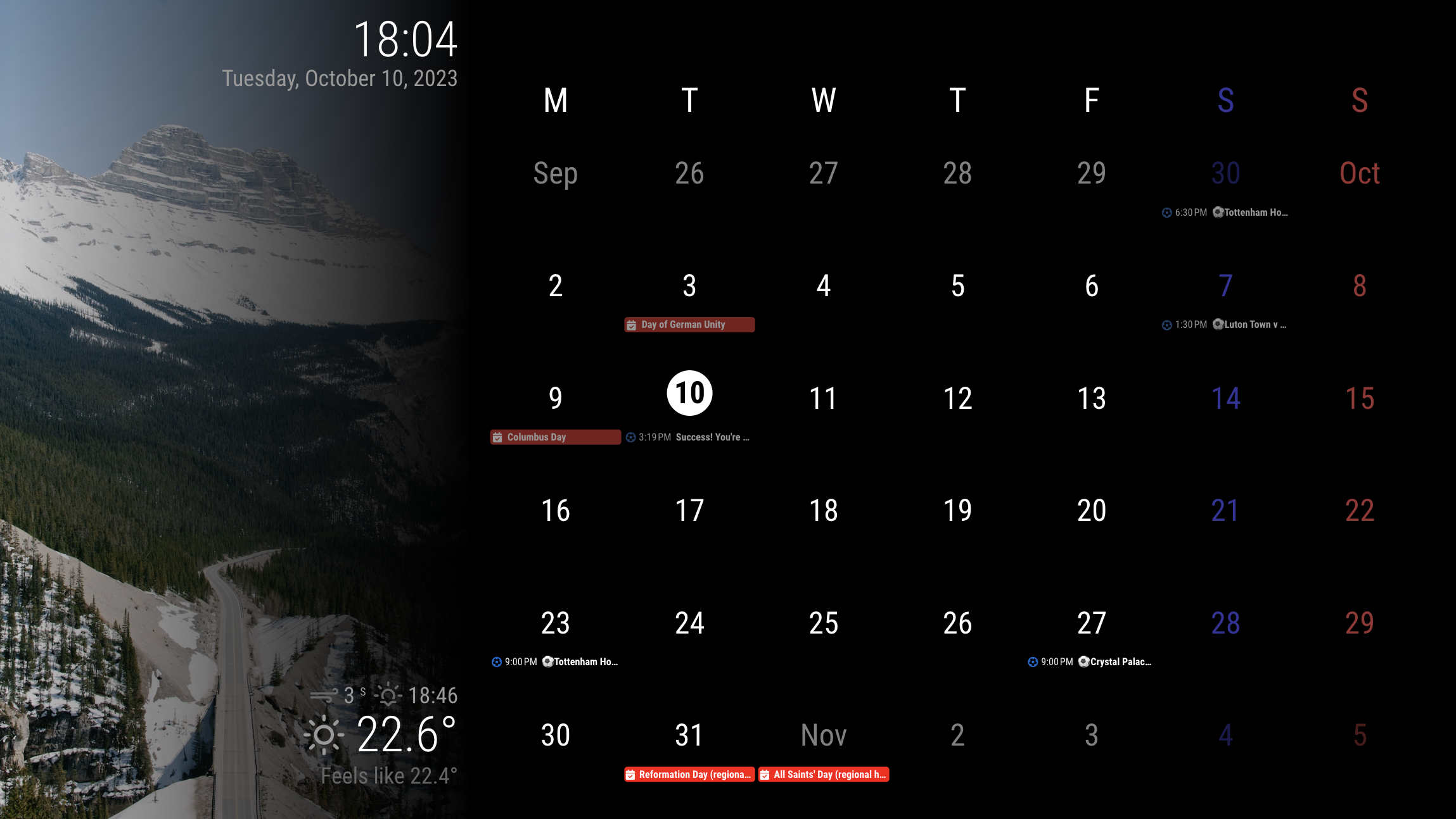
@roth_nj
similar?
-
-
@roth_nj
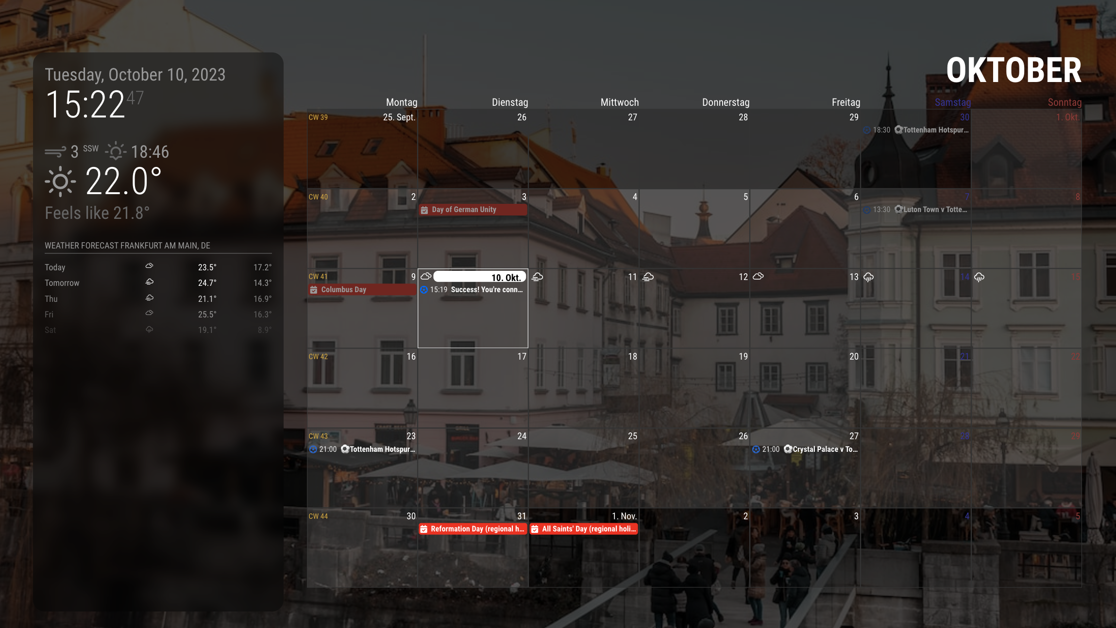
This would be just what you looked at in the previous screenshot.
Only for those modules on the screen, the CSS is severely overridden. So when you add additional modules, you should carefully handle them.
It is designed for resolution 1920 * 1080 horizon screen.config
modules: [
	{
		module: "alert",
	},
	{
		module: "clock",
		position: "top_left",
		config: {
			displaySeconds: false,
			sendNotifications: false,
		},
	},
	{
		module: "calendar",
		//position: "top_left",
		config: {
			broadcastEvents: true,
			broadcastPastEvents: true,
			maximumEntries: 99,
			calendars: [
				{
					symbol: "calendar-check",
					url: "https://ics.calendarlabs.com/76/mm3137/US_Holidays.ics",
					color: "red",
				},

				{
					symbol: "calendar-check",
					url: "https://calendar.google.com/calendar/ical/ko.german.official%23holiday%40group.v.calendar.google.com/public/basic.ics",
					color: "red",
				},
				{
					symbol: "futbol",
					url: "webcal://ics.ecal.com/ecal-sub/65254bc972b4f3000d0051df/Tottenham%20Hotspur%20FC.ics",
					color: "#0066CC",
				}
			]
		}
	},
	{
		module: "weather",
		position: "top_right",
		config: {
			weatherProvider: "openweathermap",
			type: "current",
			location: "Frankfurt",
			apiKey: "..."
		}
	},
	{
		module: "MMM-CalendarExt3",
		position: "bottom_bar",
		config: {
			locale: "en-US",
			mode: "month",
			maxEventLines: 3,
			headerWeekDayOptions: { weekday: 'narrow' },
			//firstDayOfWeek: 0,
			//minimalDaysOfNewYear: 1,
			useWeather: false,
		}
	},
	{
		module: "MMM-WeatherBackground",
	},
]
I used
MMM-WeatherBackgroundfor leftside background image, but you may use other modules.See where the position I put the modules into and how they might be overridden in the CSS.
CSS (custom.css)
:root { --color-text: #999; --color-text-dimmed: #666; --color-text-bright: #fff; --color-background: black; --font-primary: "Roboto Condensed"; --font-secondary: "Roboto"; --font-size: 20px; --font-size-small: 0.75rem; --gap-body-top: 20px; --gap-body-right: 20px; --gap-body-bottom: 20px; --gap-body-left: 20px; --gap-modules: 20px; } .fullscreen.below { width: 33.3%; } .region.top.bar { width: calc(33.3% - 60px); padding: 20px; height: calc(100vh - 40px); position: absolute; top: -20px; left: 0; text-align: right; display: flex; flex-direction: column; justify-content: space-between; background-image: linear-gradient(to right, rgb(0 0 0 / 0%), rgb(0 0 0 / 100%)); } .region.top.left, .region.top.right { box-sizing: border-box; text-align: right; top: 0; position: unset; } .region.bottom { width: calc(66.7% - 20px); padding: 20px; height: calc(100vh - 80px); position: absolute; right: 0; top: 0; } .region.bottom.left, .region.bottom.right, .region.center { display: none; } .module.MMM-CalendarExt3 .module-header { height: 0; visibility: hidden; line-height: 0; } .CX3 { --cellheaderheight: 80px; } .CX3 .cell { border: none; } .CX3 .cw { display: none; } .CX3 .thisMonth { background-color: unset; } .CX3 .cell:not(.thisMonth) .cellHeader .cellDate * { filter: brightness(0.5); } .CX3 .weekGrid .weekday { font-size: 250%; line-height: 250%; } .CX3 .cellHeader .cellDate { font-size: 250%; text-align: center; display: flex; justify-content: center; flex-direction: column; align-items: center; } .CX3 .cell.today { border: none; } .CX3 .cell.today .cellHeader { justify-content: center; } .CX3 .cell.today .cellHeader .cellDate { border-radius: 50%; max-width: 60px; max-height: 60px; } .CX3 .cell.today .cellHeader .cellDate .month { display: none; } .CX3 .week:nth-child(2) .cell:first-child .cellDate :not(.month) { display: none; } .CX3 .date_1 .cellDate .dateParts:not(.month) { display: none; } .module.clock .digital { display: flex; flex-direction: column-reverse; } -
that is awesome. looks like its actually in portrait but you rotated all the text to be read the other way? thats one way to skin that cat. i like it.
so, i know im not the first one to ask for a configuration like this. i know because i spent quite i bit of time searching and reading through all i could (here, github, reddit, etc)… it might be worth while putting together a polished post saying for a dakboard clone?
for reference. i went though and set up the dakboard but me being me, refused to pay for the upgrade. i needed it to handle 6 ical’s and wanted to be able to change the colors. simple things really, but they lock both those abilities behind the upgrade.
again, thank you very much. ill play around with it again tonight after work. im sure ill end up having some questions sooner or later
-
@MMRIZE said in multiple modules in a region:
Only for those modules on the screen, the CSS is severely overridden. So when you add additional modules, you should carefully handle them.
just be careful , as he whacked the css pretty hard here to make this work, and other modules may no longer fit properly…
MM is after all, just a web page…
-
@sdetweil said in multiple modules in a region:
@MMRIZE said in multiple modules in a region:
Only for those modules on the screen, the CSS is severely overridden. So when you add additional modules, you should carefully handle them.
just be careful , as he whacked the css pretty hard here to make this work, and other modules may no longer fit properly…
MM is after all, just a web page…
understood. as of now i only have the mmm_wallpaper and mmm_calenderext3 added in. i have half of the default modules turned off and only the clock+2 weathers still on atm. even if i do add something, it will be something like the default modules. something light and simple over the top of the photos
-
@sdetweil that’s half the fun of MM - whacking the CSS until you get what you want. :)
Hello! It looks like you're interested in this conversation, but you don't have an account yet.
Getting fed up of having to scroll through the same posts each visit? When you register for an account, you'll always come back to exactly where you were before, and choose to be notified of new replies (either via email, or push notification). You'll also be able to save bookmarks and upvote posts to show your appreciation to other community members.
With your input, this post could be even better 💗
Register Login