Read the statement by Michael Teeuw here.
Monthly Calendar View
-
And after a quick rewrite to use Moment.js instead of cumbersome Javascript calculations, I also did a bit of styling. I opted not to go the CSS route because the reality is, this is table-worth data, not CSS. It solves a lot of headaches to be honest. I did incorporate proper language translations. It just reads your locale and uses that.
- Still to-do is allowing for a Sun/Mon start of the week.
-
@KirAsh4 …that looks amazing! exactly what i looking for…
-
I think I prefer the first styling 😅 but maybe that’s just me :)
-
@paviro said in Weekly Calendar:
I think I prefer the first styling 😅 but maybe that’s just me :)
It is not only you :) I also prefer the first style.
Sometimes a little less is a little more ;-) -
CSS styling can be changed by anyone. At this point I’m just playing with it whenever I take a break from actually writing code. There are still bits of code that I don’t like. The trouble with being OCD.
-
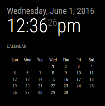
I reverted to much simpler times. One of the things that irked me is that I’m displaying a month/year on the calendar when it’s displayed right above it in the clock module. So, I made it optional. One can choose to turn off the header or leave it on. For those of you who don’t display the clock (or who put it elsewhere), it’s helpful to leave the header on, but if you have the clock enabled, there’s no sense in adding the month and year right below it again. This trims the header and keeps a clean interface.
And I left the ability for the end user to create a custom CSS file and modify the look (I turned the header back on for this preview):
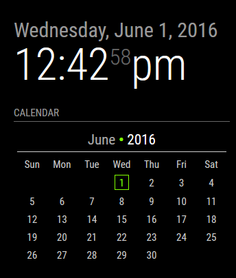
In the above example, the custom CSS added a bullet point in between the month and year (which does not exist in the default CSS), made the year digits brighter, and colorized the current day. There are several nested elements that will allow the user to customize how they want their calendar to look. I’m looking at you guys who also have a colorized version of the weather module. :)
-
I really like that touch of green in there…
Well done! -
That’s the custom CSS being implemented. By default it doesn’t have any color nor border. The user can edit their CSS and personalize it that way. Essentially the code reads:
// Module defaults defaults: { ... displayMonthyear: true, cssStyle: "default" /* Current options are 'default', 'block', 'custom' */ }, // Required styles getStyles: function() { switch(this.config.cssStyle) { case "block": return ["styleDefault.css", "styleBlock.css"]; break; case "custom": return ["styleDefault.css", "styleCustom.css"]; break; default: return ["styleDefault.css"]; } }, -
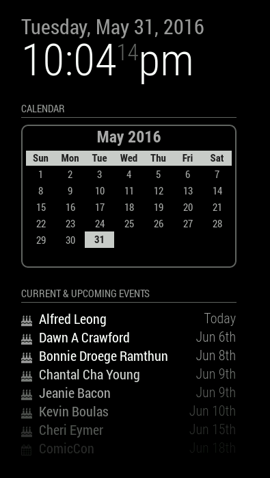
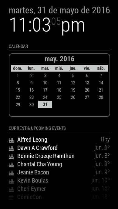
So as it turns out, it’s extremely easy to let the calendar Do Its Own Thing as far as figuring out what day to start the week on, Sunday or Monday. It litereally done by the system’s LOCALE, which you control by setting a language option in the main
'config.js'. Below is a screen shot of the English ('en') versus Spanish ('es') setting: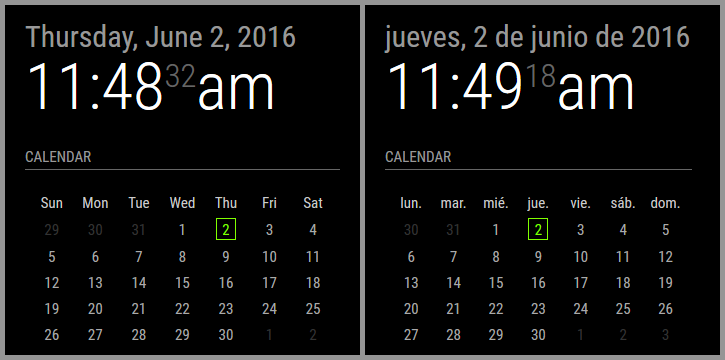
Notice how the Spanish one starts on Monday (lunes) whereas the English one starts on Sunday. I am not manually calculating this to draw the calendar. Moment.js takes care of this automatically.
Here’s the drawback: if your LOCALE defines the start of the week as Sunday, but you want to VISUALLY set the calendar to Monday (or vice verse), that would require me to actually manually calculate the entire calendar and draw it out. It’s a pain in the rear to be honest.
-
A bit late to the party thanks to a delightful holiday, but I must say: nice work on the calendar.
One small suggestion: change the green color to an inverted black and white digit. I prefer the MM to be fully B&W.
