Read the statement by Michael Teeuw here.
MMM-CalendarExt
-
@cptkex
I think https://www.w3schools.com/ is the best source for the beginners. I wish you have a good luck. -
Hi,
It’s possible to start ‘roll’ at the date of current day and no first day of month ?
Thx
-
@smotx Sorry, it can’t without source modifying.
-
I can’t seem to figure out why I don’t have the start times on my calendar. I’m really liking it other than that. I’m sure it’s probably something simple but I’m open to feeling stupid after the time I’ve spend trying to figure it out haha
{ module: 'MMM-CalendarExt', position: "lower_third", // ignore this. config: { system: { show: ['month'], locale: 'en', showEmptyView: 1, }, views: { month: { position:'lower_third', showWeeks: 0, onlyStartingTime:1, }, }, calendars :[ { -
@jimmysmalls
By default, time of month/week view is hidden because there might be not enough space.
Add this into yourcss/custom.css;.CALEXT .tableStyle .eventTime { display: block; order: 3; // when you want to display time under the event title. } -
@sean
That did the trick, thank you! One other quick question that maybe I’m overlooking the answer to in the documentation but is there a way to have it show the time on a 12 hour format instead of 24? -
@jimmysmalls
usetimeFormat: "hh:mm A"insteadtimeFormat: "HH:mm"
If you don’t want AM/PM indicator, just use"hh:mm" -
Hi, Sorry I new here. Do I need a seperate Calender for each icon/emoj? Can I use Rules for one single Calendar?
-
@jktitanium
Symbol is fixed per calendar.
However each event style(color or font except symbol) could be variable by condition. -
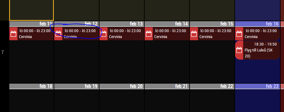
Hi. In weeks view with event time displayed, is there a way to remove the starting time and ending time on full day events?

