Read the statement by Michael Teeuw here.
Weekly Calendar
-
It’s just more real estate on the screen. Think about how you view your calendar in a regular browser and how much of the screen it takes up to view everything. Try shrinking it down and see how small you can get it before information gets hidden from you and you have to expand it again. Having the full month takes a lot of space.
Another possibility would be to make it a “running” week, where it displays 7 days, but not specifically Sunday to Saturday, but rather ‘Today, Tomorrow, Mon, Tues, Wed, Thurs, Fri’. Then tomorrow it shifts everything over to the left, and you now get ‘Sat’ appended at the end. The first day is always ‘Today’.
It’s a bit more programming, but possible.
-
@KirAsh4 for my application, that is what this project was going to be primarily for. Yes I can see the running 7 day thing working. I appreciate the help
-
Don’t get me wrong, I can see a situation where wanting the whole month displayed is desired. I’m looking at my own calendar and there is no way for me to fit all of that on the screen while also retaining other information. But I can understand if others want it. So I’m thinking, for a more broad spectrum of users, configurable options might be in order. Maybe a 2-week display, running 7-days, whole month. Or for those that have very busy days, even a daily agenda. Those are all within the scope of the API, it’s simply a matter of programming on our end.
-
Wow, that looks amazing! I’m out of town and haven’t had the chance Yet to try it on my mirror, but I’m super excited to get home and see it running. Lots of great ideas from the other commenters as well. I like the simplicity of the original events running list, but I think this weekly calendar will be great for a lot of people.
-
@idkmynameiskyle, it doesn’t exist in the wild yet. I just started working on it yesterday. It’s going to be a (long) while still before I get to anything worth releasing.
-
Right, we have two different requests here. One is to display a simple, empty calendar, and another to display an actual Google Calendar with contents.
-
@KirAsh4 I think the monthly compact view is an excellent addition to the default calendar. It looks great and it integrates well with the default design and layout.
The running week would still be a great thing to have across perhaps the bottom of a vertical mirror so that people can see what days they have to work in a given week, or other quick-glance information.
-
@idkmynameiskyle, yep, though again, I look at the amount of information one could possibly have on any given day and how to format things neatly and visible.
As an example, if I look at my Google calendar and pick one week (this week), this is what it looks like:

Notice the
'+7 more'line that I pointed out. I can’t see those in a standard weekly view. I have to either click on the link there, which trigers a pop-up with the remaining items, or switch to a daily view to see it all.Again, this is me personally. Your calendar may not be as crazy populated as mine (and I even turned OFF two others for this.) But I have to think of the possibility that someone might have multiple events in one day, specially in a family setting where everyone is doing their own thing.
-
This thread got very long and encompasses two different things:
- The request to make a weekly calendar view, which then turned into
- Another request for a plain (empty) monthly view as well.
The latter has been addressed, and is for all intents and purposes, ready. However, it no longer applies to the original post’s request. So I’m going to split this up into two separate threads. I’ll try to move the relevant posts around and clean things up a bit (if possible.)
Those of you wanting the Weekly Calendar, please continue the discussion here. Those of you wanting the Monthly Calendar, you can continue the discussion on the new thread.
-
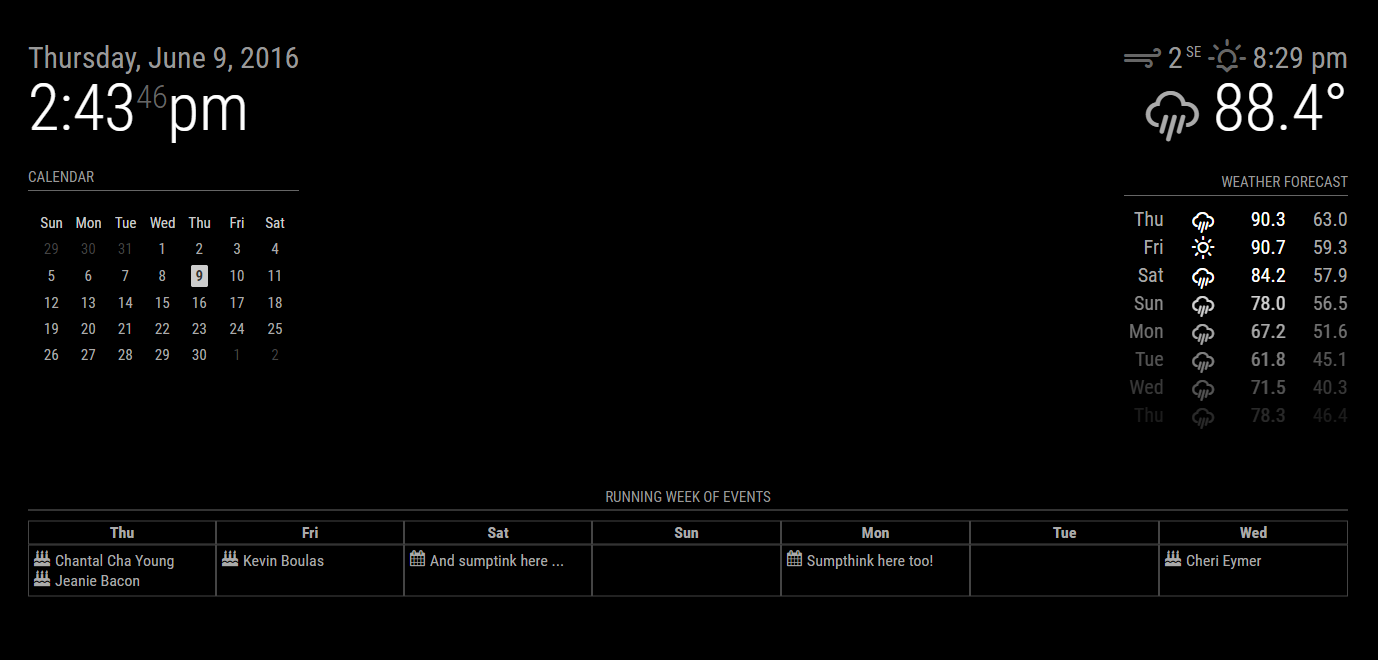
Small update:
- Rewrote most of the module to use DOM elements instead of hard-coding HTML tags
- Added calendar symbols to events
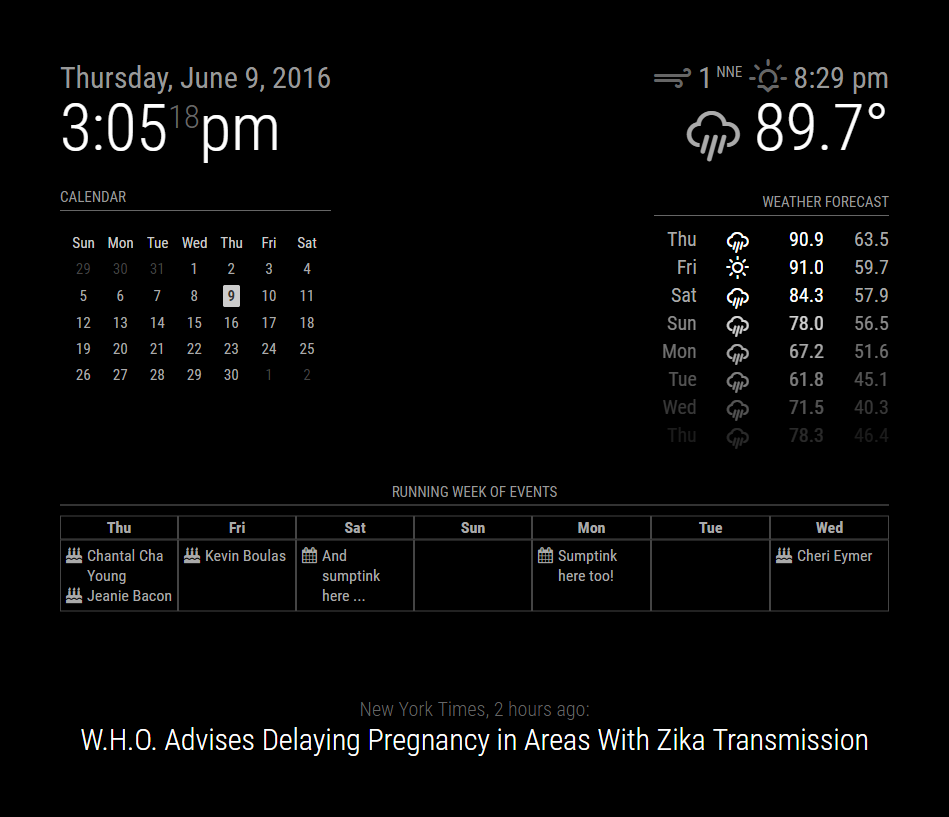
This is captured on a landscape monitor. When I’m at work, that’s what I have to work with. Things get a bit squirrely on a portrait layout because of long titles. need to fit the CSS alignment on that.

-
Guess I can always fake a portrait screen. Proper alignment done.

-
@KirAsh4 That looks incredible!!
-
Thanks. Slowly working through it.Need to roll in those multi-day events … seeing some stuff from our work calendar that isn’t displaying correctly … yet. Just a matter of proper parsing and displaying …

-
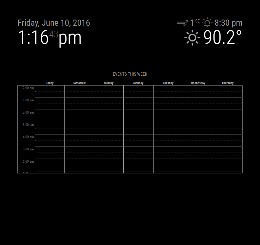
Harder part is going to be adding time display to the events … or, an hourly view. Thinking of real estate again. How many arrays can I nest … :)
-
@KirAsh4 I’m really looking forward to this being released, it looks great and gives a better view than the default list.
Nice work, and thanks for putting the time in
-
Wow…Awesome work, that is pretty damn close to what I was envisioning…Thank you for your work
-
The issue with taking up most of the screen is … that it’s not easily done. There are several “regions” on the screen that are constrained to a specific size so they don’t overlap others. Even on my large vertical screen, I can’t display a full 24 hour list. I’m flirting with the idea of limiting it to 12 hours (say 7am to 7pm) but that’s still stuff to just play with. As I said, this isn’t anywhere near even a test phase.
-
Writing this code is not for the faint of heart. I will put out this warning: this may or may not result in the final piece. And the reason I say this is simply because of how difficult it is to deal with the various overlays. I may end up scrapping this idea completely and go for a different solution that may or may not end up looking similar. (Yes I’m aware that the time starts at midnight … the actual element takes up the whole screen, it’s been pushed down and ‘height restricted’.)

-
And I seriously can not fathom that this thread has almost 1,000 views. Sheesh guys … you’re making me giddy. :)
-
Looks very Nice, but I think this will fill my Screen a bit to much.
Maybe there is also 1 Step back and then with numbers under the title “starttime - endtime”?
Hello! It looks like you're interested in this conversation, but you don't have an account yet.
Getting fed up of having to scroll through the same posts each visit? When you register for an account, you'll always come back to exactly where you were before, and choose to be notified of new replies (either via email, or push notification). You'll also be able to save bookmarks and upvote posts to show your appreciation to other community members.
With your input, this post could be even better 💗
Register Login