Read the statement by Michael Teeuw here.
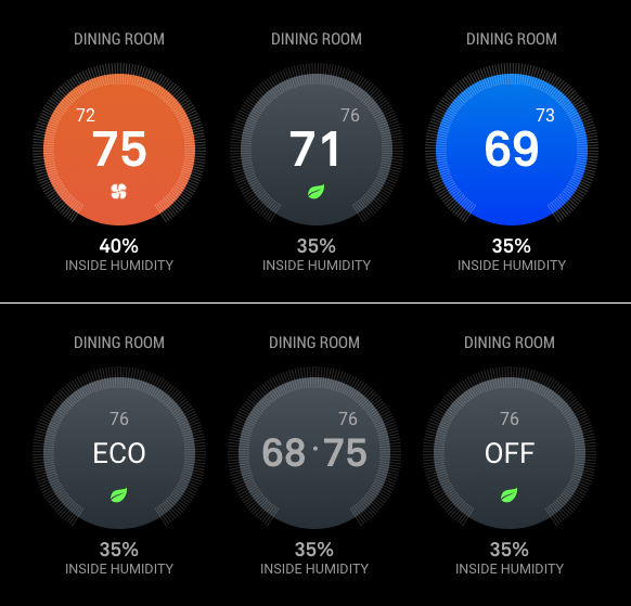
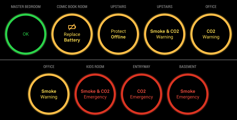
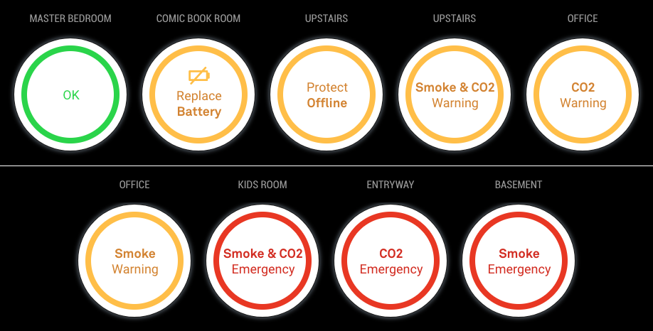
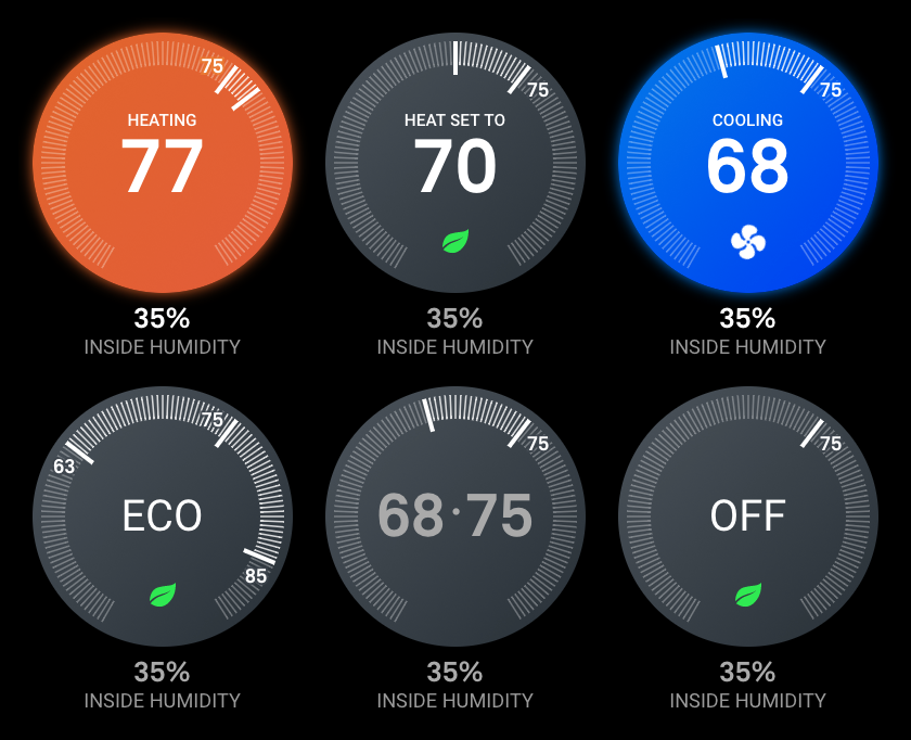
MMM-Nest-Status - New module for your Nest thermostats and protect smoke detectors!
-
Nicely done. :thumbsup:
-
@michael5r
Beautiful style! -
Great job this is what i have been looking for. I you have a dev account already is there anyway you can get that account to generate the token?
-
@dazza120 Done just done a New Oth as from my limited understanding i would have to reauthorise the other devices of that Oth easier to do a new Oth. Anyway this just cost me 3 Magic Mirror modules as this is a must i would love to be able to shrink the text type down as when my Hue lights start going on they clash :( BRILIANT MODULE Love it!
-
@dazza120 Run the
getToken.shscript in your terminal, and simply skip over the initial steps (where you set up a Nest developer account). It shouldn’t be a problem to use your existing Nest account (I also had one before I started this project). -
@dazza120 said in MMM-Nest-Status - New module for your Nest thermostats and protect smoke detectors!:
@dazza120 Done just done a New Oth as from my limited understanding i would have to reauthorise the other devices of that Oth easier to do a new Oth. Anyway this just cost me 3 Magic Mirror modules as this is a must i would love to be able to shrink the text type down as when my Hue lights start going on they clash :( BRILIANT MODULE Love it!
Thank you :)
Which texts are you trying to shrink?
-
@michael5r hi once again great module, it’s not really the text. I’m on the list display, it goes across the whole screen, I would at least like it to be reduced to the middle/centre so it leaves the weather display on the right that way when my hue lights turn on it doesn’t clash an two when I get more nest protects it doesn’t get into trouble does that make any sense? Once again thanks I saw other modules and I was like nope, saw yours and I had to do it lol 😂
-
@dazza120 said in MMM-Nest-Status - New module for your Nest thermostats and protect smoke detectors!:
@michael5r hi once again great module, it’s not really the text. I’m on the list display, it goes across the whole screen, I would at least like it to be reduced to the middle/centre so it leaves the weather display on the right that way when my hue lights turn on it doesn’t clash an two when I get more nest protects it doesn’t get into trouble does that make any sense? Once again thanks I saw other modules and I was like nope, saw yours and I had to do it lol 😂
Sure - that’s not a problem. For the list view, I’m just using the default
xsmallsize (which gives you a font-size of 15px) from Magic Mirror, but it’s easy to change.If you wish to set it to a smaller size, try adding this to your
custom.cssfile in Magic Mirror:.mmm-nest-status .nest-list.xsmall { font-size: 12px; line-height: 16px; }You can change the font-size and line-height to whatever size you want in order for it to fit.
If that’s still not small enough and you have long names for your Nest Protects, try adding this:
.mmm-nest-status .nest-list.xsmall .name {
    max-width: 100px;
    white-space: nowrap;
    overflow: hidden;
    text-overflow: ellipsis;
}
Again, you can change the
100pxto whatever looks nice on your mirror. -
@michael5r cheers but its not that everything else is solid you know where you have the smoke co2 and temp for the themostat on the right i just need that whole thing pulling a little to the left towards the names of the devices, im failing at explaining myself lol
-
@dazza120 said in MMM-Nest-Status - New module for your Nest thermostats and protect smoke detectors!:
@michael5r cheers but its not that everything else is solid you know where you have the smoke co2 and temp for the themostat on the right i just need that whole thing pulling a little to the left towards the names of the devices, im failing at explaining myself lol
I think you’re talking about about the width of the battery, co2 and smoke cells, right?
Try setting them to this:
.mmm-nest-status .nest-list th,
.mmm-nest-status .nest-list td {
    width: auto;
}
