Read the statement by Michael Teeuw here.
MMM-CalendarExt2
-
@Sean Hello,
I tried with maxItems set to 10. I’m definitely sure that I dont have more than 8 items with the calendars combined. It still doesn’t solve the problem. -
How does one replace a parentheses in the title of an event?
-
@mrmagoo_83 Regex would be “\(” and “\)” to find both.
-
-
-
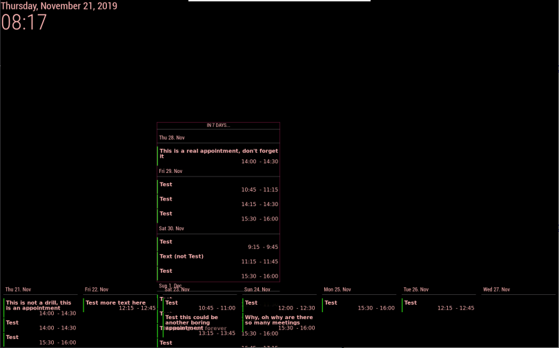
I have two views in one scene and need some layout/styling help. One row view shows the next 7 days and a column should show as many events as possible from 8 days onwards (a preview). For more precise placement, I created my own regions and added them to the index.html template.
The next-7-days daily view is at the bottom of the screen and behaves nicely. The preview column is in the center of the screen and regrettably runs over the next-7-days view.
In a daily column view, how can I skip days without events?
Which style element do I need to modify in custom.css to have the column content to stop at precise coordinates and not spill over other modules?
I tried limiting the region either with a bottom-margin or height value, both do not apply.
Here’s the style that doesn’t work
.region .preview { border: 1px #831e4d solid; position: absolute; left: 480px; width: 400px; top: 390px; height: 550px; } -
- Give your view
classNameto control more precisely.
For example,
{
  title: "Remove Empty Slot",
  name: "DailyView",
  mode: "daily",
  calendars: [],
  position:"top_left",
  hideOverflow: false,
  slotCount: 7,
  className: "remove_empty_slot"
},
Then modify your
css/custom.css.CX2 .remove_empty_slot .eventCount_0 { display:none; }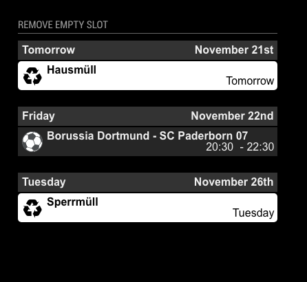
- Give your view
-
@Sean That works nicely for skipping days without events, thanks.
What can I do about the overlap of the content. I can’t limit the view height in the config file or in the class style.
-
@mmmmh
can u tell me more details? even picture would be a help to understand your expect. -
@Sean You know, I was just wondering how to get rid of empty days. Thanks!
-
@Sean said in MMM-CalendarExt2:
@mmmmh
can u tell me more details? even picture would be a help to understand your expect.Here’s an example (I disabled other modules).
-
@mmmmh
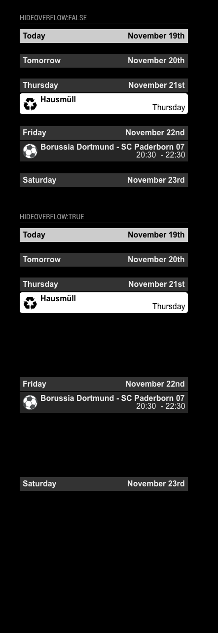
You can sethideOverflow:trueandslotMaxHeight:100px. If your view has 5 slots(with column type), The height of the view will be(100 + @) * 5.@would be some additional elements like some margins or title area. Anyway, with this calculation, you can adjust and estimate the height of the view somehow.
Or you can put this 2 view in same position(bottom_bar?), in that case, the views will be stacked not overlapped. The order will be what you ordered in configuration.Or, just use another position like bottom_bar and top_right.
-
@Sean
Thanks for the constructive help. I was already using different positions. Stacking within the same position doesn’t really work: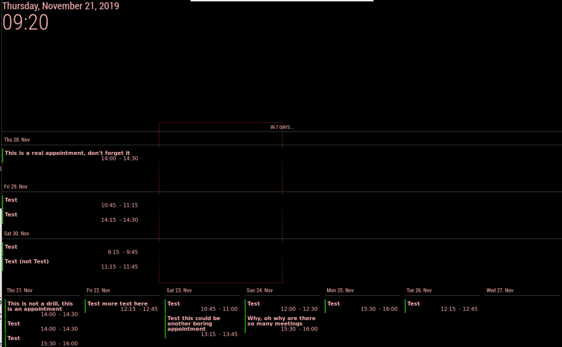
Slot limiting (and two different positions) seems to be (closer to) what I want to accomplish:
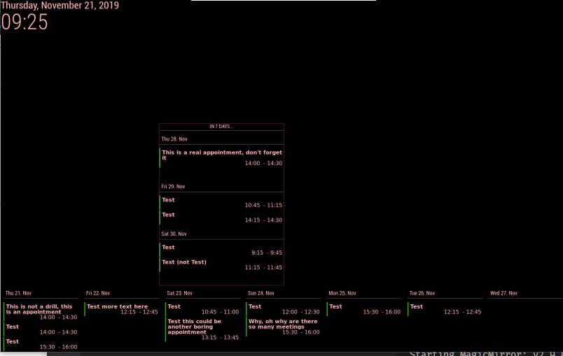
Another workaround would probably be to work with separate instances of the module.
-
@mmmmh
In your picture (trial for stacking),
You probably have trouble with styling a daily view. I think it is about the view’s location and width. In that case, you can assignclassNameto control specific view details with CSS. -
@Sean
Thanks for the remark. Stacking in the same position but with a different (additional) class for the column kinda works but there is still overlap (in this instance I am not limiting the slot height and count in the column, I would like to have as many entries as possible in the column):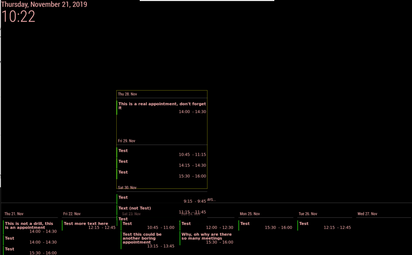
-
I found a workaround. I made the background of the lower part black. : )
In the last screenshot Thu. 28 takes up so much space, even when I enable hideOverflow. I think have to remove some hardcoded 150px in .slotContent but I can’t get to it.
-
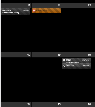
Trying to figure out two things:
One: I got the event title to wrap which is what I want, but it causes issues when there is an event following the one that wraps as you can see in the picture.
Second: How do I cut the overall height down of the whole thing? There is a lot of empty space, I’d like to limit the events per day to 3 and reduce the overall height of the calendar. -
-
I think you’ve modified CSS for sending event time to the right side, It could make the confusing wrapping. hmmm hard to explain. sorry for my poor English. What kind of method did you use?
float right?, By default this module usually useflexbox model. Try another approach with using flex. -
adjust
slotMaxHeightof view.
https://github.com/eouia/MMM-CalendarExt2/wiki/2c4.-View:week,-month
-
-
Ok, got the overall height down to manageable. I also reset the custom css work to time first, and all that. What I am looking to do is wrap the title of the event to multiple lines if it is too long, in doing so the event slot needs to increase, but when I do this, they still overlap like in the previous picture. I am very new to CSS so, I could easily have made a mistake.
-
@Sean @mrdenmark
Thanks for both of your help. I got it where I wanted it.@Sean Thanks for the module, its great! keep up the good work and awesome support.
Hello! It looks like you're interested in this conversation, but you don't have an account yet.
Getting fed up of having to scroll through the same posts each visit? When you register for an account, you'll always come back to exactly where you were before, and choose to be notified of new replies (either via email, or push notification). You'll also be able to save bookmarks and upvote posts to show your appreciation to other community members.
With your input, this post could be even better 💗
Register Login