Read the statement by Michael Teeuw here.
MMM-CalendarExt2
-
So, I tried a public google calendar as well as 2 of my private shared google calendars. The shared public one does not work, 1 of my shared one works, and 1 does not within the module. However, all of these calendars work in the default upcoming events module. Any suggestions on why this is? Also, I tried changing the “calendarfetcher.js” in the default calendar folder and with that change the default calendar stopped working, but the mmm-calendarext2 worked.
-
I think I figured out the problem. I can see other recent events added to these calendars. I think since they are older calendars they fall outside of the maxItems: 100, beforeDays: 60, afterDays: 365, maxIterations: 100 ranges. I tried adjusting those to go back to the start of the calendars and when I do it doesn’t pull in any events from any of my calendars. I’m not sure how to fix this.
-
@wegz15
maybe some repeated events couldn’t be parsed. this is using different parser with default module. it is faster and has more features. but occasionally it fails some repeated events.
i’m researching how to improve but not yet success. i may return but need more time to consider. -
@wegz15
anyway, can you send me your ics url and configuration? my mail is eouia0819@gmail.com -
@wegz15
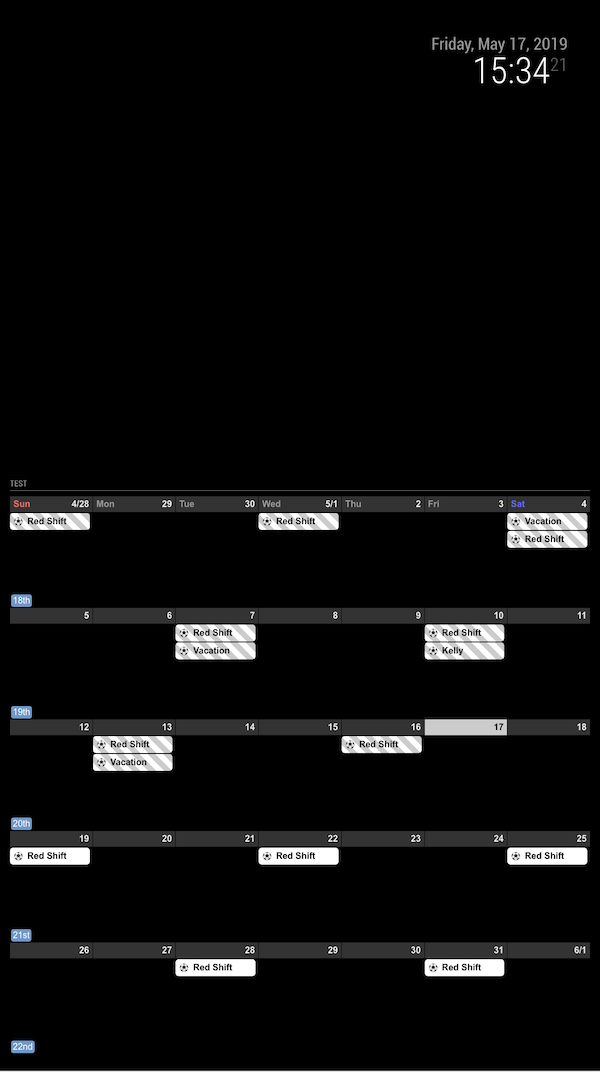
Now I think found something. set your maxIteration to 1000.
The reason is, your “Red Shift” events is started from too past, so even after 100(default value) occurrences it couldn’t reach to present age.
-
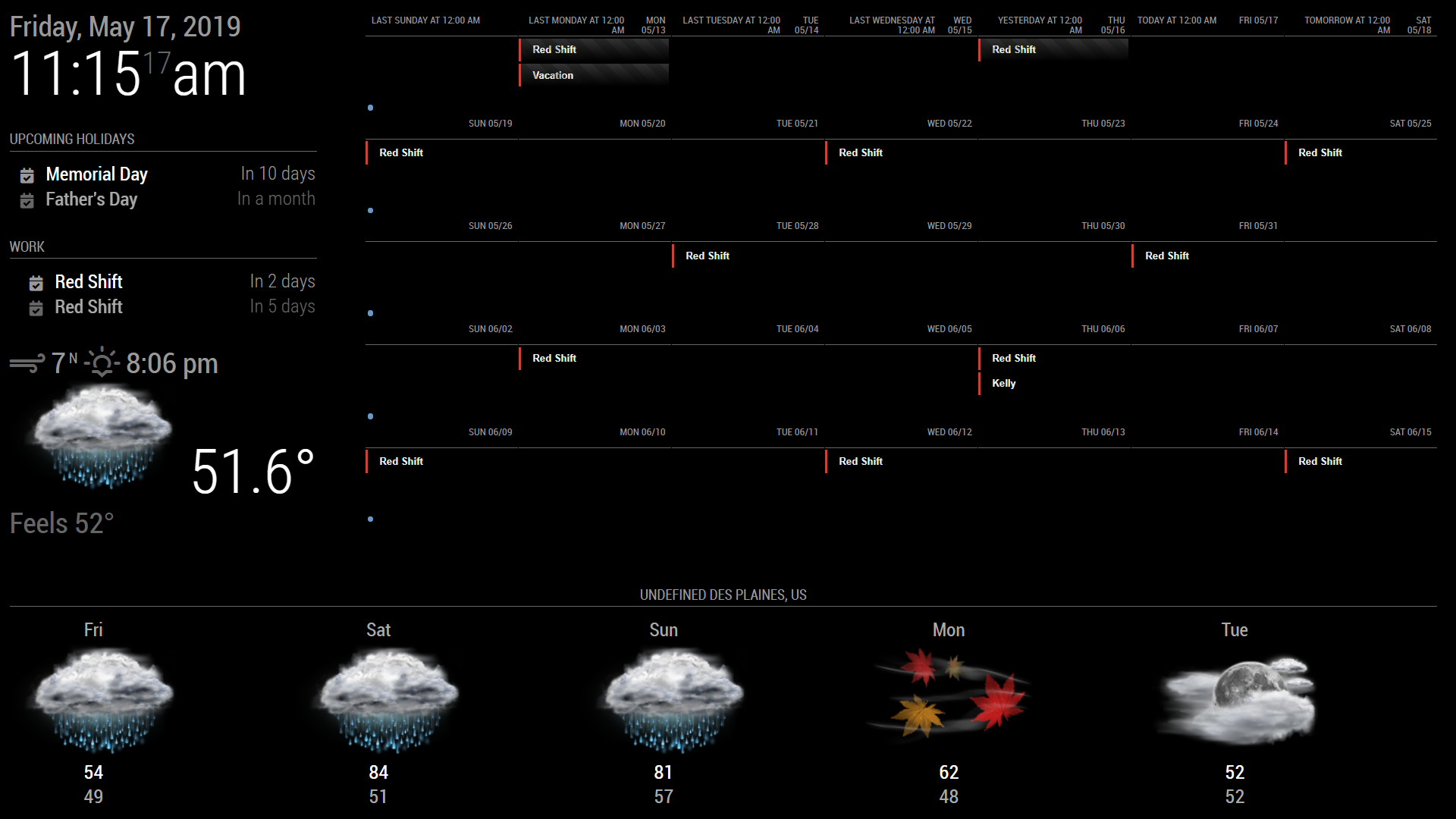
Yep, that worked. Thank you. I tried that, but I had it in the wrong spot. Its been trial and error trying to learn which values effect what on the main screen. If any one knows, is there a way to make the calendar not try to take up the full screen with the normal size text? Maybe use the % somewhere? I also have not been able to figure out how to get rid of the week number, I’m somehow missing a day, and I can’t figure out a way to get rid of the “last tuesday, Yesterday, today”. I’d also like to make that bottom weather “shorter”.
Im just not sure how or where to edit these values. Is there maybe a tutorial or video to learn how to “edit” magicmirror and modules?
-
@wegz15
monthorweekview might be too huge even for 1920*1080 size.- To get rid of
weeknumber, open yourcss/custom.cssthen add this.
.CX2 .weeksmark { display:none; }- To adjust day format, add this in your
viewconfiguration
slotTitleFormat: "D",
slotSubTitleFormat: "ddd",
I think you’ve set above fields in
defaultSet, but eachviewcan have it’s own setting. Especially,weekandmonthcould have different behaviors with other views for settings. Read the wiki carefully. https://github.com/eouia/MMM-CalendarExt2/wiki/2d.-Configuration:defaultSet - To get rid of
-
I guess what is confusing me the most is where to actually put each piece. I have that in currently and I am still seeing the “last, next today…”
module: 'MMM-CalendarExt2',
	config: {
		scenes:[
			{
				name: "DEFAULT",
				views: ["Monthly"],
			},
		],
		views:[
			{
				name: "Monthly",
				mode: "Month",
				position: "top_right",
				locale: "en",
				slotMaxHeight: "70px",
				dateFormat: "M/D",
				weeksFormat: " ",
				slotSubTitle:"ddd",
				slotTitleFormat: "D",
				slotSubTitle:"",
				dateTimeFormat: "ddd mm/dd",
				timeFormat:"h:mm A",
				slotCount: 5,
				showWeekends: true,
				hideOverflow: true,
				filterPassedEvent: false,
				calendars: ["Work"],
			},
		],
And I guess I’m asking if in general there is a way to scale the whole module so I can have a whole calendar fit into the open space. Thank you for all the help so far. This is my 3rd “day” working with magicmirror.
-
Very weird. I use your configuration (even with your ics)
And this is what my screen shows.
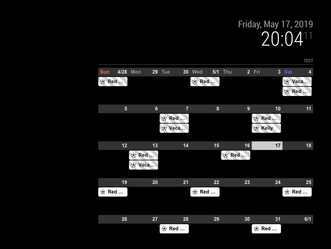
There might be more configuration values than you posted. Give me whole configuration. -
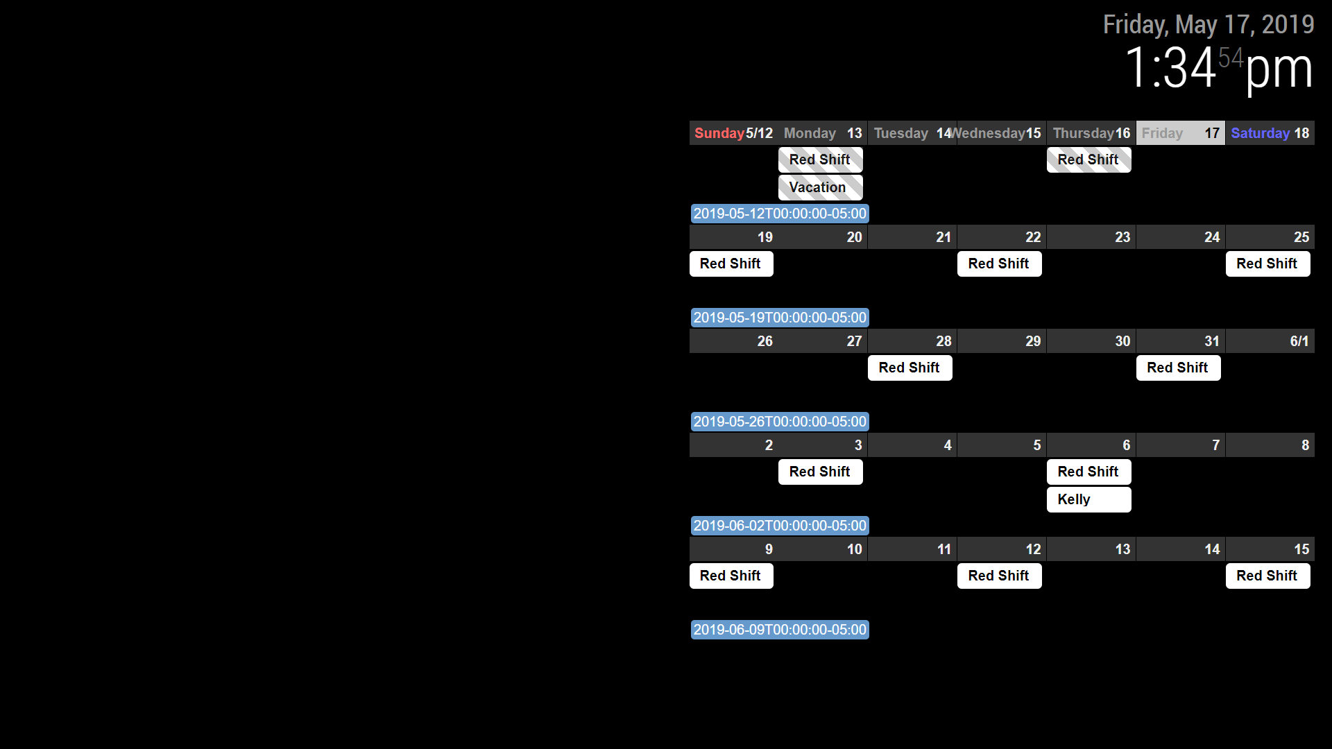
I emailed you my whole set up earlier. I think there is something, somewhere in another folder I must have messed with. I deleted everything but my clock and pasted just the calendar and it is showing up as pictured. Maybe a fresh install of MM or MMM-calendarext2.
-
@Sean thanks for the great module.
I would like to change the design of calendar as in calendarext (Weekdays and monthTitleFormat)
is this possible or should I use calendarext v1?
-
@Jerrylein
weekdays name could be cutomizable, but calext2 doesn’t have monthtitle on monthview -
@Sean
ok. but how I can change this? I mean the weekdays (sun, mon, tue,wed) are not in the same row with days.

-
@Jerrylein
That isslotSubTitleFormat.
inMon 26,Monwill beslotSubTitleand26will beslotTitle. (and additionally11/25will beslotAltTitle)So, if you set like;
{
  name: "VIEW1",
  mode: "month",
  position: "fullscreen_below",
  slotSubTitleFormat: "dddd", // (default value is "ddd")
},
It will show
Mondayinstead ofMon
https://github.com/eouia/MMM-CalendarExt2/wiki/2c4.-View:week,-month -
@Sean
thx.
But I do not want to change the format.
I would like to change the design of slotSubTitle as in Calext V1Here is Calext V1

that’s calext2
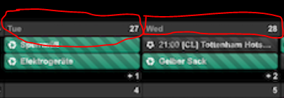
I think i should change custom.css file? but how?
-
@Jerrylein
If so, why aren’t you using CalendarExt2?
Unfortunately, that part of CalendarExt is table header so it can’t move.
But with CalendarExt2, you can mimic CalendarExt style. like this; (Even though that’s not you want.)I misread your first question. so you can make it like this;
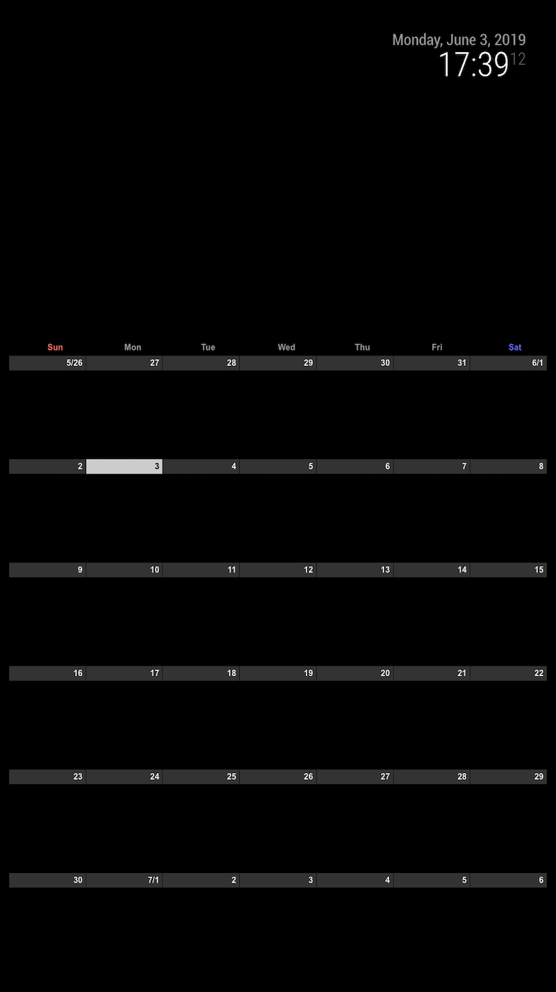
.CX2 .weekSlot.seq_0 .cellSlot .slotSubTitle { position:relative; top:-30px; left:40%; } -
I tried to add an URL that starts with
webcal://, but it doesn’t show up.
If I try other URL from an example here, it works, so the problem must be the URL with webcal. -
@flopp Just replace
webcaltohttp -
-
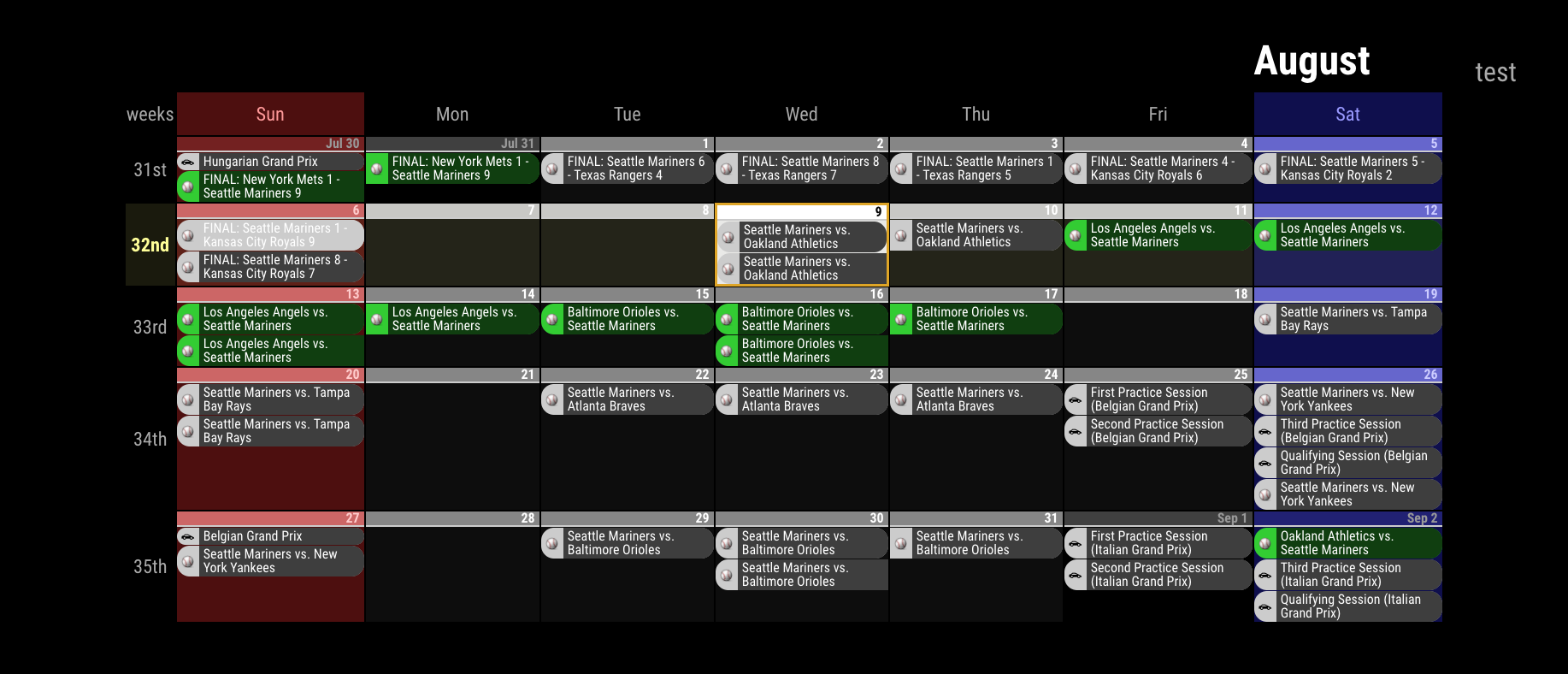
I am trying to get the view like the picture here
https://github.com/eouia/MMM-CalendarExt2/blob/master/screenshot.pngHow is that possible?
Or can I show 7 days, today to the left? Like 7 days rolling.
Hello! It looks like you're interested in this conversation, but you don't have an account yet.
Getting fed up of having to scroll through the same posts each visit? When you register for an account, you'll always come back to exactly where you were before, and choose to be notified of new replies (either via email, or push notification). You'll also be able to save bookmarks and upvote posts to show your appreciation to other community members.
With your input, this post could be even better 💗
Register Login