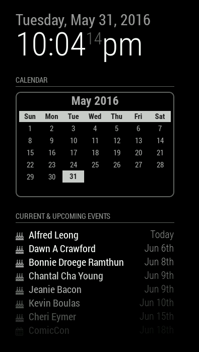
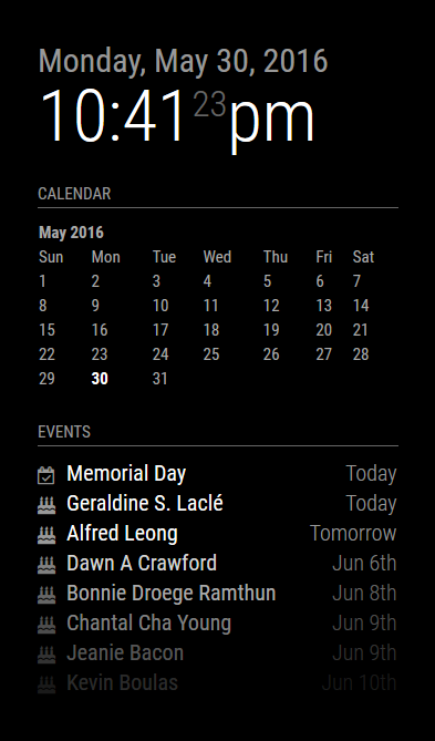
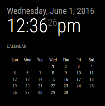
I reverted to much simpler times. One of the things that irked me is that I’m displaying a month/year on the calendar when it’s displayed right above it in the clock module. So, I made it optional. One can choose to turn off the header or leave it on. For those of you who don’t display the clock (or who put it elsewhere), it’s helpful to leave the header on, but if you have the clock enabled, there’s no sense in adding the month and year right below it again. This trims the header and keeps a clean interface.
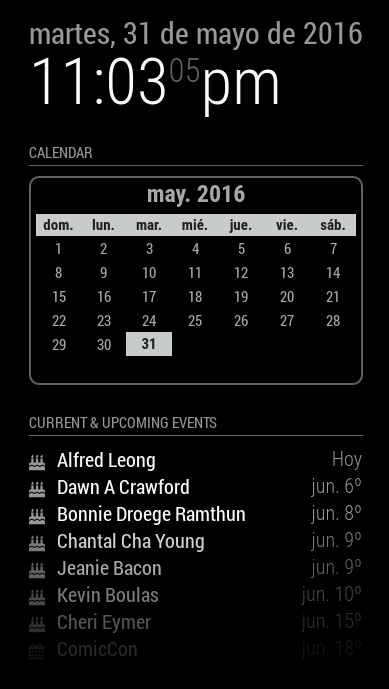
And I left the ability for the end user to create a custom CSS file and modify the look (I turned the header back on for this preview):
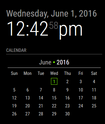
In the above example, the custom CSS added a bullet point in between the month and year (which does not exist in the default CSS), made the year digits brighter, and colorized the current day. There are several nested elements that will allow the user to customize how they want their calendar to look. I’m looking at you guys who also have a colorized version of the weather module. :)