Read the statement by Michael Teeuw here.
Error after updating MM
-
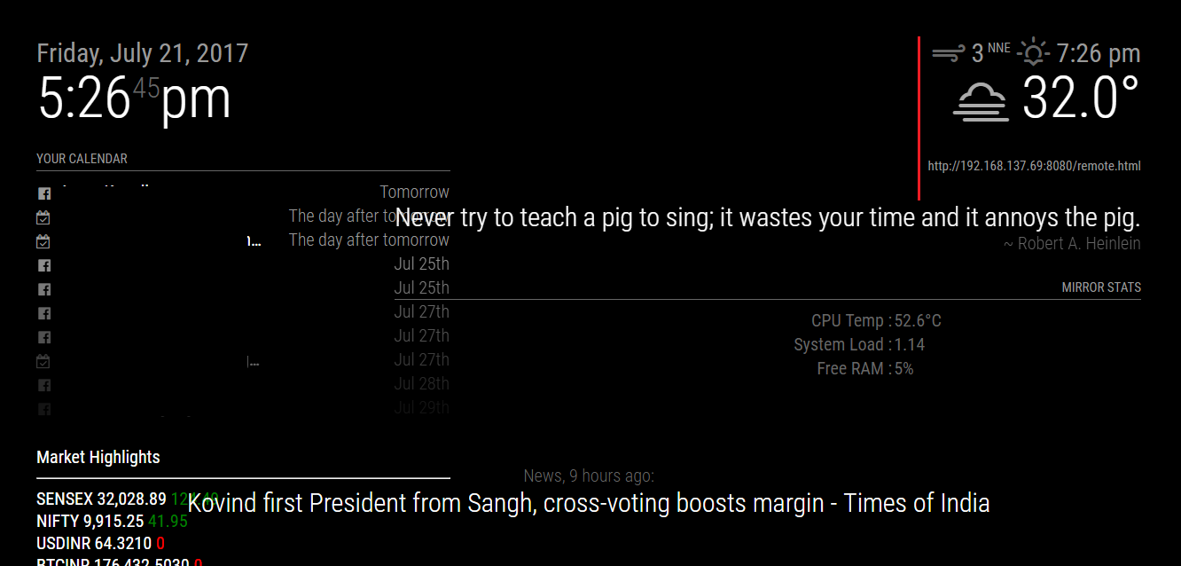
I recently updated my MagicMirror (after leaving the project unfinished 4-5 months ago), and the layout has changed a bit.
Also, one of the module (MMM-remote-control) has stopped working.I’m unable to access the mirror using the remote module. The error I’m getting is “This device is not allowed to access your mirror”
I tried this, but still the same error.
@xer0design said in ipWhitelist HowTo:
Not a fan of this addition; would have rathered it was something you enable rather than disable.
For anyone wondering how to allow all ips, use:
ipWhitelist: ["::fff:0.0.0.0/1", "::fff:128.0.0.0/2", "::fff:192.0.0.0/3", "::fff:224.0.0.0/4", "127.0.0.1", "::ffff:127.0.0.1", "::1"],- My modules were aligned to right of the screen taking width of approx 250px, now they are covering 3/4 of the whole screen. :/
all my css were untouched, am I supposed to change anything?
Screenshots & more explanation in the post below.
Also, can anyone help me reset the whole mirror/raspbian in case I want to start again? (without formatting the SD card)
- My modules were aligned to right of the screen taking width of approx 250px, now they are covering 3/4 of the whole screen. :/
-
As far as your ipWhitelist is concerned, this seems to be working for others after the update (for all IP’s)
var config = { ipWhitelist: [], address: "0.0.0.0", } -
@Mykle1 said in Error after updating MM:
As far as your ipWhitelist is concerned, this seems to be working for others after the update (for all IP’s)
var config = {
   ipWhitelist:  [],
   address: "0.0.0.0",
}
Thanks! This worked great (using ethernet cable, i’ll try using wifi and report back if i face any issues.)
-

As you can see in the image,
The quote module “never try to teach the pig…” should stay behind the red line, since it’s width was fixed, and was aligned to right.
That, along with the Mirror stats has crossed the line (no pun intended).
I want it to word wrap, but it is taking the width of the whole sentence. :(And, the Market highlights is taking up the width of the calendar module above it (which should not happen).
-
Without knowing what your module.css file, custom.css file or your config file settings are, not to mention the
regionsthe modules occupy, I couldn’t tell you what “should or should not happen” to the display of the modules.If the quotes module is in the upper_third region and aligned to the right then that is exactly how it should appear. Are you sure it is in the top_right region? And if so, it appears it is being allowed to expand as necessary, bringing the Mirror Stats with it.
Market Highlights would follow suit with the calendar module.
Perhaps the update has replaced your custom settings with defaults, or simply wiped them out.
Try this in custom.css for each of the modules you want to control, replacing MODULE_NAME with the name of each of the modules you want to constrain, and adjust accordingly.
.MMM-MODULE_NAME {
   width: 200px;
 }
Hello! It looks like you're interested in this conversation, but you don't have an account yet.
Getting fed up of having to scroll through the same posts each visit? When you register for an account, you'll always come back to exactly where you were before, and choose to be notified of new replies (either via email, or push notification). You'll also be able to save bookmarks and upvote posts to show your appreciation to other community members.
With your input, this post could be even better 💗
Register Login