Read the statement by Michael Teeuw here.
Input...What do you think?
-
I’m building my own Weather module but would like some input into what others think…
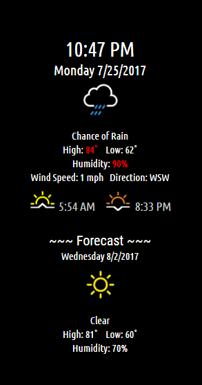
It has current condition on the top and in the Forecast section it rotates through 10 days of upcoming weather…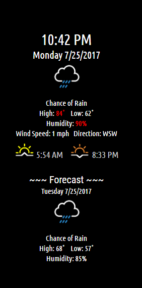
-
I think . . . you are a frickin genius!
I tip my hat to you, sir. That is some classy stuff!
-
@Mykle1 Thank you!
-
Looks GREAT, good work! How does it look on the left and right “zones”?
-
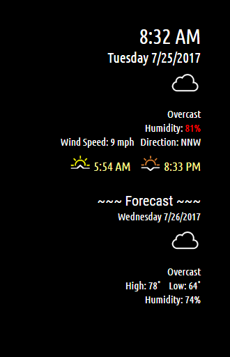
@Snille if on the right it pushes all the way to the border same for the left…no centering has been applied. Here’s some pictures:
Left side
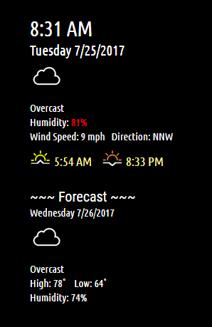
Right side
-
@cowboysdude Ok, looks good! :) I like it.
-
@Snille Yeah I’m on the fence with it… I’ve actually created 3 weather modules… but was having problems with speed… too slow.
This one seems to have solved that issue. But I may change the layout… not really sure if I like it. Here’s a capture of another layout from another module I made…

This is the one I had problems with…the icons work great on a regular computer but had big issues keeping up on the pi.
-
Ah Nice! like the last one to! Try in in the chromium browser. I’m currently running my mirror in that browser… I also have issues with “Electron”…
-
@Snille I will take a look at that for sure… sometimes I get so busy the obvious just slips right on by me LOL
-
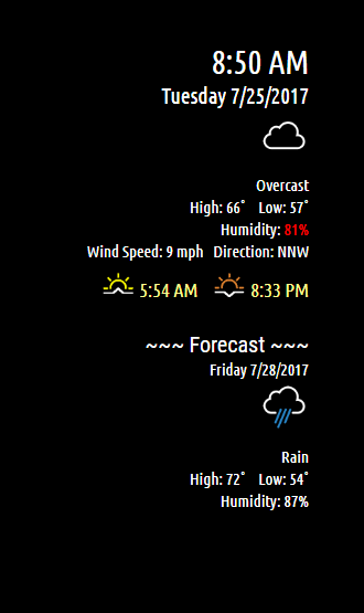
And OPPS just noticed the temp wasn’t showing up… I was working on those lines and forgot I didn’t finish them… LOL Here’s a new capture…

-
Ah, good one. What about current temp?
-
Great work!!!
//searching for download button…// :D -
@Snille GOOD POINT! Going to have a look at that later :)
Apparently I changed the api call and I get back TONS more data so I’ll have to reconfigure a bunch of stuff but I don’t mind as the info will be more extensive!!! :)
-
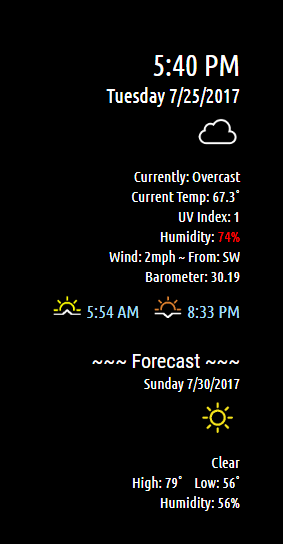
Added current conditions!
-
You’re unstoppable!
-
And this should do it…
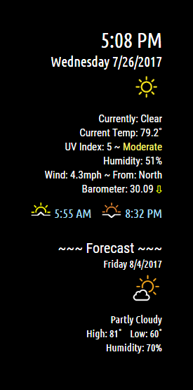
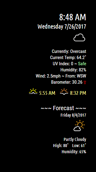
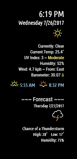
Shows current conditions…rotates through the forecast.Current conditions has UV index and Barometer… UV shows level and Barometer shows rising/falling/steady
-
Looking great! :) How does the forecast work? Do you set a day/days for the forecast? On the preview you are on “Wednesday” and the forecast is for Friday… Where is Thursday? :)
Another question, can you switch between Celsius and Farsighted?.. -
@Snille said in Input...What do you think?:
forecast is for Friday… Where is Thursday? :)
@cowboysdude said “Shows current conditions…rotates through the forecast.” above ^
Another question, can you switch between Celsius and Farsighted?..
Farsighted! That’s funny! :thumbsup:
-
-
Updated to show C :)
Hello! It looks like you're interested in this conversation, but you don't have an account yet.
Getting fed up of having to scroll through the same posts each visit? When you register for an account, you'll always come back to exactly where you were before, and choose to be notified of new replies (either via email, or push notification). You'll also be able to save bookmarks and upvote posts to show your appreciation to other community members.
With your input, this post could be even better 💗
Register Login