Read the statement by Michael Teeuw here.
MMM-forecast-io -- Localized up to the minute weather
-
@dmcinnes Testing it out. Got 2 questions…
- is it possible to activate the chart yet? (if so how)
- does the 7 day forecast work? I have showForcast: “true” in config.js but it is not displayed. Is there something else I have to set?
-
@Les the rain graph should show up when the API responds with “minutely”, when there’s minute-by-minute rain data.
Not sure why the forecast isn’t showing, it should appear by default. I’ll have to look at it later today. -
Just for reference, this is what i have in config.js
                {
                    module: 'MMM-forecast-io',
                    position: 'top_right',
                    config: {
                      showForecast: 'true',
                      // See 'Configuration options' for more information.
                      apiKey: 'keyvalue',  // Dark Sky $
                      // Only required if geolocation doesn't work:
                      latitude:   43.955907,
                      longitude: -78.906245,
                        updateInterval: 600000
                        }
                },
Note from admin: Please use Markdown on code snippets for easier reading!
-
Hi, I’m trying to use this module but it keep showing an error on the config file.
Here is the code->
{
      module: 'MMM-forecast-io',
      position: 'top_right',  // This can be any of the regions.
      config: {
        // See 'Configuration options' for more information.
        apiKey: 'my api key' // Dark Sky API key.
        // Only required if geolocation doesn't work:
        latitude:   37.1468,
        longitude: -8.5846
      }
    },
When I remove this code part the config works, so all the rest is ok.
I already have cloned the module on git to the newest version.
Can someone help me?..
Note from admin: Please use Markdown on code snippets for easier reading!
-
There is a comma missing after your apiKey
-
@Les make sure you’re on the right branch:
git checkout weather-forecast -
@yawns Thanks, it was the comma. I miss it.
-
@dmcinnes I was in the main branch. Now I got the graph and full forecast…Thanks!
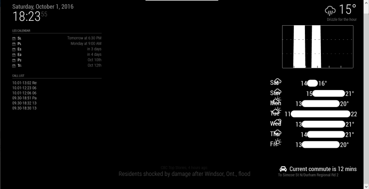
I don’t know if this is because your still working on it, or whether it’s just my setup but the days are on top of the icons. If it’s just my setup then I’m guessing adding some padding in the css file would do the trick.

-
@Les yeah still working on it :) My testing config file had the “small” class, though I’m surprised it looks so bad without it.
-
@Les thanks for the screenshot!
-
@dmcinnes No Problem. Thanks for the great module…can’t wait to see it when it’s complete. :)
-
Hi,
Can’t wait for the finished weather module ;-).
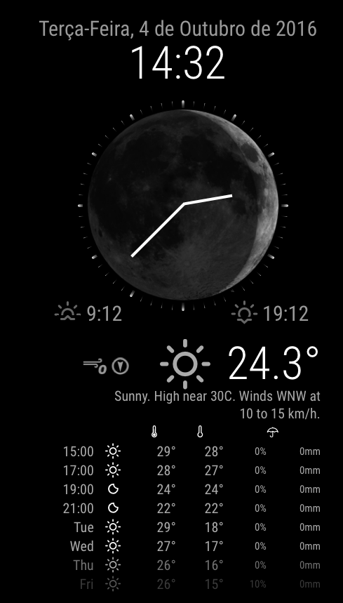
I’ve been thinking about screen optimisation and I’ve tried working on module code to make something like this “photoshopped” image, but my skills on JS are very, very limited :-(.
I think that would be a nice add-on a “fusion” of the MMM-moon-phases module (with a bigger moon image), a analog clock (with a minimalist face) and the a weather/forecast module.
What do you think?

-
@paulocarrasco said in MMM-forecast-io -- Localized up to the minute weather:
Hi,
…
I think that would be a nice add-on a “fusion” of the MMM-moon-phases module (with a bigger moon image), a analog clock (with a minimalist face) and the a weather/forecast module.What do you think?
Just my 2 cents, but the picture looks amazing. I also like that you showed a few temperatures from later in the day before giving the future day forecasts. Daily percipitation % is also a great idea. :)
However, for the purpose of screen real estate may I suggest making things switchable (on/off). So for example, date/time at the top. then moon/analog cloock. Then current weather, then forecast. So people can pick what is important to them… And this is just me, but I like having the current weather at the top So the moon/clock is distracting to me. if I could move it (I know I’m asking for a lot…but if I could move it to the bottom…would look great, and still give me info in the order of priority I need.) Anyways, just take this as once persons views :) Good luck with your module, can’t wait to see it when it’s complete! -
Looking forward to try this module too. It looks very nice
-
Interesting proposition: adding the moon phases to the clock. Adding clock faces is very easy, however integrating one module into the other (a clock into the weather module, or a partial weather query inside the clock module), now you’re working to make a third beast of a module. A possible solution might be to have the clock module listen to broadcasts from the weather module and adjust its face accordingly.
A possible working method:
configure the clock to have an analog face (with a default face)
configure the clock to listen to weather broadcasts
configure the weather module to broadcast moon phases
if/when the clock receives such notification (hopefully only once a day), it will change its face to match and timing will be of importance here when the mirror first loads up - what if the weather module broadcasts before the clock is up and running?Then there’s the question of, how detailed do you want it to be? Do you want a 28-day moon phase displayed? Or a simplified 8-stages version?
Something else to keep in mind, having an actual image will increase the payload of the module itself. Right now all of the analog faces are SVG files, which are rather small, and they can be scaled without losing resolution. You can’t easily do that with an actual picture. Either you are including very large images in case someone (like me) decides to have a screen with ONLY the clock on it, taking up the full screen, and still be able to scale it small for the “normal” folks. Personally my vote would be to use plain black and white SVG images. They’ll be small and easily scalable.
Anyway, that’s my 2 pesos.
-
@paulocarrasco That moon clock looks awesome!
Hey Everyone! I’ve just released the updated Forecast IO module with forecast and precipitation graph (I’m considering renaming it to MMM-Darksky since forecast.io is no more…)
https://github.com/dmcinnes/MMM-forecast-io
Features:
- The precipitation and forecast can be individually turned on or off.
- Configure with the “small” class for a more compact look.
- The precipitation graph only shows when there’s rain.
Screenshot:

Let me know what you think!
-
Hi everyone,
I installed the mmm-forecast but I can’t figure out why i got the same error than @paulocarrasco …
Here is my code:
{
			module: 'MMM-forecast-io',
			position: 'top_right',  // This can be any of the regions.
			config: {
					// See 'Configuration options' for more information.
					apiKey: 'my API key' // Dark Sky API key.
					 // Only required if geolocation doesn't work:
						latitude:   47.902964,
						longitude: 1.9092510000000402
					}
		};
I tried removing this part and averything else works.
Do you have any idea ?
thanks !
Note from admin: Please use Markdown on code snippets for easier reading!
-
@Claymobil said in MMM-forecast-io -- Localized up to the minute weather:
apiKey: ‘my API key’
You’re possibly missing a comma after the API key, try
apiKey: ‘my API key’, -
@ianperrin Thanks a lot !
Works perfectly fine now :-)
-
@Claymobil glad it works! Sorry about that, that missing comma is in the example config. I’ve updated it.
Hello! It looks like you're interested in this conversation, but you don't have an account yet.
Getting fed up of having to scroll through the same posts each visit? When you register for an account, you'll always come back to exactly where you were before, and choose to be notified of new replies (either via email, or push notification). You'll also be able to save bookmarks and upvote posts to show your appreciation to other community members.
With your input, this post could be even better 💗
Register Login