Read the statement by Michael Teeuw here.
Separating text from image
-
Hi,
I’m using MMM-Lunartic and it’s great. The only minor issue is that the text goes through the image of the moon, making it difficult to read. I’d like to move the text down (and maybe increase the size too) but have zero understanding of CSS editing. I’ve looked through the .CSS files in the module but cannot find any options that define text position or size.
Apologies if this is a really silly question! -
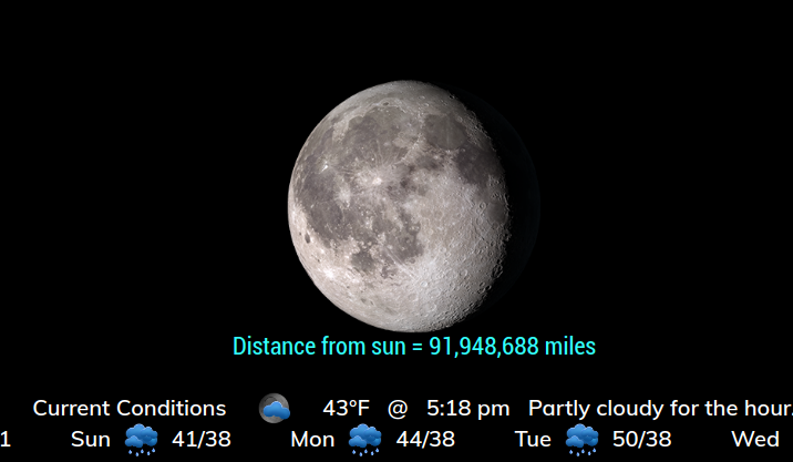
Add these to your custom.css file. Play with the values to your satisfaction. :-)
.MMM-Lunartic .xsmall.bright {
  font-size:22px;
}

.MMM-Lunartic img.photo {
/*  display: none;              uncomment if you don't want an image */
  width: 100%;                /* adjust size of moon picture */
  margin-left: 0px;          /* Precisely align moon picture with these */
  margin-right: 0px;
  margin-top: 0px;         /* -41px for current. -21px for animation or static. */
  margin-bottom: -11px;      /* -51px for current. -21px for animation or static. */
}
This pic shows the result of the above

-
@Mykle1 Thank you kind sir.
-
Forgot something. The
maxWidth: "300px",in the config entry will likely have to be increased to accommodate the larger text, unless you want the text to wrap. -
For clarity, the edits have to be in the custom.css file, not in the MMM-Lunartic.css file?
-
@ForeverBrewing said in Separating text from image:
For clarity, the edits have to be in the custom.css file, not in the MMM-Lunartic.css file?
Yes, that’s right. Look at the very first line of that post again. :laughing:
Hello! It looks like you're interested in this conversation, but you don't have an account yet.
Getting fed up of having to scroll through the same posts each visit? When you register for an account, you'll always come back to exactly where you were before, and choose to be notified of new replies (either via email, or push notification). You'll also be able to save bookmarks and upvote posts to show your appreciation to other community members.
With your input, this post could be even better 💗
Register Login