Read the statement by Michael Teeuw here.
Question for custom css
-
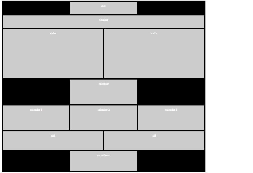
New to Magic Mirror. I had a friend help build a web page (family dashboard) prior that had a 7 day forecast, a month view of google calendar, and weather radar. After learning more about the capabilities of Magic Mirror, I wanted to add several additional modules. I am currently running a small 19" monitor rotated and mounted to the side of my kitchen cabinet. My question before heavily getting involved with MM is around the regions. I’m looking more into a heavily modified format using CSS grid or something similar. Attached image is my proposed layout. Curious if this can be accomplished? And if so, is there any specific guidance on tying in the modules to those specific grid locations?!

-
@dsmigl see the MM index.html for the designed layout… each area is a stack, 1st in config is top, next is lower, etc…
most modules are written to honor the layout -
@sdetweil Thanks Sam! knowing this can be accomplished I will proceed with learning all the ins and outs of MagicMirror. Just at first glance, the capabilities appear close to endless and the community is always there to help.
-
@dsmigl i don’t know IF it can be … looks pretty hard from the MM design perspective
-
@sdetweil understood, will get in and mess with it and see how close, if any, I can get it.
-
Anything is possible, with enough work. That’s the fun of being a developer. You are god on your machine, up to and including rewriting the operating system - the very laws of nature, if you will - to create things as you see fit.
Granted, it’s not always easy and it may not be worth the effort. But it is possible.
That said, you can probably modify the original Magic Mirror code to add new regions. You’ll need to modify the
index.htmlandmain.ccsfiles at the very least. You probably will need to modify the main script to add the new region names to the routines that load the modules.And you’ll want to fork the Magic Mirror repository and work from your fork. Otherwise, you’ll lose everything with the next upgrade.
-
@dsmigl Someone here on the forum rewrote the css part into a grid style. It is a very good idea which I have put on my todo list as well.
https://forum.magicmirror.builders/topic/10498/magic-mirror-redesign-wip-d/2?_=1588662144678Apart from that, most of what you are showing COULD be done using the current format. But I guess changing to a grid display would be easier.
-
@lavolp3 Thanks! I loaded up a new MM build today and started messing with the configs using this one as a reference and so far I am liking the results. Similar to what I was originally aiming for. Much appreciated for pointing this out!
Hello! It looks like you're interested in this conversation, but you don't have an account yet.
Getting fed up of having to scroll through the same posts each visit? When you register for an account, you'll always come back to exactly where you were before, and choose to be notified of new replies (either via email, or push notification). You'll also be able to save bookmarks and upvote posts to show your appreciation to other community members.
With your input, this post could be even better 💗
Register Login