Read the statement by Michael Teeuw here.
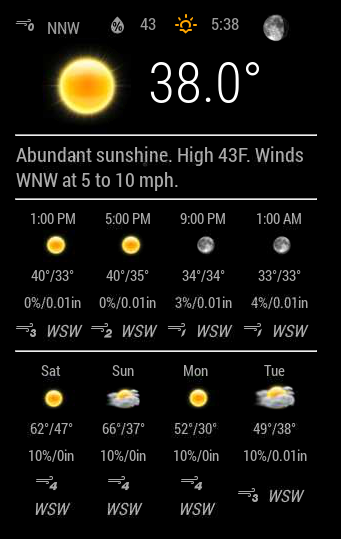
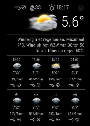
Weatherunderground - currently - hourly - daily - configurable
-
@bminer1 i think you have another issue, because the text wi-from-sw should actually be an icon
-
@bminer1 Pull the new version ;)
-
@RedNax much better! Thank you!
Just one thing, aesthetically, the little wind icons arent all uniform.
-
@bminer1 Made the fontsize smaller in css.Please try it.
You can try to tweak this is it still behaves oddly.
.MMM-WunderGround .smaller { font-size: 60%; } -
@RedNax After the latest update, the Module wouldn’t start :-(
-
@ostfilinchen Anything in the logs? Works fine here…
IT could be your chosen weatherstation is feeding ‘estimated’ forecasts. The module skips those as they vary wildly (0 to 15 degrees C)… Should clear up on it’s own in that case.
Update: There was no logging on skipping estimated forecasts. Added it just now.
-
@RedNax in dev Mode it says: uncaught TypeError: cannot read property ‘cloudy’ of undefined. MMM-WunderGround.js Line 877
-
@ostfilinchen Some obsolete coloricon code got in the way it seems. Are you not using the coloricons?
-
Thanks @RedNax I still remember the day I was trying to get this module to work [NOOOOOB LOL] and you helped me I appreciated that! Now the colors are just awesome!!!
I’m finding that myself personally colors are making my mirror stand out and I like it… I’m sure many other users do as well!
Thanks!
-
@RedNax I Use the colored Icons. After the last update it works. But i’m Not sure if it goes wrong with an other weather like cloudy…

