Read the statement by Michael Teeuw here.
MMM-Worldclock
-
MagicMirror Module to display clocks from multiple time zones
After not getting an answer on Sean’s EXCEPTIONAL worldclock module (His first) from the new maintainer, I decided to fork it and start working on it myself. As such, I present to you “MMM-Worldclock”… It’s mostly Sean’s work, with a few fixes here and there right now.
This will be fully supported, much in the spirit of Sean’s work.
This module is derived from default MagicMirror module ‘clock’ and modified. Thanks to michaelteeuw.
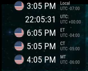
This module displays times from around the world.
Modified fork of worldclock by eouia, renamed and improved.
Installation
- Execute the following commands to install the module:
cd ~/MagicMirror/modules # navigate to module folder git clone https://github.com/BKeyport/MMM-Worldclock # clone this repository- Then, add the following into the modules section of your config/config.js file:
{
  module: 'MMM-Worldclock',
  position: 'top_left', // This can be any of the regions, best results in top_left or top_right regions
  config: {
    // See 'Configuration options' for more information.

    timeFormat: 'hh:mm A', //defined in moment.js format()
    style: 'top', //predefined 4 styles; 'top', 'left','right','bottom'
    offsetTimezone: null, // Or you can set `Europe/Berlin` to get timegap difference from this timezone. `null` will be UTC timegap.
    clocks: [
      {
        title: "Home",
      },
      {
        title: "HOLLYWOOD", // Too long title could cause ugly text align.
        timezone: "America/Los_Angeles", //When omitted, Localtime will be displayed. It might be not your purporse, I bet.
        flag: "us",
      },
      {
        timezone: "Asia/Seoul",
      },
    ]
  }
},
Of course, you should change the configuration values for your purpose.
for configuration options see github.
Updates:
2020-08-06 (BKeyport) Fixed timeFormat per clock to work properly.
2019-02-24 (Sean) offsetTimezone is added.
2017-08-25 (sean) supports MMM-TelegramBot (https://github.com/eouia/MMM-TelegramBot) command /worldclock is added
2017-08-10 (sean) Country flags are supported. HTML/CSS Structures are refined.** Note: telegram bot may not work in this version, I did not modify that code in the slightest, however, if it’s relying on the module name, it’s broken. I’ll fix it if it gets reported to me.
Thanks to Seongnoh Sean Yi’s (eouia) for his exceptional module and all the wonderful support he’s done over the years. I wouldn’t have the knowledge I have without Sean’s help.
-
Hi, congratulations for the job, I really needed such a module and I’m trying it on my MM but I have difficulty in viewing the times side by side, horizontally and not vertically. Can you tell me what can I do?
-
I’ll refer back to the original module here:
This code does work with my updated version of the module:
In your custom.css:
.worldtime {
  display:flex;
  flex-direction:row;
}

.world{
  width:200px;
}
As a reminder, only make changes to your files, not system files.
– B
-
Thank you very much
-
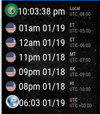
Update: As of 1/18/21 - new feature - You now may use a flag of your choice, using the altflag command.
It’s not perfect, but it’s there.
			module: "MMM-Worldclock",
			position: "top_left",
			config: {
				style: "right",
				offsetTimezone: null,
				clocks: [
					{
						title: "Local",
						timezone: "America/Los_Angeles",
						altflag: "washington.png",
						timeFormat: "hh:mm:ss a",
					},
					{
						title: "ET",
						timezone: "America/New_York",
						flag: "us",
						timeFormat: "hha MM/DD",
					},
					{
						title: "CT",
						timezone: "America/Chicago",
						flag: "us",
						timeFormat: "hha MM/DD",
					},
					{
						title: "MT",
						timezone: "America/Boise",
						flag: "us",
						timeFormat: "hha MM/DD",
					},
					{
						title: "AK",
						timezone: "America/Anchorage",
						flag: "us",
						timeFormat: "hha MM/DD",
					},
					{
						title: "HI",
						timezone: "Pacific/Honolulu",
						flag: "us",
						timeFormat: "hha MM/DD",
					},
					{
						title: "UTC",
						timezone: "UTC",
						timeFormat: "HH:mm MM/DD",
						altflag: "world.jpg"
					},
				]
			},
		},
-
Thanks for the module. I have installed it and have it working, but do have one question: How do I keep the top ‘home’ time zone from displaying? I already have the clock module running, so I don’t need a 2nd module telling me the local time… Unfortunately, when i remove the code for the home timezone, it still displays. Thanks in advance,
-
@JohnGalt Let me see your config, that’s really odd…(JUST the config for Worldclock/MMM-Worldclock, no need for the rest)
-
Here you go:
{ module: “MMM-Worldclock”,
position: “bottom_right”, // This can be any of the regions, best results in top_left or top_right regions
config: { // See ‘Configuration options’ for more information.
timeFormat: ‘hh:mm A’, //defined in moment.js format()
style: ‘top’, //predefined 4 styles; ‘top’, ‘left’,‘right’,‘bottom’
offsetTimezone: null, // Or you can setEurope/Berlinto get timegap difference from this timezone.nullwill be UTC timegap.
clocks: [
{ title: “Home”,
flag: “us” },
{
title: “Italy”,
timezone: “Europe/Rome”,
flag: “it”,
},
{
title: “Durban, So Africa”, // Too long title could cause ugly text align.
timezone: “Africa/Johannesburg”, //When omitted, Localtime will be displayed. It might be not your purporse, I bet.
flag: “za”,
},
{ title: “Aruba”,
timezone: “America/Curacao”,
flag: “aw”,
},
] // Close clocks list
} // Close Worldclock config
}, // Close module MMM-Worldclock -
Hummm - It looks like the forum stripped out leading tabs and/or spaces, but the content look OK…
-
@JohnGalt didn’t mark it as code… use
To remove the home timezone, just remove it, including the opening and closing bracket.
You don’t need to specify your local time zone. In my examples, I only use MMM-Worldclock to display the time on my mirror, so I need a local view. I pasted the code adjustment below, didn’t retab it, and I may have missed a few “adjusted” quotes, so if MM don’t like it, check the quotes.
clocks: [ { title: "Italy", timezone: "Europe/Rome", flag: "it", }, { title: "Durban, So Africa", // Too long title could cause ugly text align. timezone: "Africa/Johannesburg", //When omitted, Localtime will be displayed. It might be not your purporse, I bet. flag: "za", }, { title: "Aruba", timezone: "America/Curacao", flag: "aw", }, -
@bkeyport - Thanks! It works as you describe. I thought I had already tried removing that code to no avail, but obviously hadn’t. Thanks again!
-
NOTICE: As of the current moment, this module is not behaving well with MagicMirror 2.16. The module comes up smaller than intended.
As such, the workaround is as follows:
in custom.css
.MMM-Worldclock .main {
  font-size: 1.65rem;
}

.MMM-Worldclock .caption {
  font-size: 1rem;
}
Hopefully the font generation in MagicMirror will go back to normal in a couple of releases. Of course, you can adjust the font sizes as you please.
-
It’s a superb module but needs some CSS adjustments. Thanks for the helpful hints here in the thread.
Is it possible to update the clock only when the time has changed? The current refresh is every second, but I only use a clock with hours and minutes.
That might also lower the load on the browser and it would probably be helpful for CSS customizations via the browser developer tools.

-
@macg I doubt there’d be any performance boost, as the whole browser/javascript is constantly scanning for changes. The original code this is based on used the second for the refresh as it assumes the second would be the minimum displayed unit.
There’s really no such thing as idle anymore.
As for CSS - please, adjust it, adding to your custom.css file - and publish what you do here. Sean’s CSS is good, mine is weaker, but I’m learning and playing at the pace my job allows. Changes that I evaluate would help the core will be included.
-
@bkeyport By updating all of a second, I didn’t get to all the style classes with Chromium’s developer tools. But luckily you had already posted the essential ones.
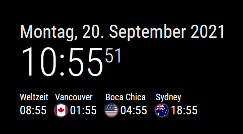
I cared about the horizontal layout and yours has been tweaked a bit. The first clock with UTC time didn’t get a flag or globe, so it didn’t need to be as wide as the others. The text color and size were adjusted with MM variables. The size is 6px smaller than my standard (24px). The time difference to UTC time was hidden. With “display: none” I had no success, therefore my way over the transparent text.
At the config.js is:
style: ‘top’,
offsetTimezone: null,And here al my lines for the custom.css:
/* Arrange clocks horizontally */
.MMM-Worldclock .worldtime {
      display: flex;
      flex-direction: row;
}
.MMM-Worldclock .world{
      width: 100px;
}
.MMM-Worldclock .world-0{  /* 1st clock = UTC clock */
      width: 70px;
}

/* Time title font color and size */
.MMM-Worldclock .zone {
      font-size: calc(var(--font-size) - 6px);
      color: var(--color-text-bright);
}

/* Hide time difference to UTC */
.MMM-Worldclock .gap {
      font-size: 1px;
      color: transparent;
The screenshot of this is in my previous post.
For the time zones, I looked here to see which ones are accepted. At first, I thought that America/Texas or America/Houston would be possible. But this is not the case.
-
@macg America/Texas, Houston is really America/Chicago
-
@macg They went for the biggest city in the timezone. I’m annoyed by that too. Los Angeles shouldn’t represent all of Pacific Time, damnit.
-
@macg can you share how you got them to be horizonal?
-
@solelo With the first eight lines of the posted snippet of my custom.css, you get the horizontal representation. Copy them into your custom.css and adjust the pixel width.
@BKeyport Pick Vancouver or the time zone itself (PST8PDT). :winking_face: That’s why I found the list of possibilities so helpful.
@sdetweil Yes, I had chosen the Windy City then, too.
-
@macg Thanks! I added it to my custom.css but it didn’t change. Is there anything else I should be checking?
Hello! It looks like you're interested in this conversation, but you don't have an account yet.
Getting fed up of having to scroll through the same posts each visit? When you register for an account, you'll always come back to exactly where you were before, and choose to be notified of new replies (either via email, or push notification). You'll also be able to save bookmarks and upvote posts to show your appreciation to other community members.
With your input, this post could be even better 💗
Register Login