Read the statement by Michael Teeuw here.
Throwing down the gauntlet
-
@jbeck615 you shouldn make the changes in the module itself all config changes should go in the config file
-
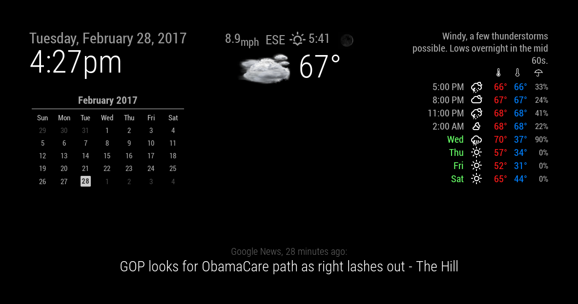
@strawberry-3.141 to be honest i dont know if i pasted enough as it kept cutting me off due to character count but just let me know. no rush. also the picture here, the current weather at the center, is what ideally id love to have at top right. however when i change the position, the top info above the current weather and those icons pop up. thanks regardless for taking a look!
-
.region.top.right .MMM-WunderGround table.small td:nth-child(6) { display:none; } .MMM-WunderGround .weathericon { font-size: 45%; line-height: 5px; display: inline-block; -ms-transform: translate(0, -3px); /* IE 9 */ -webkit-transform: translate(0, -3px); /* Safari */ transform: translate(0, -3px); } .MMM-WunderGround .day { padding-left: 0; # padding-right: 10px; } .MMM-WunderGround .vcen { vertical-align: top; } .MMM-WunderGround .weather-icon { padding-left: 0px; text-align: center; width:50px; } .MMM-WunderGround .max-temp { padding-left: 0px; padding-right: 0; } .MMM-WunderGround .min-temp { # padding-left: 10px; # padding-right: 0; } .MMM-WunderGround .forecastText { # padding-left: 10px; # padding-right: 0; # word-wrap: break-word; # text-align: right; # rowspan: 0; } .MMM-WunderGround .tableheader { font-size: 75%; text-align: center; } .MMM-WunderGround .hour { font-size: 75%; text-align: center; } .MMM-WunderGround .pop { font-size: 86%; } .MMM-WunderGround .mm { font-size: 75%; } .MMM-WunderGround .green { color: #83FFB3; } .MMM-WunderGround .yellow { color: yellow; } .MMM-WunderGround .red { color: #FF4C4C; } .MMM-WunderGround .center { text-align: center; padding-right: 10px; } .MMM-WunderGround .left { text-align: left; } .MMM-WunderGround .lpad { padding-left: 10px; } .MMM-WunderGround .currentWeatherIcon { font-size: 75%; line-height: 45px; display: inline-block; -ms-transform: translate(0, -3px); /* IE 9 */ -webkit-transform: translate(0, -3px); /* Safari */ transform: translate(0, -3px); width: 40%; height: 40%; } .MMM-WunderGround .forecastWeatherIcon { font-size: 75%; line-height: 65px; display: inline-block; -ms-transform: translate(0, -3px); /* IE 9 */ -webkit-transform: translate(0, -3px); /* Safari */ transform: translate(0, -3px); width: 50%; } .MMM-WunderGround .moonPhaseIcon { height: 34px; vertical-align: middle; } .MMM-WunderGround .hrDivider { font-size: 10px; } .MMM-WunderGround .sub { vertical-align: sub; font-size: smaller; } .MMM-WunderGround .smaller { font-size: 60%; } .MMM-WunderGround .max-temp { color: #FF1A1A; } .MMM-WunderGround .min-temp { color: #0080ff; } .MMM-WunderGround .day { color: #6f6; } .region.top.center .MMM-WunderGround table.small { display:none; } .region.top.right .MMM-WunderGround table:not(.small) { display:none; } .region.top.right .MMM-WunderGround table.small td:nth-child(6) { display:none; } -
@Mykle1 ive never touched any of the monthly calendar files until i added your lines above to the end of my mcal.css file and was curious if you had any thoughts as to why your numbers are aligned to the left (when facing monitor) of the abbreviated days and mine are aligned to the right? just curious
-
@strawberry-3.141 the main config file and never touch the config files of each modules folder?
-
@jbeck615 said in Throwing down the gauntlet:
ive never touched any of the monthly calendar files until i added your lines above to the end of my mcal.css file
Those should have been added to your custom.css file within your css folder
and was curious if you had any thoughts as to why your numbers are aligned to the left (when facing monitor) of the abbreviated days and mine are aligned to the right?
Are you talking about WunderGround still? If so, then mine are aligned to the right as well.
-
@jbeck615 said in Throwing down the gauntlet:
the main config file and never touch the config files of each modules folder?
There are no
configfiles in each module folder. Anything inside the actual module folder is part of the module and should not be altered. You set up each modules configuration in the config.js file inside your config folder. After that, any customizing of each module should be done in the custom.css file in your css folder.This is the WunderGround entry in my config.js file. The setup of the module.
{
    			module: 'MMM-WunderGround', // Just for current weather
    			position: 'top_center',
    			config: {
        		apikey: 'YOUR API KEY', // private; don't share!
        		pws: 'pws:KNYNEWYO103', // Richmondtown Weather Station - Very Cool
			currentweather: 1,
        		coloricon: true,
			animationSpeed: 5000,
    			roundTmpDecs: 0,
    			UseCardinals: 1,
			windunits: "mph", // bft or mph
			}
		},
		{
    			module: 'MMM-WunderGround', // Just for forecast
    			position: 'top_right',
    			config: {
        		apikey: 'YOUR API KEY AGAIN', // private; don't share!
        		pws: 'pws:KNYNEWYO103', // Richmondtown Weather Station - Very Cool
			currentweather: 0,
        		coloricon: true,
        		hourly: '1',
        		fctext: '1',
        		fcdaycount: "10",
        		fcdaystart: "1",
        		hourlyinterval: "2",
        		hourlycount: "1",
			animationSpeed: 5000,
        		alerttime: 10000,
        		alerttruncatestring: "english:",
    			roundTmpDecs: 0,
    			UseCardinals: 1,
    			layout: "vertical",
			windunits: "mph",
    			sysstat: "0"
			}
		},
And this is the WunderGround entry in my custom.css file. To customize things like color, icons, position, size, etc…
}

.region.top.right .MMM-WunderGround table th {
  display: none; /* removes icons above max-temp, min-temp and % chance of rain */
}

.MMM-WunderGround .max-temp {
  color: #f66;
}

.MMM-WunderGround .min-temp {
  color: #0ff;
}

.MMM-WunderGround .weather-icon {
  color: #f93;
}

.MMM-WunderGround .day {
  color: #6f6;
}

.region.top.center .MMM-WunderGround table.small,   /* selector for ONLY current weather Thanks to Strawberry-3.141 */
.region.top.right .MMM-WunderGround table:not(.small),   /* selector for ONLY weather forecast */
.region.top.right .MMM-WunderGround table.small td:nth-child(6)  {
  display: none;    /* this line and line above selector for NO rain amount column */
}
I hope this clears things up for you
-
@Mykle1 sorry i meant to say the js files not the config. i swear im not as dumb as im sounding here! however your clarification did make sense so thank you!
-
@Mykle1 but just to make sure, changes only go in the config.js file in the config folder, dont touch the js files in each of hte modules, and if needed, modify the css files in each module correct? ive just been a bull in a china shop even if most of it is working well. thanks!
-
@jbeck615 said in Throwing down the gauntlet:
changes only go in the config.js file in the config folder
Each module has a ReadMe that describes the config.js
options. You’re not really changing the config.js file. You’re choosing options that the author has provided, dont touch the js files in each of hte modules
Correct. Those are part of the module itself
, and if needed, modify the css files in each module correct?
You modify the custom.css file FOR each module, not IN the module folder
-
@Mykle1 yep on the same page now! ill stop messing with the js files in each modules folder. thanks
-
@jbeck615 said in Throwing down the gauntlet:
yep on the same page now! ill stop messing with the js files in each modules folder. thanks
You’re welcome. I did it too, at first
-
@jbeck615 The custom.css file is in the css directory in /pi/MagicMirror not within each module directory.
-
@jproehl yep i am aligned after getting that clarification earlier. HUGE thanks
-
@Mykle1 quick question, at the bottom of the css coding above, what does “selector” mean? thanks again!
-
@jbeck615 it’s kind of a query to which elements you want a css rule to be applied
-
Almost accomplished this look today. Got some duplicate weather showing up I’m sure I can fix. The main problem I’m having is: No Realistic icons for weather at all. :(
-
@cyberphox said in Throwing down the gauntlet:
Almost accomplished this look today. Got some duplicate weather showing up I’m sure I can fix. The main problem I’m having is: No Realistic icons for weather at all.
Are you using WunderGround weather? If so, make sure you have
coloricon: true,in your config. Like this.module: 'MMM-WunderGround', // Just for current weather position: 'top_center', config: { apikey: 'YOUR API KEY', // private; don't share! pws: 'pws:KNYNEWYO103', // Richmondtown Weather Station - Very Cool currentweather: 1, coloricon: true, animationSpeed: 5000, roundTmpDecs: 0, UseCardinals: 1, windunits: "mph", // bft or mph -
@Mykle1 Definitely using WunderGround…got the colors changed and have coloricon: true…gonna go double check it again! lol
-
@Mykle1 ok so turns out all this time I was using an older WunderGround module. Once I did a git pull and updated - bam - there were the realistic icons!
Now I have to play with widths! how did you manage to fit your calendar, date/weather, and weather forecast all along the top! LOL
Hello! It looks like you're interested in this conversation, but you don't have an account yet.
Getting fed up of having to scroll through the same posts each visit? When you register for an account, you'll always come back to exactly where you were before, and choose to be notified of new replies (either via email, or push notification). You'll also be able to save bookmarks and upvote posts to show your appreciation to other community members.
With your input, this post could be even better 💗
Register Login