Read the statement by Michael Teeuw here.
Throwing down the gauntlet
-
@jproehl curious if you ever solved #2? i got the same issue with the icons showing up under the current
-
@jbeck615 Hi: That problem went away when I fixed a missing close bracket “}” in the custom.css. So, if you are getting the extra icon line in your current conditions display for the same reason I was, check to make sure that all of the entries in custom.css are of the form:
.“modulename” .“className” {
“parameter”: “value”;
}A concrete example of this is:
.clock .time {
color: #99F;
}One of my entries was missing that very last bracket. When I fixed that, the icon line went away and all the subsequent parameters that I was trying to change in the custom.css file also got changed.
I suspect that when that syntax error showed up the rest of the custom.css file was not processed and the parameter on which I left off the bracket and all the subsequent ones were never included.
Hope this helps! Good luck.
-
@jproehl thank you. ill do some deeper vetting. thanks!
-
@jbeck615 if you post your css here we can help to spot the issue
-
This post is deleted! -
@strawberry-3.141 oh my thank you SO much for offering. i hate asking for help but let me tinker with it for a couple of days and if no luck i will take you up on the offer. LOVE this community. thank you again for even offering!
-
I thought you might like to know that I had some success with the custom.css file without asking for your help. I did do some looking around in the module .js file and the Developers Tools. I was careful not to change anything. I was looking for clues on what changes specific parts of a module. (e.g. table, text, align, padding, margin, etc…)
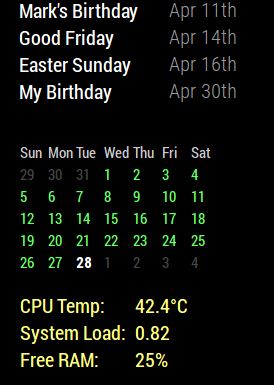
I wanted to be able to move the calendar_monthly module to the left margin. I also wanted to constrain the module to a specific width so that it wouldn’t expand when another module stretches the region they both occupy. And just for good measure, I threw in some color. So, using the the css information that you’ve already given me for other modules, and the information I got from looking in the module.js file and Developers Tools, I did this.

With this
}

.calendar_monthly table {
  width: initial;
  float: left;
}

.calendar_monthly td {
  text-align: left !important;
}

.calendar_monthly calendar-table {
  text-align: left !important;
}

.calendar_monthly {
  width: 200px;
  color: #6f6;
}
“I’m smart! I can do things!” (Fredo Corleone - The Godfather II)
-
This post is deleted! -
@strawberry-3.141 So I can definitely post the css coding but my pi takes some time to start up some days it seems… anyway what I was ultimately trying to do was, using wunderground, get rid of the last column as you and Mykle1 showed above and get the icon for current to look realistic/color but keep the forecast icons as generic icons. so the way i attempted this was incorporate all of the edits you all provided above. then i repeated wunderground twice in the modules, one to show current and the color icon (realistic icon) and a second time just to show forecast but with generic icons. however when i stack them both in top right thats where i get the unwanted icons. if i put current wunderground in the top center then they go away. thoughts? i can provide css if needed for sure. thanks for even looking!  image url)
 -
@Mykle1 thanks for sharing! the width of the monthly calendar was bothering me and i was going to research later anyway!
