Read the statement by Michael Teeuw here.
MMM-forecast-io -- Localized up to the minute weather
-
@Mykle1 @strawberry-3-141 @yawns
now im having an issue where it wont sit in the corner if that makes sense?it keeps a buffer only on the MMM-forecast-io all others are right agains the edge i installed
body {
  margin: 0px;
  height: 100%;
  width: 100%;
and that moved everything else to the edge but forcast-io stayed it even keeps a buffer when i relocate it to the other side of the screen…

sorry bout the phrase it was the first thing i figured out how to edit and since i’m making this for the wife well… figured i’d have fun with it :)
-
@Littlejohn21 said in MMM-forecast-io -- Localized up to the minute weather:
sorry bout the phrase
LMFAO! That is PERFECT!
Ok, so, in honor of your wife’s #@#'s, you can try this entry in your custom.css file. I assume you want to move the module to the right and up, so you only need
margin-right: -40px;andmargin-top: -40px;. Adjust those numbers accordingly until you get the result you want..MMM-MODULENAME { margin-left: 0px; margin-right: -40px; margin-top: -40px; margin-bottom: 0px; } -
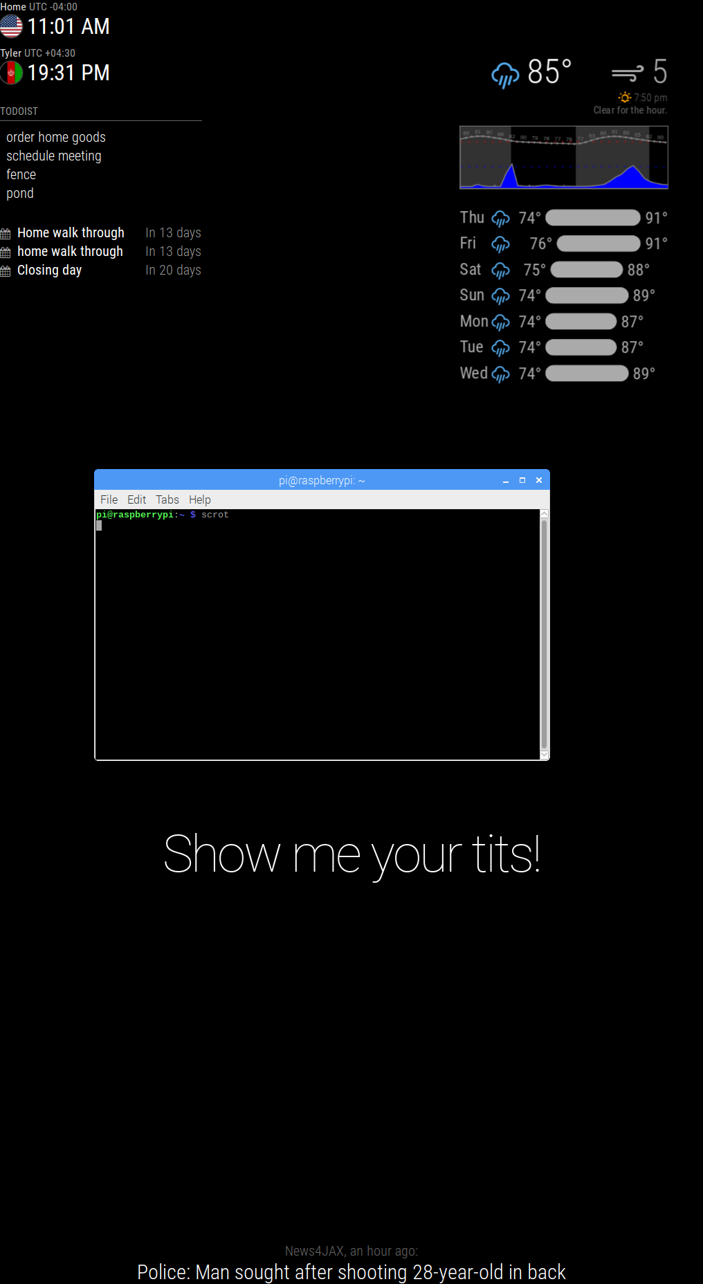
Hey quick question: how do I change the color of the precipitation graph? I’ve got a decent amount of custom CSS that’s working (including other things for this module) but for the life of me I cannot seem to change this one element?
Here’s what I’ve got going on for this module right now (more icon colors elsewhere, I gotta clean up the file!):.MMM-forecast-io .summary {color: #aaa;} .MMM-forecast-io .forecast-row .weathericon {color: #aaa} .MMM-forecast-io .wi-night-alt-cloudy {color: #1a659e} .MMM-forecast-io .wi-volcano {color: #8c2f39} .MMM-forecast-io .precipitation-graph {color: #1a659e;} .small.MMM-forecast-io .forecast { margin-right: 0px; margin-left: auto; } .small.MMM-forecast-io .summary { text-align: right; }I’m absolutely positive I’m missing something dumb here
-
@pyrosmiley Hello! The precipitation graph is created using an HTML Canvas so unfortunately the colors cannot be tweaked by CSS apart from the border. The Javascript will need to be modified to support additional colors. Here is where the color is set for the curve and further up it draws the horizontal lines and tick marks. Ideally these colors are configurable. I’ve added an issue to the repo to track it!
I’m knee deep in another project, so if someone wants to take a crack at it, please be my guest :)
-
@dmcinnes Oh, okay — that makes a lot of sense! Glad to know it’s not just me missing something. I’ll take a look at the html and see what I can do, thanks for pointing that out for me.
-
@jinjirosan Hi, have you made the changes available to download? Would like to give it a go as currently using a combination of the default weather and forecast-io.
-
Hello! as i am completely new to this MM…i am unable to where the icons images are placed…if anybody knows that,guide me , so that i want to change the UI for mine…
-
@mongo116 The changes were merged into the main branch of the module, so if you’re up to date, then you should be able to add ‘’’precipitationFillColor’’’ to your config. I added a description and some other info to the readme as well.
-
@Basanth_Kumar I’m on my phone so I can’t look up links very effectively, but there are a couple of guides on the forums that are good for learning how to setup your configuration file. The official guide on the github page is also pretty thorough. It definitely took some trial and error for me to get up and running (gotta pay attention to those commas!) but you’ll get it. Just follow those guides, and just change one little thing at a time so you can learn to see how it works — you’ll get the hang of it!
-
@pyrosmiley Thanks for that. What about the wind, and sunrise / sunset settings? Or were these never merged? Thanks…
