Read the statement by Michael Teeuw here.
MMM-Scrobbler CSS
-
I am developing a family wall board with a number of modules but the one I am struggling with at the moment is the excellent MMM-Scrobbler by @PtrBld . I have seen some examples where people have got the art work to align to the side of the meta data for album, track and artist. I have tried playing around with the custom css and can make the art work bigger and smaller as well as making the space for the text bigger and smaller but I am struggling on how to make the art work align fully to the left and right of the text.
Any ideas or suggestions??
Cheers
-
Hi spwood100,
could you post a screenshot? I do not fully understand what you want to accomplish.
-
That would help wouldnt it :-)
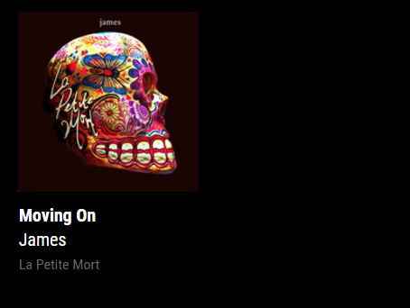
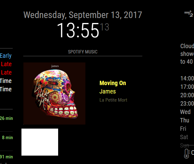
How it currently displays:

How it would be useful to have the option to diplay

I have seen other examples where this has been achieved but not sure how its done. If its possible to have different display options in the app settings that would be awesome !
Thanks for your help
-
Ok, now it is clear.
I just updated the module and you should now be able to use the key “alignment” in your config.{ module: 'MMM-Scrobbler', position: 'top_right', config: { username: 'Last.fm username', apikey: 'Last.fm api key', //time interval to search for new song (every 15 seconds) updateInterval: 15 * 1000, //how often should we try to retrieve a song if not listening delayCount: 5, //time interval to search for new song if the 5 times not listening is received. //set this to the same number as updateInterval to ignore this option delayInterval: 120*1000, animationSpeed: 1000, showAlbumArt: true, showMetaData: true, //Determines the position of the meta text. Possible values: top, bottom, left, right alignment: "bottom", } }This is not tested since I do not have a mirror atm but it should work ;)
-
You are an absolute legend, let me pull the latest version and I will test and let you know
-
if you want the meta text centered you need to add
.right > .meta {
    /* margin-left: 16px; */
    margin: auto 16px;
}
to your css.
-
Works like a dream with just a few “nuances” such as if you have it on the right side of the screen with the meta data to the right of the image, the meta data disappears off the screen and I suspect the same with the left. Otherwise its really good … thanks so mch!!!
-
@PtrBld said in MMM-Scrobbler CSS:
if you want the meta text centered you need to add
.right > .meta {
/* margin-left: 16px; */
margin: auto 16px;
}to your css.
It’s a good idea to add the module’s name to this rule so that it does not accidentally affect another module that coincidentally happens to use the same class names. Something like this:
.module.MMM-Scrobbler .right > .meta { /* margin-left: 16px; */ margin: auto 16px; } -
Thanks @PtrBld for you lightning quick turn around of this one and to @j-e-f-f for the extra advice, much appreciated
-
@spwood100 how did you get the “Spotify Music” header at the top of it?
-
@solelo said in MMM-Scrobbler CSS:
@spwood100 how did you get the “Spotify Music” header at the top of it?
Please try this:
{ module: 'MMM-Scrobbler', header: 'Spotify Music', // <<<<<< position: 'top_right', config: { username: 'Last.fm username', apikey: 'Last.fm api key', //time interval to search for new song (every 15 seconds) updateInterval: 15 * 1000, //how often should we try to retrieve a song if not listening delayCount: 5, //time interval to search for new song if the 5 times not listening is received. //set this to the same number as updateInterval to ignore this option delayInterval: 120*1000, animationSpeed: 1000, showAlbumArt: true, showMetaData: true, //Determines the position of the meta text. Possible values: top, bottom, left, right alignment: "bottom", } } -
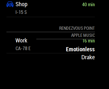
@yawns that worked perfect. Now it’s blocking the bottom MyCommute module, any ideas how to get that fixed?

Screen Shot 2018-07-04 at 12.18.22 PM 🌚 -
@SoleLo , add the following into the module config
header:
So for example
module: ‘MMM-Scrobbler’,
position: 'top_right',
header: 'insert your text here'
  config: {
Should work, let me know if it doesnt
-
@spwood100 I got it to work but it shows up over the MyCommute module…
-
@SoleLo , that would be something to do with the relative sizes of the modules. You would probably need to play about with some custom css to get these to not overlap, something I am still struggling with on my screen from time to time.
Some excellent posts in the forum on css though:
You could also post in the CSS help section?
https://forum.magicmirror.builders/category/31/development
Cheers
-
@spwood100 thanks I actually just did some trial and error and figured it out, It was much simpler than I thought.
Hello! It looks like you're interested in this conversation, but you don't have an account yet.
Getting fed up of having to scroll through the same posts each visit? When you register for an account, you'll always come back to exactly where you were before, and choose to be notified of new replies (either via email, or push notification). You'll also be able to save bookmarks and upvote posts to show your appreciation to other community members.
With your input, this post could be even better 💗
Register Login