Read the statement by Michael Teeuw here.
MMM-DarkSkyForecast - Yet ANOTHER weather module
-
@j-e-f-f Thanks for the info. I will give it a go. Thanks for creating an awesome module.
-
and how can I doit this for german?
and when you say “…Set units: “us” in your config.”
where comes this in the config?
please take a look at my sample config{ module: "MMM-DarkSkyForecast", header: "Weather", position: "top_right", classes: "default everyone", disabled: false, config: { apikey: "SUPER SECRET!!!", latitude: "51.506130", longitude: "-0.090270", iconset: "4c", concise: false, forecastLayout: "table", units: "auto", < - - #### is this so right for german? language: "de" < - - #### is this so right for german? } }, -
@robiv8 said in MMM-DarkSkyForecast - Yet ANOTHER weather module:
and how can I doit this for german?
and when you say “…Set units: “us” in your config.”
where comes this in the config?
please take a look at my sample config{ module: "MMM-DarkSkyForecast", header: "Weather", position: "top_right", classes: "default everyone", disabled: false, config: { apikey: "SUPER SECRET!!!", latitude: "51.506130", longitude: "-0.090270", iconset: "4c", concise: false, forecastLayout: "table", units: "auto", < - - #### is this so right for german? language: "de" < - - #### is this so right for german? } },My module doesn’t support the
autoparameter for units, even though it’s valid for calling Dark Sky’s API directly. My thinking was that it’s ambiguous as to what you might get, and everyone will know exactly which units of measure they want. So you need to specify one of the four explicit options forunits:si: metric units. (temp in Celcius, wind measured in m/s)
ca: same assibut wind measured in km/h
uk2: same assi, but wind measured in mph
us: imperial units. (temp in Farhenheit, wind in mph)If you specify anything else or omit the
unitsconfig, the module defaults toca. (Oh Canada!)As for the language config, this is independent of units. This will determine editorial content that the API returns such as the weather summary, and eventually when I get around to adding it, weather alerts. If you leave it blank, it will use the language config for MagicMirror, so if you’ve already got MM configured for German, then you don’t need to set the language parameter to get this content in German. The parameter is there in case for some reason you want a language other than what you have MM configured for, or maybe MM doesn’t support your preferred language, but Dark Sky does, for example
x-pig-latinfor Pig Latin. (Seriously… try it!) -
When I installed this module it did not import current region settings etc based on pi software install as I had to change them all in the config. I just thought I was an idiot and did something wrong when installing module and didn’t want to look like a fool posting an issue. HA!
-
Thanks for the explanation.
Without extra entries in the config, the weather and the text is in German.
But the time on US like 7pm 1pm and so on …
How can I change that and where? -
@nobita said in MMM-DarkSkyForecast - Yet ANOTHER weather module:
from your info " …this module requires MagicMirror version 2.2.0 or later…"
so How can I know my version of Magic Mirror?
Thanks so muchTwo ways you can tell… When you start MM with
npm startyou’ll see the version number of MagicMirror. Otherwise, just try running the module. If you get weird gibberish on the screen that looks like default non-specific module content then you need to upgrade. Otherwise, if you see weather content, then you’re fine.If you’ve installed Magic Mirror somewhat recently, then likely your version is adequate.
-
@robiv8 said in MMM-DarkSkyForecast - Yet ANOTHER weather module:
But the time on US like 7pm 1pm and so on …
How can I change that and where?In the README file there are a few config options you’ll be interested in:
label_maximum
label_high
label_low
label_timeFormat
label_days
label_ordinals
These can be used to customize text to your exact liking.
Read about all of the config parameters here:
https://github.com/jclarke0000/MMM-DarkSkyForecast/blob/master/README.md -
@j-e-f-f
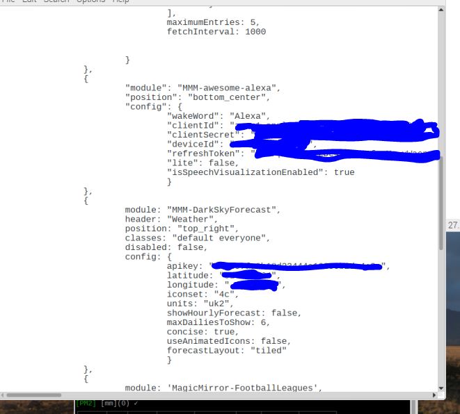
 it still does it even though alexa is in bottom center, here is my config file.
 -
Thanks for the tip. Now it working in German.
-
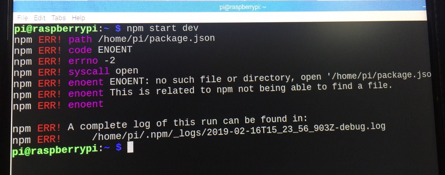
@lavolp3 ,after install DarkSkyForecast only “Loading…” display and use " npm start dev"
Error happen like this

someone help me please,how to solve it -
You have to cd into the MagicMirror directory first, then run
npm start devpop@HPEu:~$ cd MagicMirror/ pop@HPEu:~/MagicMirror$ npm start dev -
You must be in your MagicMirror folder!
and then type: npm start dev
Oh! Sorry @Mykle1
Did not see that you have already answered. -
No worries. I like your answer so much that I’m upvoting it! :thumbsup:
-
This post is deleted! -
@mykle1 Thank so much,Beacuse I’m Beginner and my mistake
-
You’re welcome. We all make mistakes. We were all beginners. Can’t we all just get along? :-)
Peace!
-
@mykle1 Ask again after install MMM-DarkSkyForecast nothing happen only Loading
How can I first step to find error?
Thanks for everyone to help me again -
Post your config entry for that module using a code block so others can have a look at it for you
-
Hello,
it is pssible to add the sunrise and sunset in the DarkSky-Modul.
I need a huge of help, becuase i have no idea to insert the sunrise and sunset.
Any ideas or a little tutorial for me?
Thanks @all.
-
@hansolo MMM-forecast-io has sunset and sunrise time integrated and both take data from the same source.

So yes, it’s possible. The data is there. But I’m out. I’m unfortunately currently sitting on other projects.
Hello! It looks like you're interested in this conversation, but you don't have an account yet.
Getting fed up of having to scroll through the same posts each visit? When you register for an account, you'll always come back to exactly where you were before, and choose to be notified of new replies (either via email, or push notification). You'll also be able to save bookmarks and upvote posts to show your appreciation to other community members.
With your input, this post could be even better 💗
Register Login
