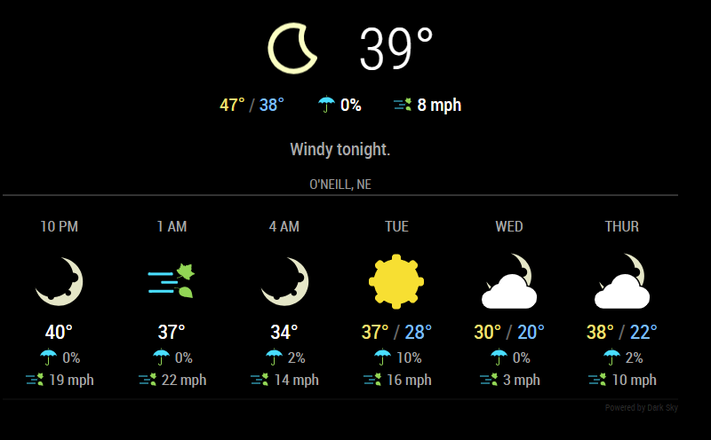
Read the statement by Michael Teeuw here.
MMM-DarkSkyForecast - Yet ANOTHER weather module
-
@j-e-f-f & @lavolp3
I figured out the issue…idiot error (me). I typed the config option as “apiKey” instead of “apikey” and it wouldn’t read it as registered. So sorry for taking your time. Works now.

-
@djsunrise19 said in MMM-DarkSkyForecast - Yet ANOTHER weather module:
Looks very nice. Is there a way to get the “feels like” temperature, too? I can’t find anything about it.
I’m planning to add it. This is something I’d like as well.
-
@johans said in MMM-DarkSkyForecast - Yet ANOTHER weather module:
@j-e-f-f
No, It doesn’t come back.
I made a new installation on fresh SD card.
All works fine without installing your module, after that it’s not working anymore.Can you try something? Completely remove MMM-DarkSkyForecast (i.e.delete the directory with
rmdir -rf MMM-DarkSkyForecast), and comment out the entry in the config. Restart MM. Does your player come back now? If so, try this:Reinstall my module using
git clone ...but DON’T runnpm installin theMMM-DarkSkyForecastdirectory. All of the dependencies are currently included with Magic Mirror, so it should work as-is.Put the DarkSky entry back in your config and restart MM. If everything works then the issue is that my module is installing a different version of one of the dependencies than what is included in MM, and likely is causing the incompatibility with the MMM-Widget module.
-
@j-e-f-f Thank you for this nice weather module :)
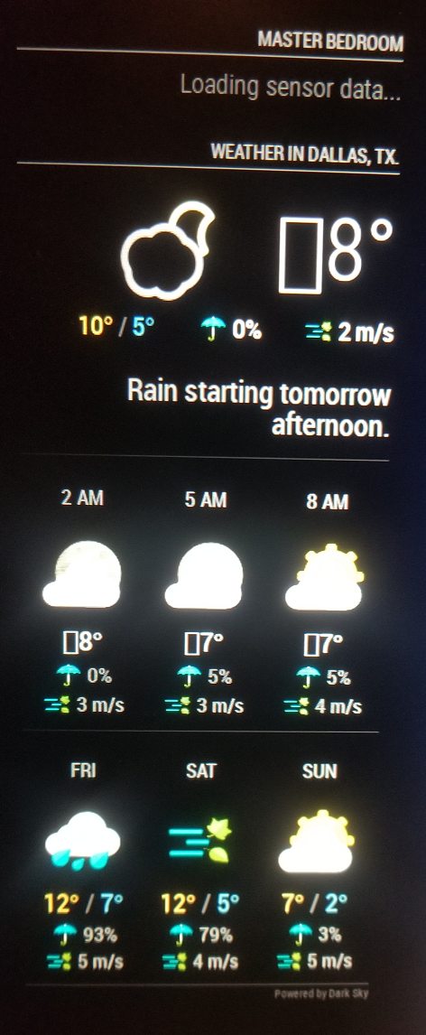
I do have a strange occurrence happening however… no matter if i useca, us, sifor units in front of every high temperature number i get a square… the temperature is displayed along with that square … what is that??Oh another thing …how can i make the background of your module non transparent/black or semi transparent?? I am trying to use the @Sean MMM-WeatherBackground and the majority of pictures are too bright to read this module.

-
This post is deleted! -
Any ideas at what those squares are in front of my temperature numbers everybody ?? ;)
-
@richland007 said in MMM-DarkSkyForecast - Yet ANOTHER weather module:
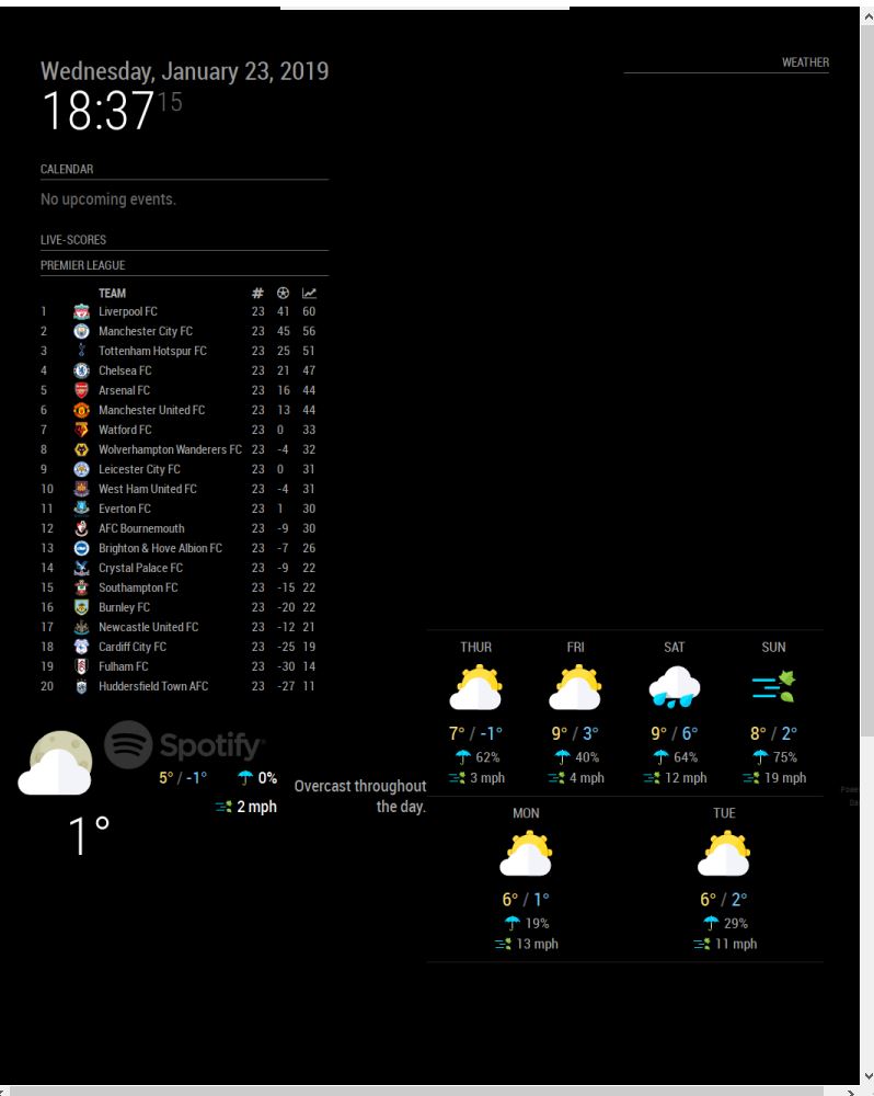
how can i make the background of your module non transparent/black or semi transparent??
Try this in your
custom.cssfile:.MMM-DarkSkyForecast .module-content { background-color: rgba(0,0,0,0.5); }The first three parameters
0,0,0are the color (in this case black), and the last parameter0.5is the level of transparency. Adjust accordingly to suit your needs. -
@richland007 said in MMM-DarkSkyForecast - Yet ANOTHER weather module:
Any ideas at what those squares are in front of my temperature numbers everybody ?? ;)
No idea why this is happening, but it generally means that the browser is trying to render a character that is outside of the character set.
Can you PM me with your config? I wonder if the data is providing those characters.
-
@j-e-f-f Thank you for your reply.
Do you want my entire MM config.js file or just the MMM-DarkSkyForecast part of it??
D -
EDIT: SORRY, nevermind… small mistake in my latitude gave wrong values…
-
@j-e-f-f any way I can see the wind direction too?
-
@cr4z33 it is shown if you include
concise: falseinto the config.
That’s the way to show more info.
If you want to ONLY show the wind direction you would have to manipulate the .js file manually in line 429windSpeed: Math.round(speed) + " " + this.getUnit("windSpeed") + (!this.config.concise ? " " + this.getOrdinal(bearing) : ""),into
windSpeed: Math.round(speed) + " " + this.getUnit("windSpeed") + " " + this.getOrdinal(bearing),In my case this unfortunately messes up the layout a bit. But it seems to work.
-
@lavolp3 said in MMM-DarkSkyForecast - Yet ANOTHER weather module:
@cr4z33 it is shown if you include
concise: falseinto the config.
That’s the way to show more info.That’s already perfect thanks! :thumbs_up_medium-light_skin_tone:
-
@richland007 said in MMM-DarkSkyForecast - Yet ANOTHER weather module:
@j-e-f-f Thank you for your reply.
Do you want my entire MM config.js file or just the MMM-DarkSkyForecast part of it??
DJust the dark sky portion.
-
Hey i have your module working but when i also add the MMM-Awsome-alexa module it moves to this location even though ive set it to display in the top_right. It goes into the right location when mmm-awesome-alexa is removed. Any ideas ?

-
@lavolp3 said in MMM-DarkSkyForecast - Yet ANOTHER weather module:
If you want to ONLY show the wind direction you would have to manipulate the .js file manually in line 429
Or you can write rules to hide things in your
custom.cssfile. That way your change doesn’t get overwritten by a module update. I’ve wrapped everything in a css class, so you can pick and choose what is displayed. Start MM in dev mode and you can use the inspector to figure out the class names, or examineMMM-DarkSkyForecast.njkto see the HTML layout and the classes applied.For example, let’s say you wanted the wind direction, but not the max wind speed. First set
concise: falsein the module’s config. Then hide the max speed as follows:MMM-DarkSkyForecast .wrapper.tiled .forecast-container .forecast-item .wind-gusts { display: none; }Make sure to take a look at
.MMM-DarkSkyForecast.cssto see hoe specific the existing rule is. Yours needs to be at least as specific if you want it to override the default. For example, this would not have worked:MMM-DarkSkyForecast .wind-gusts { display: none; }since the existing rule is more specific:
MMM-DarkSkyForecast .wrapper.tiled .forecast-container .forecast-item .wind-gusts { display: block; } -
@jackoliver361 said in MMM-DarkSkyForecast - Yet ANOTHER weather module:
Hey i have your module working but when i also add the MMM-Awsome-alexa module it moves to this location even though ive set it to display in the top_right. It goes into the right location when mmm-awesome-alexa is removed. Any ideas ?
This is strange behaviour… Does this happen regardless of where you specify awesome-alexa to be? For example if you specify that it should be
bottom_centerdoes it still mess up Dark Sky? -
Sorry for this noob question but is it possible to change the temperature display from celsius to farenheit?
-
from your info " …this module requires MagicMirror version 2.2.0 or later…"
so How can I know my version of Magic Mirror?
Thanks so much -
@btorres79 said in MMM-DarkSkyForecast - Yet ANOTHER weather module:
Sorry for this noob question but is it possible to change the temperature display from celsius to farenheit?
yep. Set
units: "us"in your config.
Hello! It looks like you're interested in this conversation, but you don't have an account yet.
Getting fed up of having to scroll through the same posts each visit? When you register for an account, you'll always come back to exactly where you were before, and choose to be notified of new replies (either via email, or push notification). You'll also be able to save bookmarks and upvote posts to show your appreciation to other community members.
With your input, this post could be even better 💗
Register Login
