Read the statement by Michael Teeuw here.
MMM-CalendarExt
-
@bokifide
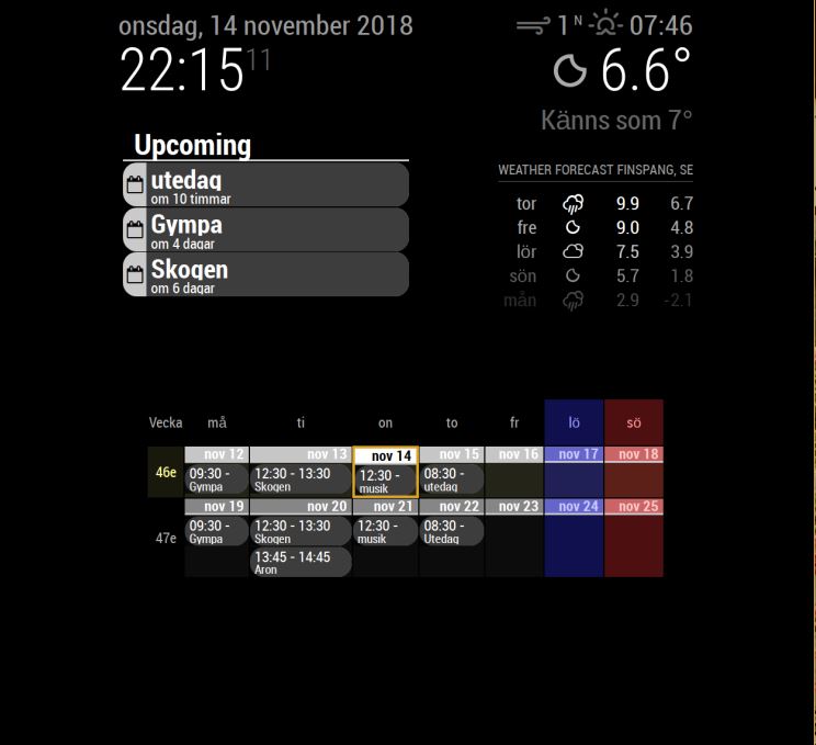
Add this to yourcss/custom.css.day_6 { display:none; } .day_7 { display:none; } .CALEXT .tableStyle td { width:17%; } -
@sean said in MMM-CalendarExt:
.day_6 {
display:none;
}.day_7 {
display:none;
}.CALEXT .tableStyle td {
width:17%;
}Worked!! Thank you so much, that’s perfect :)
-
Hello,
How can I delete the text ‘in 15 hours’
In addition it does not seem right to me.
Or does this indicate the end of the event?module: 'MMM-CalendarExt', position: "top_left", config: { colored: true, system: { show: ['current','daily'], locale: 'fr-be', //when omitted, default value would be your system default locale by moment.js showEmptyView: 0, fullDayEventLocalize: 0, redrawInterval: 30*60*1000, //minimum 60000 userProfileConfig: 0, startProfile: '' }, views: { current: { position: "top_left", title: "Aujourdhui", limit: 3, etc...Thanks![alt text]
-
@doudy
I’m on travel, so I’ll reply to you on Monday. -
@doudy
Thanks -
@doudy said in MMM-CalendarExt:
How can I delete the text 'in 15 hours’
add this in your
~/MagicMirror/css/custom.css.CALEXT .current .eventTime { display:none; }Or does this indicate the end of the event?
Sorry, That’s not available.
-
That is OK.
Thanks -
hi! still loving your module but im having some issues :/
i´ve been trying to add the code you have linked previously to make the calender bigger but i cant seem to stretch it to the screen sides?
also, why is tuesday bigger then the rest?
how do i remove the corners for each entry text?
it doesnt seem to recognize my oneLineEvent: 1; ?
any help is greatly appriciated

-
@cptkex
First, I should know your whole CSS and Configuration to give detail and exact answer,
Anyway,i´ve been trying to add the code you have linked previously to make the calender bigger but i cant seem to stretch it to the screen sides?
Add this into your
MagicMirror/css/custom.css.CALEXT .tableStyle { margin:0; max-width: 100%; }More detailed adjustment could be needed. But most of case, this is enough.
also, why is tuesday bigger then the rest?
Because Tuesday has more long-text event than other day. I set this as relative-width. You can fix it by this.
.CALEXT .tableStyle td {
    /* Set values for your environment or screen size */
    width: 17%;
    max-width: 17%;
    min-width: 17%;
}
Or This.
.CALEXT .tableStyle td {
  /* adjust for your screen size */
    width: 100px;
}
how do i remove the corners for each entry text?
#CALEXT_weeks.tableStyle .event.endHere .eventContainer{
  border:none;
  border-radius:0;
}

#CALEXT_weeks.tableStyle .event.startHere {
  border:none;
  border-radius:0;
}
it doesnt seem to recognize my oneLineEvent: 1; ?
It is working. So, Some events are showing only start time. If you grow the width of cell, you can see more clearly.
Anyway,
weeksandmonthstypes are not so good for Vertical Screen because vertical-width could be around 1080px,(Maximized, when you remove all the default margin of MM) It means each cell could have only 140px width at most. it would be not enough space for displaying event. You need to use smaller font size.(you’d better to learn some CSS skills if you have interests.)
-
@sean thanks for replying, and yes i should definitly learn more CSS if i want to use this. I just needed to know where to start, and i can work myself forward from there. I know the 1080 pixel space isnt optimal for a Weeks setup, but going through all the other alternatives, it provides just the right kind of data for my family´s day to day activities, so its more suitable. I am playing around with the font sizes, trying to find what fits within the design and how visible it is. I have tried other setups for greater visibility, but ended up with this being the best option together with the upcoming one that is more “at a glance”
thank you so much for your help, ill try to read up on some CSS so i dont bother you with every little detail. My biggest problem has been that i dont know where to start, and now i have enough data to start changing parameters to learn what i need to change to achieve the best possible outcome.
-
@cptkex
I think https://www.w3schools.com/ is the best source for the beginners. I wish you have a good luck. -
Hi,
It’s possible to start ‘roll’ at the date of current day and no first day of month ?
Thx
-
@smotx Sorry, it can’t without source modifying.
-
I can’t seem to figure out why I don’t have the start times on my calendar. I’m really liking it other than that. I’m sure it’s probably something simple but I’m open to feeling stupid after the time I’ve spend trying to figure it out haha
{ module: 'MMM-CalendarExt', position: "lower_third", // ignore this. config: { system: { show: ['month'], locale: 'en', showEmptyView: 1, }, views: { month: { position:'lower_third', showWeeks: 0, onlyStartingTime:1, }, }, calendars :[ { -
@jimmysmalls
By default, time of month/week view is hidden because there might be not enough space.
Add this into yourcss/custom.css;.CALEXT .tableStyle .eventTime { display: block; order: 3; // when you want to display time under the event title. } -
@sean
That did the trick, thank you! One other quick question that maybe I’m overlooking the answer to in the documentation but is there a way to have it show the time on a 12 hour format instead of 24? -
@jimmysmalls
usetimeFormat: "hh:mm A"insteadtimeFormat: "HH:mm"
If you don’t want AM/PM indicator, just use"hh:mm" -
Hi, Sorry I new here. Do I need a seperate Calender for each icon/emoj? Can I use Rules for one single Calendar?
-
@jktitanium
Symbol is fixed per calendar.
However each event style(color or font except symbol) could be variable by condition. -
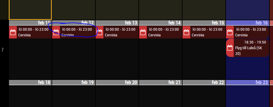
Hi. In weeks view with event time displayed, is there a way to remove the starting time and ending time on full day events?

Hello! It looks like you're interested in this conversation, but you don't have an account yet.
Getting fed up of having to scroll through the same posts each visit? When you register for an account, you'll always come back to exactly where you were before, and choose to be notified of new replies (either via email, or push notification). You'll also be able to save bookmarks and upvote posts to show your appreciation to other community members.
With your input, this post could be even better 💗
Register Login