Read the statement by Michael Teeuw here.
MMM-Spotify
-
Hi there,
I am currently using this module in combination with the GroveGesture module. I can use simple gesture commands (up, down, left, right etc).I want to implement a solution to quickly switch between artists, playlists, tracks etc.
However, do you guys know if there’s a module that works well for this? I haven’t found anything like this just yet…
I am completely fine with adding the playlists hardcoded in the config file.If this does not exist, I might consider making this as an addition to the MMM-Spotify module.
-
Hello, thanks for this excellent module, I’ve been using it for some time but only now I came across a problem that I don’t know how to solve …
I need to hide another module when MMM-SPOTIFY is in play mode, and hide when MMM-SPOTIFY is in PAUSE.
Has as ? -
@luizcarlosnery i haven’t looked in the code yet but a possibility might be too look if the spotify module sends notifications. If it does you might fetch these to hide your module using the
notificationReceivedfunction -
Hi everybody. I am the new owner of this module (as of last year October). I haven’t monitored these forums / this post for problems so far. If you do have technical problems with this module please be so kind to directly open an issue in the git repo:
https://github.com/skuethe/MMM-Spotify/issues
It makes working on issues a lot easier. Thanks!
As to some of the open topics / questions here of the last weeks:
- @Abstr @razserv2010 I’ve recently re-worked the multi user authentication and fixed some problems with it:
https://github.com/skuethe/MMM-Spotify/releases/tag/v2.0.1 - @crisvdn I am using it with MMM-Touch (which, of course, requires a touch screen) - it is a very powerful module
- @luizcarlosnery there is no direct option to do this. But you can definitely get something to work. There is a build-in config option to send custom notifications on suspend / resume:
notificationsOnSuspendandnotificationsOnResume- see README for more details
You could, for example, use it in addition with MMM-pages which has some nice options to handle suspending / resuming special modules based on different pages
I hope that helps for now. I have some more fixes and improvements in the pipe that will be merged in the next comming weeks.
- @Abstr @razserv2010 I’ve recently re-worked the multi user authentication and fixed some problems with it:
-
@lavolp3 Thanks, but I managed to solve it by editing “Spotify.js” in play (param, cb) {
this.doRequest (“/ v1 / me / player / play”, “PUT”, null, param, cb)
}pause (cb) {
this.doRequest (“/ v1 / me / player / pause”, “PUT”, null, null, cb)
}
I included the url commands for the remote control and solved the problem. -
@luizcarlosnery Hi @skuethe, first of all: great module.
I have set
style: "mini"in my config which works well. However I have made some adjustments to picture size and text size in custom.css.
But I’m missing the scrolling title in this mode.Also, what happens to minibar mode.
I understand you plan to remove that?I have also corrected one issue resulting in an error if you’re not showing the account name, will send a PR on github for that.
-
@lavolp3 Hey there. Thanks for the feedback.
About the
style: "mini"settings:- what adjustments did you do to the picture and text sizes? This is currently still an open topic on my side - so if it is some general improvement for the module feel free to also create a PR for that
- I unfortunately don’t know what you exactly mean by “the scrolling title”. Could you elaborate?
About the
minibarmode:
In my opinion this design breaks completely with the other two styles as it feels and looks completely different. In addition the implementation in the code is almost completely separated, which makes maintaining it an unnecessary effort.To be honest - I don’t even know if it is still working or if some of the changes in the past broke usage of it.
I try to get feedback from people using it - if they want to keep it etc.About the account name issue:
Great thanks - looking forward for your PR -
@skuethe
Module looks like this for me know
width a width of 500.
I unfortunately don’t know what you exactly mean by “the scrolling title”. Could you elaborate?
You see it here. I’d need to see the rest of the title. It could scroll. That is already implemented in the minibar I think.
Also, Volume is always at 100% for me. Played from the android app. API issue?
-
@lavolp3 said in MMM-Spotify:
Also, Volume is always at 100% for me. Played from the android app. API issue?
Confirmed API issue. Spotify API returns volume 100%, which is not the case in the app itself. Unfortunately.
Am I the only one having this issue? -
@skuethe said in MMM-Spotify:
what adjustments did you do to the picture and text sizes? This is currently still an open topic on my side - so if it is some general improvement for the module feel free to also create a PR for that
My suggestions , generally as well as for mini mode:
- font sizes are hardcoded here, I would rather use the MM classes as reference from main.css. Meaning: giving the module and sub-elements a class “small”, “xsmall” by including the config option
classes. I have done that already and works well. - adjustable cover size.
- option to hide module when nothing is played
- spotify label small and more dimmed (like in MMM-NowPlayingOnSpotify
All of the above is not difficult to manage I guess.
A problem with the module is in my point of view the coding. It’s difficult for me to adept to sean’s style, e.g. leaving semicola completely out, indenting only with 2 spaces. But tha can be managed of course
Let me know what you like to see as PR
- font sizes are hardcoded here, I would rather use the MM classes as reference from main.css. Meaning: giving the module and sub-elements a class “small”, “xsmall” by including the config option
-
@lavolp3 said in MMM-Spotify:
@lavolp3 said in MMM-Spotify:
Also, Volume is always at 100% for me. Played from the android app. API issue?
Confirmed API issue. Spotify API returns volume 100%, which is not the case in the app itself. Unfortunately.
Am I the only one having this issue?Interesting. I have no issues with volume display and even the volume control (via touch). Works fine on all the different devices - haven’t tried android though.
- font sizes are hardcoded here, I would rather use the MM classes as reference from main.css. Meaning: giving the module and sub-elements a class “small”, “xsmall” by including the config option
classes. I have done that already and works well. - adjustable cover size.
- option to hide module when nothing is played
- spotify label small and more dimmed (like in MMM-NowPlayingOnSpotify
Let me know what you like to see as PR
Feel free to submit a PR for all those topics if you see them as a valid improvement!
- font sizes are hardcoded here, I would rather use the MM classes as reference from main.css. Meaning: giving the module and sub-elements a class “small”, “xsmall” by including the config option
-
Just released a new version of the module, which improves usage for systems without UI (running in a container f.e.):
https://github.com/skuethe/MMM-Spotify/releases/tag/v2.1.0As there are updated dependencies, be sure to execute
git pull && npm installinside the
MMM-Spotifyfolder.Again, if anybody is running into problems, please open issues in the github repo.
-
@skuethe Thanks for maintaining this project. I understand that it is still not possible to display multiple accounts at the same time? (Family account, different devices; e.g. display “x is playing for user y on device z” or so?)
Another feature request: I’d like the module to be hidden when nothing is being played. I am just using this for status display, not for control of spotify. Possible to add in a coming version?
-
@requiemmg said in MMM-Spotify:
I understand that it is still not possible to display multiple accounts at the same time? (Family account, different devices; e.g. display “x is playing for user y on device z” or so?)
First time I am reading about this request :)
I am unsure how that could be solved - since UI is configured / optimized to display exactly one song. That would mean some massive design changes. In addition, it would need some looking into how to support querying multiple accounts at the same time / in different instances.
For me this is out of scope at the current point in time. You can, of course, create a new issue with an enhancement request and will see how things change in the future, or maybe somebody else wants to contribute code to that idea.Another feature request: I’d like the module to be hidden when nothing is being played. I am just using this for status display, not for control of spotify. Possible to add in a coming version?
There already is a feature request open for that:
https://github.com/skuethe/MMM-Spotify/issues/176
However, I did not yet have time to work on it. -
@skuethe Thanks. U was asking about Multi-user way back in this thread before you started maintenance. I’d think this might be great for visualization. But I think It’d need an additional multi-user view (and personally, I like to use the bar menu)
-
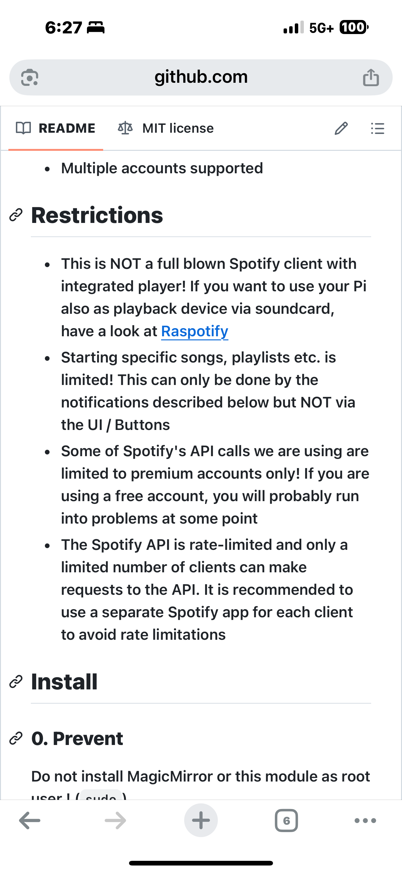
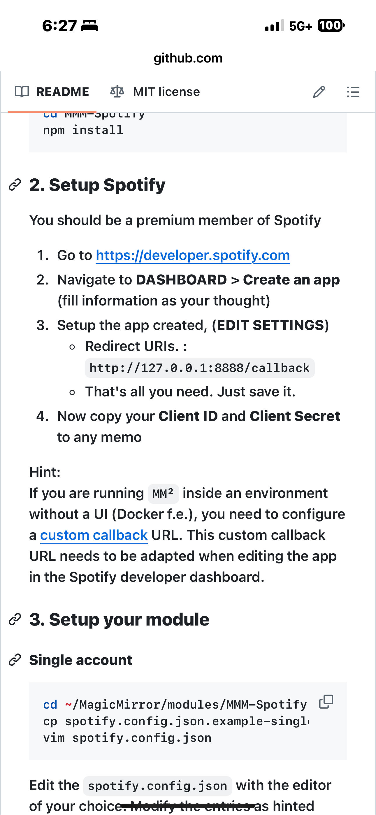
I think I’m doing something wrong, I don’t really understand it. Is there a step-by-step guide? OAuth worked fine for Google services, but not with this Spotify setup. My steps:
Run node first_auth.js as in the MMM-Spotify instructions → Terminal shows “[SPOTIFY] Initialized”.
Browser opens with Spotify login, I enter my account, Spotify asks for access. → Still no code in terminal.
After clicking accept, browser redirects to localhost:8888 with ?code=**** in the URL.
But then an error pops up immediately in the terminal, before I can do anything with the code. At which step am I supposed to use this code, and where should I put it? -
@Sean @ejay-ibm great release, guys!
Would it be possible to swap the plain white Spotify logo for a darker version, like the one in MMM-NowPlayingOnSpotify? 😬Also, is this a standalone Spotify module? If so, is a Spotify Premium account required?
One more thing: I noticed the module doesn’t switch to ‘standby’ view after stopping music until I restart MagicMirror.
-
Also, is this a standalone Spotify Premium Mod APK file? If so, does a Spotify Premium account need to be used?
One more thing: I noticed that the app doesn’t automatically go into “standby” mode after stopping music playback unless I restart the app.
-
@kinggiotai did you read the readme


-
@kinggiotai also this is not apk. It’s JavaScript plugin into MagicMirror
Hello! It looks like you're interested in this conversation, but you don't have an account yet.
Getting fed up of having to scroll through the same posts each visit? When you register for an account, you'll always come back to exactly where you were before, and choose to be notified of new replies (either via email, or push notification). You'll also be able to save bookmarks and upvote posts to show your appreciation to other community members.
With your input, this post could be even better 💗
Register Login