Read the statement by Michael Teeuw here.
MMM-Astrology
-
@Mykle1 Thanks I posted two today… This day in History also ;)
-
Ok, I have the Astrology up and running in my top_right, just under my weather. Real nice. I just need to push the whole thing to the right margin. I’ve tried some things in custom.css to accomplish this, based on entries that Strawberry made on other modules for me, but I can’t seem to get it to move! Are you screwing with me? ;-)
Nice work, bro
-
@Mykle1 I’m no css guru but try this in your custom css to push it over:
.MMM-Astrology .content {
  margin-left: 13%;
  position: absolute;

}
.MMM-Astrology .header {
	margin-left: 30%;
  }
You may have to play with the % numbers…
-
@cowboysdude said in MMM-Astrology:
I’m no css guru but try this in your custom css to push it over:
I was going to try your css suggestion this morning but before I even entered that into the custom.css file the module isn’t loading. All I get is the “Forecasting…” and nothing else. I didn’t change anything and it was working yesterday. I reloaded MM quite a few times but it never completes loading the module. I’ll try again later
-
Let me look into it :)
-
-
@Mykle1 I made a couple of changes so do a git pull when you get back :) Now I’m off to dinner myself!
-
This post is deleted! -
I’ll be installing this as soon as i get back from vacation…and i think its time to start building a bigger mirror!!!
-
@cowboysdude said in MMM-Astrology:
I made a couple of changes so do a git pull when you get back Now I’m off to dinner myself!
Short day at work today. I’ll pull the new version and fire her up in a few. I’ll get back to you
-
@cowboysdude said in MMM-Astrology:
I made a couple of changes so do a git pull when you get back
I told you I’d get back to you. :-)
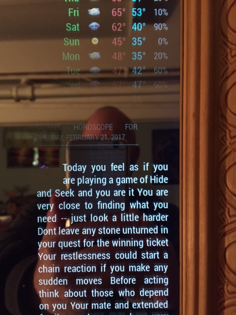
I successfully justified your module to the right using your css suggestion. However, the header css would not move the header permanently, meaning, as the module loads it appears as if it’s oriented correctly, but then it snaps back over to the left when the module does load. Now, I don’t know if you noticed from any of my pictures, but I don’t use headers at all, none. I would be more than pleased to be able to remove the header altogether. I noticed there is no header: in the config.js so how would I go about removing that.
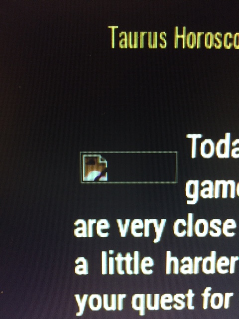
Also, the logo? for Taurus seems to not load. There is a little symbol there. It’s not very clear at all in the picture. Broken link?
Otherwise, here it is.

-
Interesting…
Do a git pull and add this to your custom.css
 .MMM-Astrology .content {
  margin-left: 11%;
  }
  .MMM-Astrology .title {
	margin-left: 11%;

}
Adjust your % accordingly :)
-
@cowboysdude said in MMM-Astrology:
Do a git pull and add this to your custom.css
Another one? I only ask because I did one earlier this afternoon. Ok, I’ll do another git pull and follow your suggestions. I’ll get back to you. Thanks for helping me out.
-
As it turns out I did need another git pull, and with some adjustments to your css advice I was able to justify to the right. However, if I choose a width (250px) then the header becomes 2 lines and only the top line justified to the right. I still would like to not have a header at all, as I mentioned earlier.
The only other problem is the icon at the beginning of the horoscope. Even at 400px width yields the picture below

Let me not forget to thank you for your work here, so, thanks :thumbsup_tone1:
-
You can always use xsmall for the header ;) OHHHHHHHHH and the icons… that was my fault I didn’t upload them LOL
Was in a hurry… as for the title you can adjust that as well in the custom.css… under MMM-Astrology .title {
font-size: ??;
}One more ‘git pull’… :) Made some other changes.
-
@cowboysdude said in MMM-Astrology:
One more ‘git pull’… Made some other changes.
Sorry to make you work on your birthday!
-
@Mykle1 said in MMM-Astrology:
@cowboysdude said in MMM-Astrology:
One more ‘git pull’… Made some other changes.
Sorry to make you work on your birthday!
Heck no… I don’t stop working LOL Plus I’m taking the day off so I don’t mind at all :)
-
I know the cool site where you can read many interesting articles on this topic https://horo.io
-
@sam5168 If they have an api I can ;)
-
Hey @cowboysdude! My wife has thoroughly enjoyed your Astrology app! I finally got around to updating everything (including the 256 MM2 updates) and I’m stumped! I can’t seem to get anything in the CSS file to impact anything with the MMM-Astro app alignment or sizes. I really just want to increase the font size and alight everything similar to the previous poster. Icon trapped into the beginning of the text. Right now, it appears as though the logo, sign, and date are aligned left. Content all flush to the right, but chaos on the left side. I’m attempting to upload an image, however it says it’s too large. Hopefully I explained that thoroughly enough. Please help! Thank you in advance!
Hello! It looks like you're interested in this conversation, but you don't have an account yet.
Getting fed up of having to scroll through the same posts each visit? When you register for an account, you'll always come back to exactly where you were before, and choose to be notified of new replies (either via email, or push notification). You'll also be able to save bookmarks and upvote posts to show your appreciation to other community members.
With your input, this post could be even better 💗
Register Login


