Read the statement by Michael Teeuw here.
MMM-CalendarExt
-
@sk4018
I think you can useweeksview insteaddailyview. But starting weekday depends on which locale are you using. -
@sean
Thx a lot
It works
Greetz -
I just updated this module, and it stopped working. I even tried resting to the simple config from the readme, and nothing is coming up. Where can I see the logs for it to try and fix this?
-
@redink
stop pm2 mmthennpm start devin your MM directory root. -
@Sean
Sorry to ask again
Is there any possibility to increase a little bit the size of the letters?
I mean the ones showing in the calendar as a “task”?
thanks -
@vauxdvihl
You can adjust anything in CSS. (It could not be so easy but really funny)
Or tell me which letters to be increased. -
@Sean
I want to play around with the following values

Increase / Decrease “FINAL: SEA7 - OAK 6”
Increase / Decrease “Time (04:05-07:05)”I am not a programmer :-)
Thanks a lot
-
@vauxdvihl
Add this into yourMagicMirror/css/custom.cssfile..CALEXT .eventTime { font-size: 120%; line-height:110%; } .CALEXT .eventContent { font-size: 140%; line-height:110%; }You can adjust these values with relative
%or absolutepx(Or many other various things) -
@Sean
Thanks a lot
In custom css file a have the following:div.CALEXT .event .symbol { order:1; display:block; flex-basis: 30px; // Modify this text-align:center; min-width: 50px; // Modify this font-size: 150%; // Add this } div.CALEXT .events .symbol.emoji { font-size: 150%; //Adjust this as your wish. you can use px or % } div.CALEXT .events .symbol.font-awesome { font-size: 250%; //Adjust this as your wish. you can use px or % } div.CALEXT .tableStyle .eventTime { display:block; } .CALEXT .eventTime { font-size: 80%; line-height:110%; } .CALEXT .eventContent { font-size: 250%; line-height:110%; }The adjustment of time works fine.
But not of the initial content.Sorry
But can you please help againThanks a lot
-
@vauxdvihl
Because your other CSS rules might override that rule. (Simpler rule name might have lower priority). See this. https://developer.mozilla.org/en-US/docs/Web/CSS/SpecificityAnyway, you can use like this;
 div.CALEXT div.slot div.eventsBoard div.eventContainer div.eventContent {
   font-size: 250%;
   line-height:110%;
 }
(For more exact rule specificity, I should know whole CSS of your MM, but I believe above code enough)
-
Hello @Sean ,
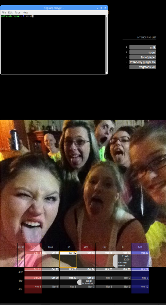
Been playing around with this module for a day now (not very savvy with javascript) and I cannot figure out how to increase the size of my Calendar. I’m using weeks (4 count) and position bottom_bar, but I would like it to take up about a third of the bottom (vertical monitor). I know this must be a change in CSS, but I dont know what to do. Any help would be great!
-Yoey -
@yoey2112
Which parts do you want to grow up? More details I need to help. Image could be a help. -

So 2 things really. I’d like the Calendar to take up the entire bottom 3rd of the screen.
Second, any suggestions on making it look a little popping?
Thanks!
-
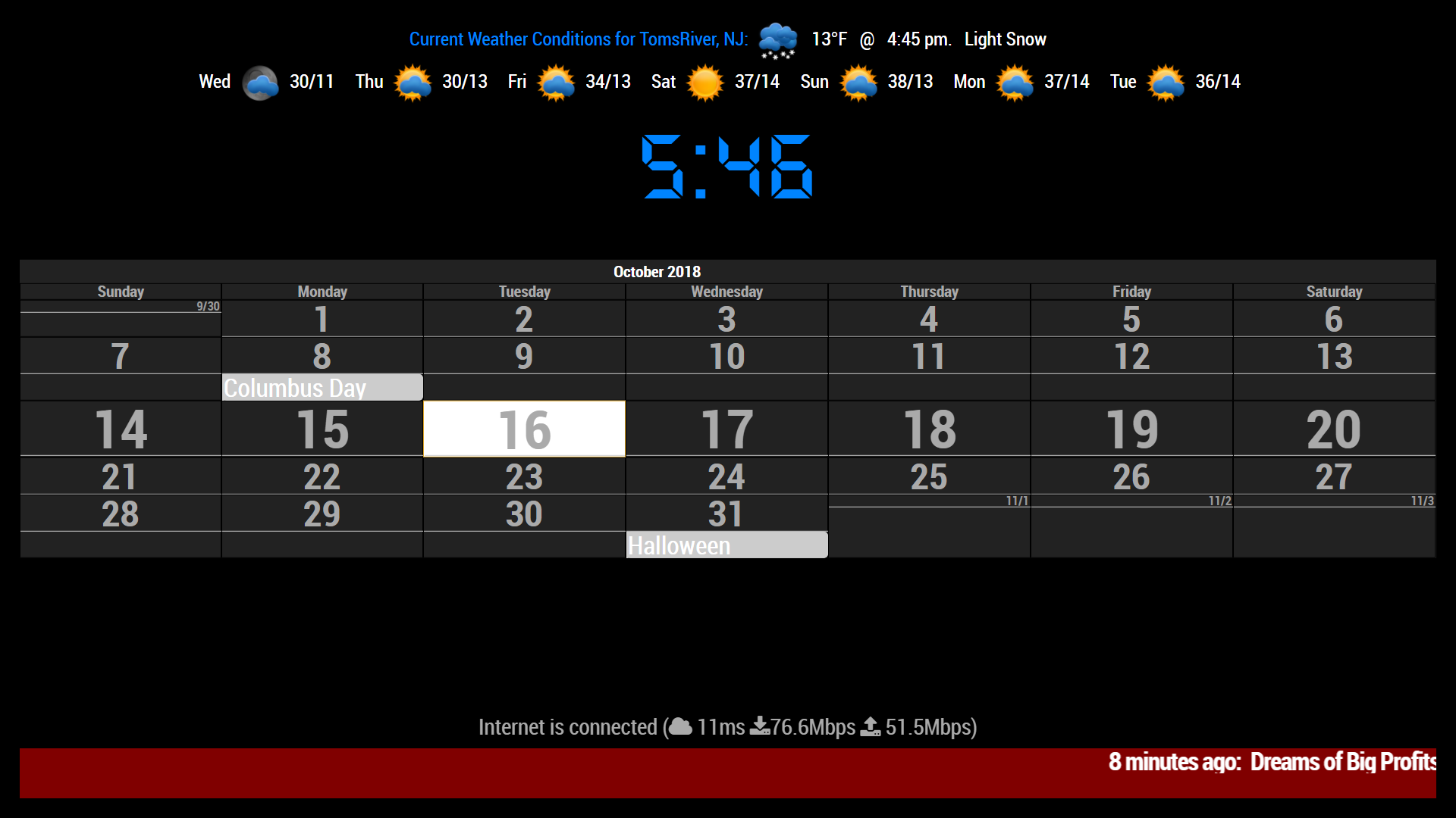
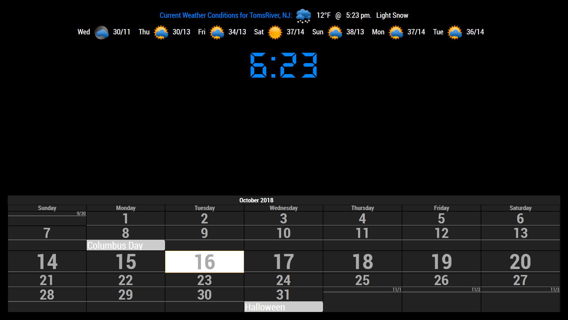
May I ask how you were able to show blank events?
mine looks like this, all jumbled up and no blanks…

-

add the following to your custum.css file
#CALEXT_month.tableStyle { max-width:100%; width:100%; background:none; } -
@Sean
Do you see the calendar posted above by @yoey2112 ?
It has blank events instead of collapsed events, I am wanting mine to look like that!
But, I can’t figure out how to get it done!
-
@justjim1220 I added that to my custom CSS but its still fairly small, a little bigger though. Is there any way to adjust the height of that location as well?
-
what did you add? I have been looking to do this!
the height is self-adjusting per the font sizes and line heights for the table cells.
May be able to figure out a better way if I had the code you used to get the empty cells to show like that.
-
@justjim1220
I’ve already sent email for which was talked between us.@yoey2112
For the whole module width;.CALEXT .tableStyle { margin:auto; max-width: 90%; /* change to 100% and if you want, you can add field `width` */ }But it will be affected by your MM body width (By default, it has some margin)
-
@Sean Can I also adjust the height of the calendar? Example, if I wanted the Calendar to take up the entire bottom half of a Vertical screen?
Hello! It looks like you're interested in this conversation, but you don't have an account yet.
Getting fed up of having to scroll through the same posts each visit? When you register for an account, you'll always come back to exactly where you were before, and choose to be notified of new replies (either via email, or push notification). You'll also be able to save bookmarks and upvote posts to show your appreciation to other community members.
With your input, this post could be even better 💗
Register Login