Read the statement by Michael Teeuw here.
MMM-DarkSkyForecast - Yet ANOTHER weather module
-
@j-e-f-f
Thanks for your module,it 's very nice and useful
I have problem ,this module not support my language
because ,I am Thai peaple
I would to know how to add support Thai language
Thank for your help -
@humdinger44 try pm2 list from the MagicMirror folder
-
@j-e-f-f
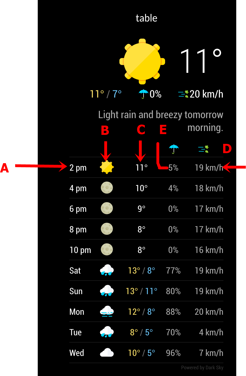
I try to adjust fontsize in custom.css but not work
so I would like to know how to Enlarge fontsize and change color
at position A,B,C,D,E (as photo)
Thanks for hint

-
Dear @j-e-f-f ,
thank you for this great module. I enjoy looking at it every morning :grinning_face:I would like to use real world data from a temperature sensor at our house instead of the “current temperature” data from the weather service.
Would it be possible to optionally add an URL to the config that returns the temperature as plain value (e.g.
15.76) and replace the corresponding value from the weather service?Thanks for considering this,
Phillip -
@rudibarani it’s a great idea but not exactly as simple as enabling a second data source URL. As my module is designed to use the Dark Sky API, I would need a separate routine to handle the different data format, and it would be a one-off for just your sensor model. Of course others will want their sensors supported and so on… unfortunately I don’t have the time to support such variances in functionality, which all do what my module already does — provide you with real-time weather information.
One of the major benefits of the Dark Sky API is how accurate it is, given you can put in your exact long/lat coordinates. The temperature you’ll get from the API should be very close to what your sensor is providing, maybe off by at most one or two degrees.
That said, my module is very much open-source. You are free to fork it and try to add this functionality on your own. If your programming experience is limited, modifying someone else’s code is a good way to learn. My code is very well documented so you should have a good idea as to what each part does. Also JavaScript is very forgiving and makes for a great beginner’s language.
I know this isn’t the answer you wanted to hear, but I hope you’ll be encouraged give modifying my module a shot. It’s very satisfying when you make something like this work for your exact needs. It’s how I got started, and I guess it’s just snowballed from there! :D
-
Dear @j-e-f-f,
thanks for your feedback. I don’t have much coding skills (yet) - but I will try :slightly_smiling_face:
Best,
Phillip -
Hi,
- is it possible to hide the LINE under?
“Powered by Dark…” - Is it possible to delete the Test after the current Wind?
- Is it possible to change the Time over the current Weather?
- is it possible to hide the LINE under?
-
This post is deleted! -
@trividar how to hide "Power by Darksky " I change custom.css like this
.MMM-DarkSkyForecast .attribution {
color:black; } -
@nobita Thank you!
-
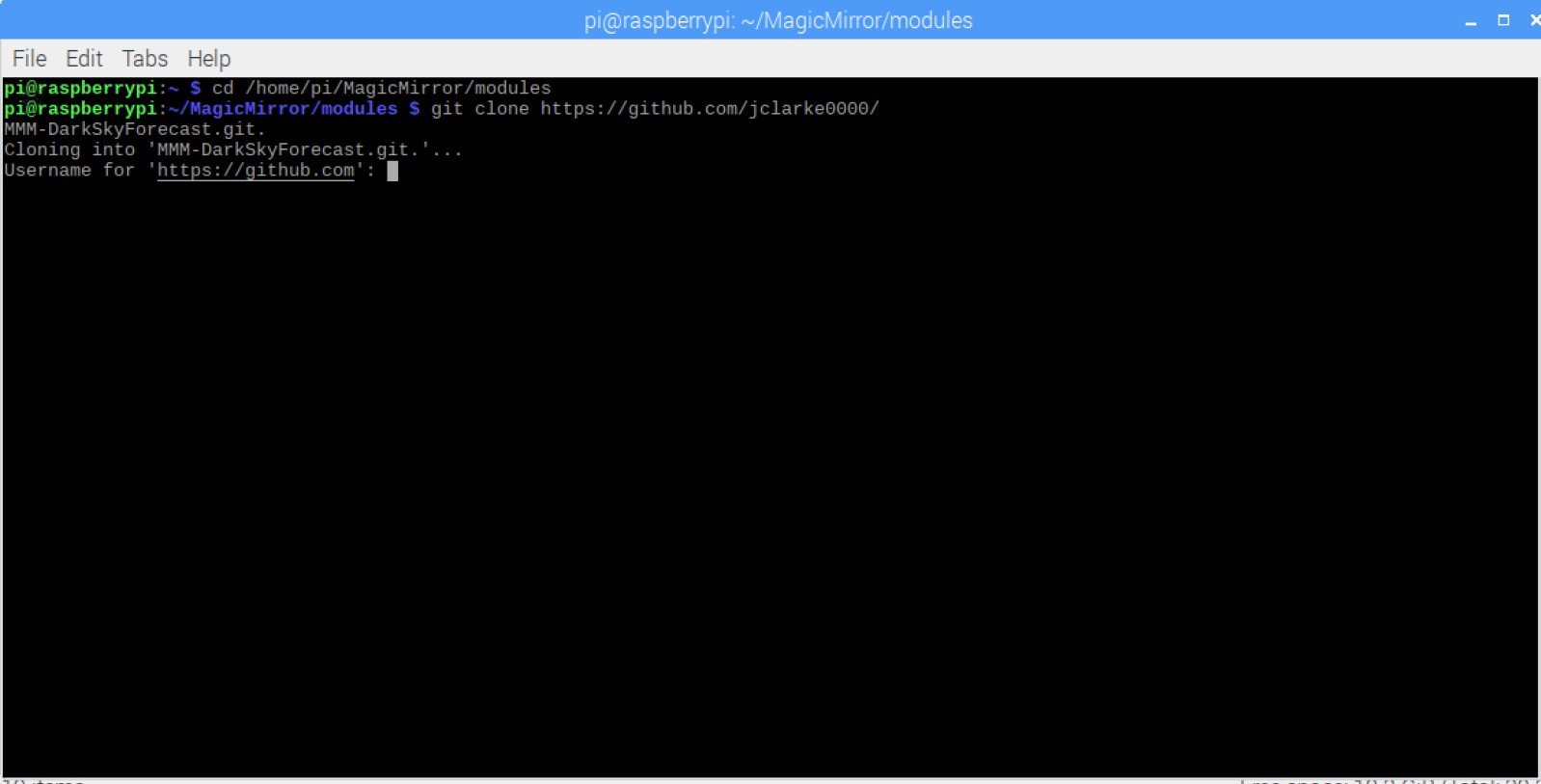
i cant git clone and install , what can i do ?

-
@t-architecture99 hm… never asks for my username
-
@t-architecture99
git clone https://github.com/jclarke0000/MMM-DarkSkyForecast.git. wrong
git clone https://github.com/jclarke0000/MMM-DarkSkyForecast.git rightthe Point at the end is the Problem
-
@Stoffbeuteluwe nice catch!
-
@Stoffbeuteluwe many thanks to you ^^
-
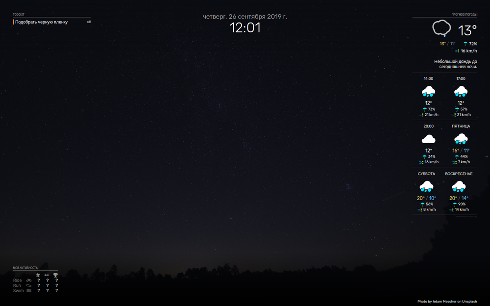
Thanks for such a beautiful module! Looks great. Is it possible to position the module horizontally?

-

I can’t figure out how to make the temperature row fonts bigger
The 80/49 0% 6 mph
RT
-
Latest version of Magic Mirror on Raspberry Pi Zero W.
Git cloned directory for MMM-DarkSkyForecast. Directory created under MagicMirror/Modules. Ran npm install. . Installed and mentioned 16 severe vulnerabilities.
Whatever?
Modified /config/config.js with entries from git hub repositiory instructions.
Ran linter against config.js. No lint :)
Restarted Magic Mirror. Module does not display. Here is my config.js/* Magic Mirror Config Sample * * By Michael Teeuw http://michaelteeuw.nl * MIT Licensed. * * For more information how you can configurate this file * See https://github.com/MichMich/MagicMirror#configuration * */ var config = { address: "0.0.0.0", // Address to listen on, can be: // - "localhost", "127.0.0.1", "::1" to listen on loopback interface // - another specific IPv4/6 to listen on a specific interface // - "", "0.0.0.0", "::" to listen on any interface // Default, when address config is left out, is "localhost" port: 8080, ipWhitelist: [], // Set [] to allow all IP addresses // or add a specific IPv4 of 192.168.1.5 : // ["127.0.0.1", "::ffff:127.0.0.1", "::1", "::ffff:192.168.1.5"], // or IPv4 range of 192.168.3.0 --> 192.168.3.15 use CIDR format : // ["127.0.0.1", "::ffff:127.0.0.1", "::1", "::ffff:192.168.3.0/28"], language: "en", timeFormat: 12, units: "imperial", // serverOnly: true/false/"local" , // local for armv6l processors, default // starts serveronly and then starts chrome browser // false, default for all NON-armv6l devices // true, force serveronly mode, because you want to.. no UI on this device modules: [ { module: 'MMM-Remote-Control', // uncomment the following line to show the URL of the remote control on the mirror position: 'bottom_left', // you can hide this module afterwards from the remote control itself config: { apiKey: '56cab4b5d5e24cfea8c436ac591d722c' } }, { module: "MMM-DarkSkyForecast", header: "Weather", position: "top_right", classes: "default everyone", disabled: false, config: { apikey: "not gonna share it :)", latitude: "39.164581", longitude: "-119.766922", iconset: "4c", concise: false, forecastLayout: "table" } }, { module: "alert", }, { module: "updatenotification", position: "top_bar" }, { module: "clock", position: "top_left" }, { module: "calendar", header: "US Holidays", position: "top_left", config: { calendars: [ { symbol: "calendar-check", url: "webcal://www.calendarlabs.com/ical-calendar/ics/76/US_Holidays.ics" } ] } }, ] }; /*************** DO NOT EDIT THE LINE BELOW ***************/ if (typeof module !== "undefined") {module.exports = config;} -
@BD0G open the developers window ctrl-shift-i on the keyboard. Select the console tab and scroll up to see any errors, usually red text.
-
I press CTRL-SHIFT-I with Magic Mirror Running and no console is presented. Actually there is no change at all. Its as if I have not pressed any keys.
Hello! It looks like you're interested in this conversation, but you don't have an account yet.
Getting fed up of having to scroll through the same posts each visit? When you register for an account, you'll always come back to exactly where you were before, and choose to be notified of new replies (either via email, or push notification). You'll also be able to save bookmarks and upvote posts to show your appreciation to other community members.
With your input, this post could be even better 💗
Register Login
