Read the statement by Michael Teeuw here.
MMM-DarkSkyForecast - Yet ANOTHER weather module
-
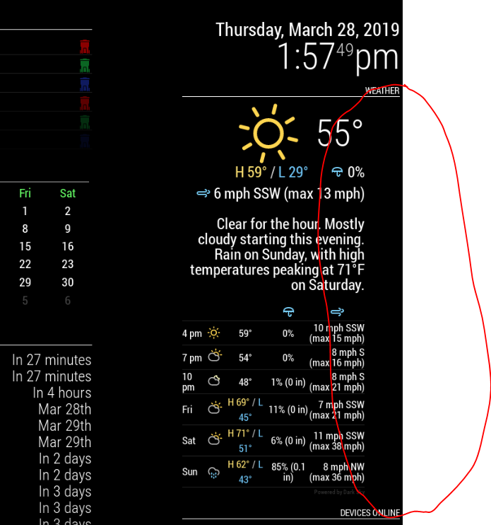
Trying to find out how to remove this spacing circled in RED.

-
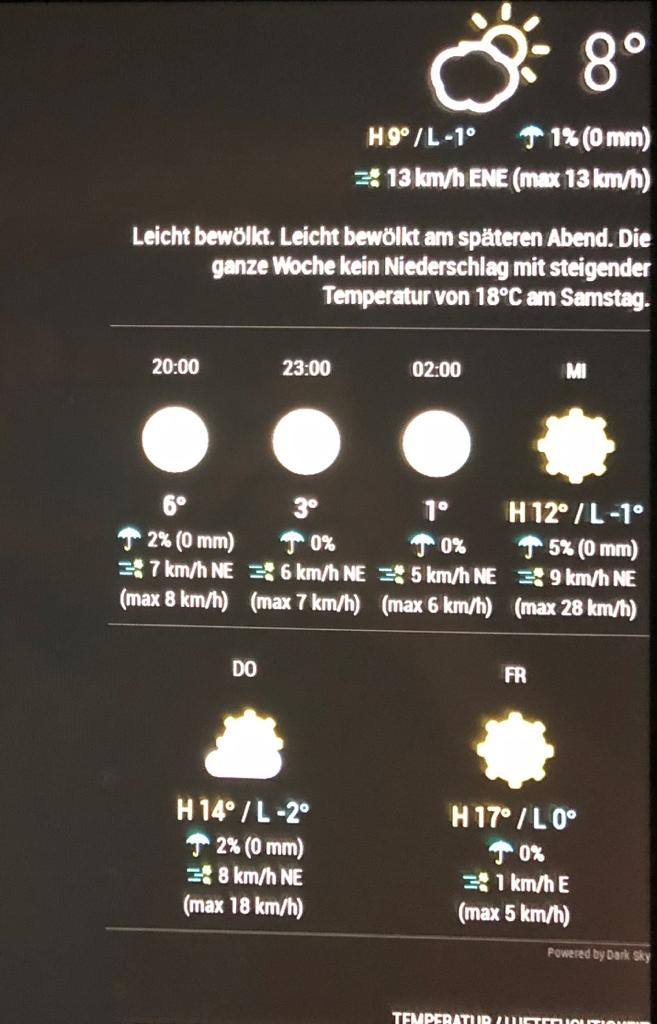
Hi all, why my day forecast jambs to the hourly forecast? This happens not always just rendemly?
 image url)
 -
@pugsly You can check out the css of the part using the developer’s tools of your browser.
The css properties can then be switched on and off and with that you can find out what is responsible for the space.I would guess your module has become broader due to another module. The forecast part, however, seems to have a fixed width and is aligned left. Then you get an empty space on the right.
-
@mydiva The width of your module seems to have become so big that the daily forecast slips into hourly line. I would suggest to set a fixed width for this part or control the width of the other module influencing this.
-
@mydiva said in MMM-DarkSkyForecast - Yet ANOTHER weather module:
Hi all, why my day forecast jambs to the hourly forecast? This happens not always just rendemly?
By default, my module does not force a size for the tiles in this view, as I can’t guess how many columns you’ll have if you’ve adjusted the size of your main layout columns. It should be three columns on a default magic mirror installation, but the actual forecast information might cause the tiles to grow or shrink.
You can fix this in your
custom.cssfile. Try this:.MMM-DarkSkyForecast .forecast-item { width: 33%; /* for a three column layout */ }Adjust as desired. For a four-column layout, specify
25%(You may need to also increase the size of the main container (e.g.:top_left) to get it all to fit. For a two-column layout, use50%.I might add a specific configuration to handle this in the future so that you don’t need to write CSS to address this.
-
@pugsly said in MMM-DarkSkyForecast - Yet ANOTHER weather module:
Trying to find out how to remove this spacing circled in RED.
By default my module forces a fixed width of
300px. It looks like your parent column (i.e.:top_right) is either explicitly set to be larger or is being forced larger by another module (maybe the “Devices Online” module underneath the forecast in your screenshot).You can address either of the above situations in your
custom.cssfile. If you’ve set an explicit width for the parent column, then this should fix the issue:.MMM-DarkSkyForecast .module-content { width: 100%; }Otherwise, if another module is forcing the width of the column to be larger than normal, then you can either try to tame the width of that module, or you can set an explicit pixel width for your forecast to use the extra space. Try something like this:
.MMM-DarkSkyForecast .module-content { width: 450px; /* adjust this as desired */ } -
@onkelbobby
Done… after several trails I got the right setup …
Thanks -
Is there a way to hide or delete the „power by …“ signet? Thx… by the way thanks for answering my previous question, I just resized 20px and it works now 👌 thx🤘
-
Hi,
I have test to modify every lines on original CSS and i can’t found how to reduce space top and under ‘day’
Thx for helpsorry, I knew stupid, I had already asked this question and already had the answer ^^
For help others who wants to redure space :
.MMM-DarkSkyForecast .module-header { margin-bottom: 20px; /* adjust to taste */ } .MMM-DarkSkyForecast .module-header.forecast-header { margin-bottom: 20px; /* adjust to taste */ } .MMM-DarkSkyForecast .wrapper.tiled .forecast-container .forecast-item .time, .MMM-DarkSkyForecast .wrapper.tiled .forecast-container .forecast-item .day-name { line-height: 20px; /* adjust to taste */ } Thx to module designer -
Hello,
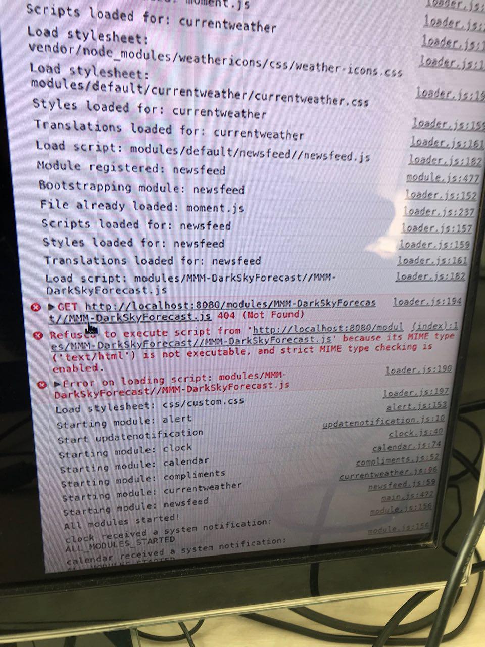
can someone help me out?
I dont know how to resolve this issue.
My console says : " …MIME type is not executable…".

