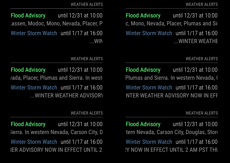
@JohnGalt appreciate the update.
For the module interference while no alerts are active, good eye. This is caused by the default “margin-bottom” that MagicMirror gives to each module. The result is that when no alerts are visible, the module takes up no space, but its margin is still pushing surrounding modules to create the undesired effect that you observed.
I have a quick (slightly-hacky) solution. In your “custom.css” file, add the following:
.MMM-WeatherAlerts {
  margin-bottom: 0px;
}
That should clean up the impact on your default weather modules. The side effect of this is that when there are alerts active, they will be stacked more tightly on-top of one another. I will look and see if I can find a robust way of handling this styling issue so that the spacing is included when the alerts are active and the spacing is “off” when there are no alerts to show. The trick here is that the spacing (margin-bottom) is set by the main app, and not by my module so it may take some work to implement a good solution.
FYI, on my mirror I have the alert module at the bottom of my default weather modules so it avoids this issue all together. Just another option…
