Read the statement by Michael Teeuw here.
MMM-NewsFeedTicker
-
Description:
A modification of the default newsfeed module that wil show the newsfeed logo and scroll across your screen like those you can see on the TV News Channels (CNN, ESPN, MSN, etc).
ScreenShots:


Download:
[card:justjim1220/MMM-NewsFeedTicker]
-
@justjim1220
Everything is fantastic, I just want to personalize something and I can not. as seen in printscren I moved a bit to the right feed but I can not stop the writing from going over the buttons. Can someone help me?
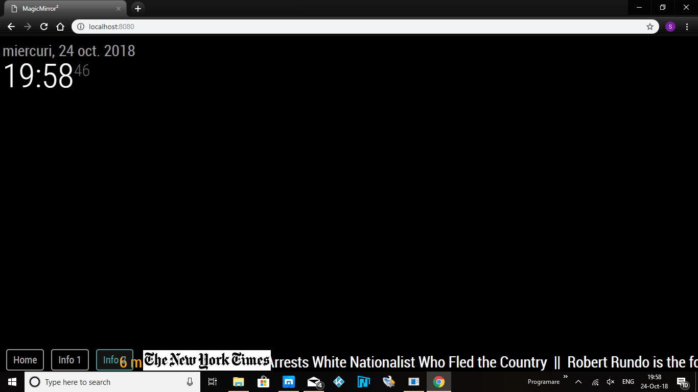
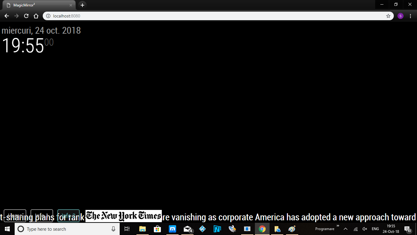
-
Add:
margin-left: 20%;under the.MMM-NewsFeedTicker {section of the MMM-NewsFeedTicker.css file.Change the ‘20%’ to the same setting you made to get the image to move to the right.
-
@justjim1220 Thank you for your reply, this sounds great but not working for me because to move the module to right and bottom I changed as well the position from relative to absolute. And if I change back that I can’t move there. So please tell me a complete solution to move there and to hide writing over the buttons. Thanks
-
What did you change to move to the right?
-
@justjim1220 what should i put into
defaultLogo : ""if I would like i.e to use a different logo?
Also what is the max. image size accepted (in MegaBytes and pixels) please? :)
Can we load various RSS into rotation into the same line? -
@justjim1220
Hi, this is what I add to custom.cssMMM-NewsFeedTicker { height: 40px; background-color: black; margin-left: 20%; } .MMM-NewsFeedTicker .tickerbody { position: absolute; bottom: 7px; } .MMM-NewsFeedTicker .image { position: absolute; margin-left: 20%; bottom: 7px; height: 40px; }but i find what the problem is:
When i change the color of background to black just i hide background but that is not in same line like writing, is upper for that reason the writing is not hidden when go over the buttons. i change back the background to maroon and you can see the difference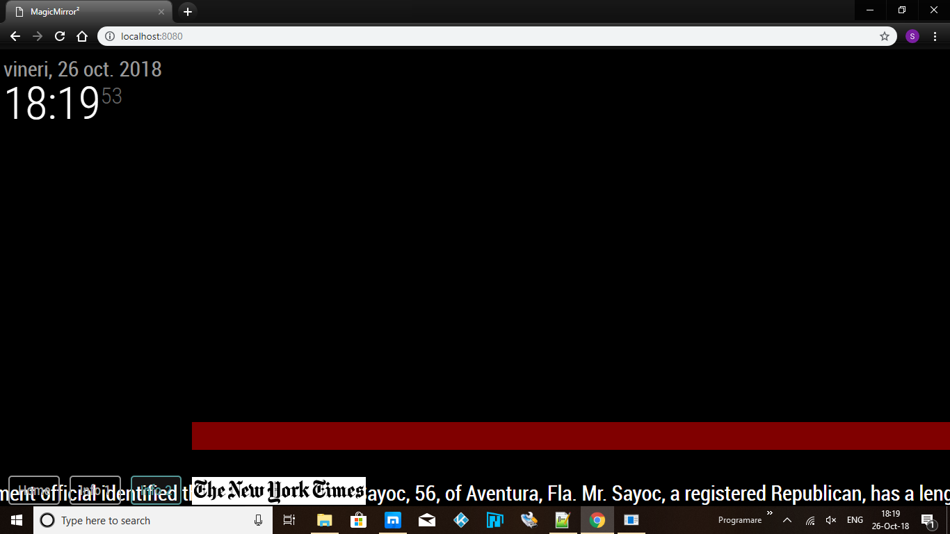
-
ok,
change background-color to
background: none;
and,
change position back to relative under the image sectionshould work for you…

-
@justjim1220
I tried but it does not work. Now in custom.css it looks like this:.MMM-NewsFeedTicker { height: 40px; background-color: none; margin-left: 20%; } .MMM-NewsFeedTicker .tickerbody { position: absolute; bottom: 7px; } .MMM-NewsFeedTicker .image { position: relative; margin-left: 20%; bottom: 7px; height: 40px; }And the screen is like that:
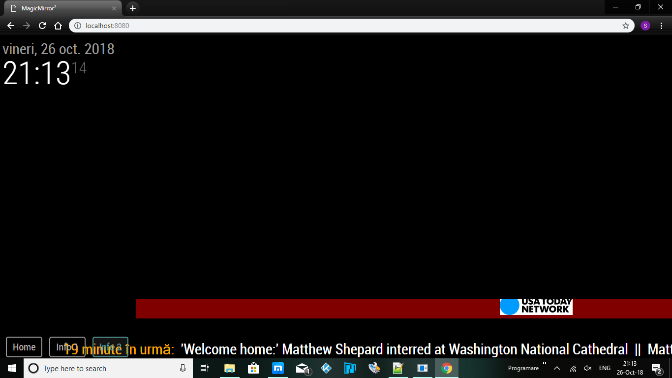
-
The problem is just to move that red line to bottom under the writing line and after that everything it’s fine. Thanks
-
Apologies!
Looks like I did tell you wrong about the position…
Here is the css that makes it work for me, try them and let me know…@keyframes marquee { 0% {left: 100%;} 100% {left: -100%;} } .MMM-NewsFeedTicker { width: 100%; height: 100px; line-height: 100%; overflow: hidden; background: none; margin-left: 20%; } .MMM-NewsFeedTicker .tickerbody { position: relative; bottom: 0; left: 0; vertical-align: middle; white-space: nowrap; text-align: left; animation: marquee 31s linear; } .MMM-NewsFeedTicker .headline { padding-top: 15px; margin: 0 auto; white-space: nowrap; } .MMM-NewsFeedTicker .image { position: absolute; display: inline-block; vertical-align: middle; bottom: 10; margin-left: 0; height: 100px; z-index: 10; background-color: #FFF; } -
what is the name of the module for the buttons?
-
@justjim1220
Sorry but it’s not working. I copied the css you put above in MMM-NewsFeedTicker.css but it still does not work. Now it looks like that
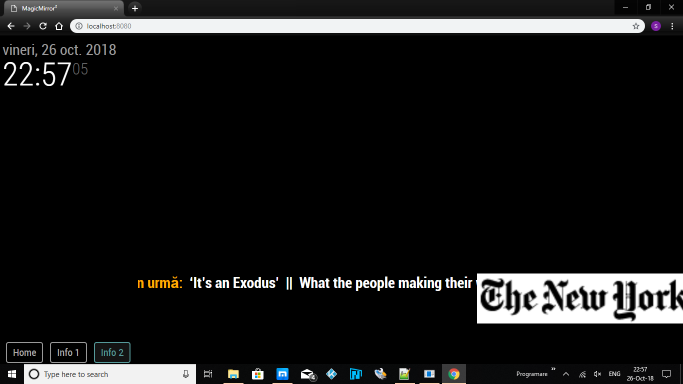
Buttons are created with the module “MMM-TouchNavigation” -
do you still have the entries you put into the custom.css?
-
OK, you need to add the following to your custom.css file:
.navigation-menu {
    display: flex;
    align-items: stretch;
    position: absolute;
}
With the code I posted and this addition to the custom.css file, I was able to get this…


If you added any NewsFeedTicker code to your custom.css file, you need to remove it.
If you want the background color back to maroon, change the
background: none;tobackground-color: maroon; -
@justjim1220
Finally it’s working now. Thank you very much:thumbs_up: -
Thank you very much for the help, but still I do not understand how you moved that red line down. I would be curious, can not get any position you want on the vertical for this module?
-
you should be able to place it in any of the regions,
it works best in the top_bar, middle_center, and bottom_bar for the 100% width -
This post is deleted! -
@justjim1220 can you please help me setting a custom logo into
defaultLogo : ""?
I’ve tried so far with several image formats and I’ve used both HTTP and HTTPS, but it still doesn’t load the logo… :thinking_face:
Hello! It looks like you're interested in this conversation, but you don't have an account yet.
Getting fed up of having to scroll through the same posts each visit? When you register for an account, you'll always come back to exactly where you were before, and choose to be notified of new replies (either via email, or push notification). You'll also be able to save bookmarks and upvote posts to show your appreciation to other community members.
With your input, this post could be even better 💗
Register Login