Read the statement by Michael Teeuw here.
MM css help please
-
hello, I am French and I am writing with a translator, is someone could help me, I would like to make the texts of the modules brighter and know how to bring the modules closer to the right side (for the right modules) and the same thing on the left I was told that it was with the css file, but I am lost, thanks for your help
-
In your custom.css file you would add this to the body for a 10 pixel border around the entire mirror. Your modules should then adjust themselves unless there are some individual css rules applied to the modules themselves. You can adjust to your liking. Personally, I don’t like modules pushed up against the edge of the mirror. For me, the 10 pixels is perfect.
body { margin: 10px; height: calc(100% - 20px); width: calc(100% - 20px); } -
to make fonts brighter you should add these lines to your custom.css and change them to your liking. Below are mine.
I set all rather bright to be able to dim the monitor itself more. Then it doesn’t shine that much through the glass..dimmed { color: #f5f5f5; } .normal { color: #fcfcfc; } .bright { color: #ffffff; } -
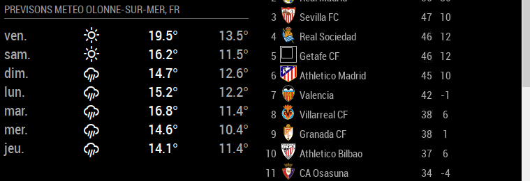
@Mykle1 bravo and thank you for your help, I modified the css and my left modules shifted to the left and it’s perfect, but it also shifted the right modules, is it possible that the right modules shift to the right, I know it is not easy to explain by writing, I will try to attach a screenshot … and I have a question to ask you on your MMM-EARTH-Live module, is that 'should I open a new topic?

-
@Mykle1 @lavolp3 well done you are champions
bravo and thank you for your help, I modified the css and my left modules shifted to the left and it’s perfect, but it also shifted the right modules, is it possible that the right modules shift to the right, I know it is not easy to explain by writing, I will try to attach a screenshot … and I have a question to ask you on your MMM-EARTH-Live module, is that 'should I open a new topic?
-
@Mykle1
sorry i didn’t see that !!! it’s great nowheight: calc(100% - 20px);
width: calc(100% - 20px); -
@Manu85 said in MM css help please:
MMM-EARTH-Live module, is that 'should I open a new topic?
Yes please.
And you can mark this topic as solved
Hello! It looks like you're interested in this conversation, but you don't have an account yet.
Getting fed up of having to scroll through the same posts each visit? When you register for an account, you'll always come back to exactly where you were before, and choose to be notified of new replies (either via email, or push notification). You'll also be able to save bookmarks and upvote posts to show your appreciation to other community members.
With your input, this post could be even better 💗
Register Login