Read the statement by Michael Teeuw here.
MMM-DWD-WarnWeather - Wetterwarnungen
-
Hi guys !
Here’s my first MagicMirror² module which shows you weather-warnings from Deutscher Wetterdienst for your location in germany.
[card:LukeSkywalker92/MMM-DWD-WarnWeather]
Hope you’ll enjoy it ! :)
-
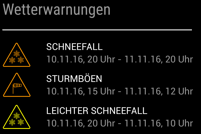
Here’s a small preview:
-
Hi @LukeCodewalker! Great Module and i like it. But something is wrong with the css. If I have more than 1 Module on one position, than it’s to width. That didn’t look good.
Can u please check this?
Daniel
-
Hey,
i did no debugging yet.
I will Check that soon and will inform you when its fixed.
Maybe you can Start an issue. -
Hey @ostfilinchen,
css should be fixed now.
Can you please check it? -
@LukeCodewalker: it’s better but always the width is to great.
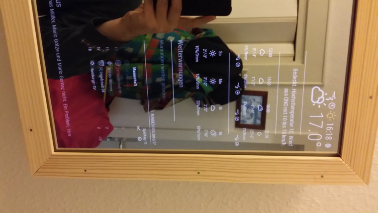
And now, no warnings would be loaded. It stops with “Warnungen werden geladen”. It must Display “keine Warnungen”, because there’re no warnings.
-
@ostfilinchen : ok, now everything should be fine.
could you please check that?
Thanks for your help =) -
now it Looks good. One Correction please. Can u Change the Headline to the Standard like calender and so on? In the pic of my post i mean the Headline “1. Bundesliga 2016/2017”.
I have commented out line 56-60 in MMM-DWD-WarnWeather.js. And in my custom.css i add these lines:
.MMM-DWD-WarnWeather div.displaytitle {
text-transform: uppercase;
font-size: 15px;
font-family: “Roboto Condensed”;
border-bottom: 1px solid #666;
line-height: 15px;
padding-bottom: 5px;
margin-bottom: 10px;
color: white; -
@ostfilinchen : done =)
-
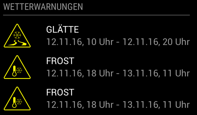
So that’s how it looks now.
-
Thanks! Great job
-
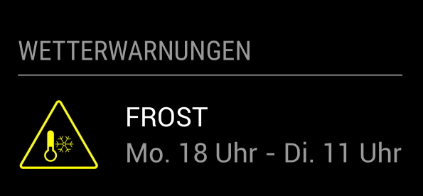
I made some small changes to the formatting of the date. It now looks like this:
-
Nice work and thanks for shareing!
Does the german wheater forecast provide an API? Are those warnings for a special region or a general broadcast for your state (Bundesland)?
I think I have look if the Swiss guys does too, usually they provide alot of datas (ch opendata) - Need those warnings too, especially for snow/icy conditions :).
-
Hey @tajno,
they don’t really provide an API. I did a bit of reverse engineering on their website and found that you can get a JSON file with all the warnings for Germany for a specific time.
This JSON contains warnings for all regions (Landkreise) of Germany.
If you find an API for Switzerland I can help you to implement it. -
@LukeCodewalker Very interesting module, will you add this to the wiki as well?
Also why did you make a custom header? Wouldn’t it be better to use the default header functionality?
-
@Jopyth Thank you. Yes I will add it.
Sure I will fix it soon. -
@weedorbeat good idea. I’ll put that on my list.
-
@weedorbeat hey,
do you have an idea, how the warnings should show for which region they are? Just making a header for each region would not be very nice in my opinion. My first idea was to put the region in brackets behind the warning. But i definitely want to keep the appearance of the module very simple/small. Another thing I want to implement is the starting altitude of the warning (like “Schneefall ab 400m”). But there i have the same problem: I don’t had an idea how to display it with keeping the module looking nice. -
@LukeCodewalker to display different things in a module, i implemented kind of caroussels in a couple of my modules to show only one part per time interval e.g. 20 seconds. this will result in a small display but can handle a lot of informations. in the develop branch is a new feature to extend the header defined by the user with custom values. you could add there the region.
-
Ok now it looks like this:
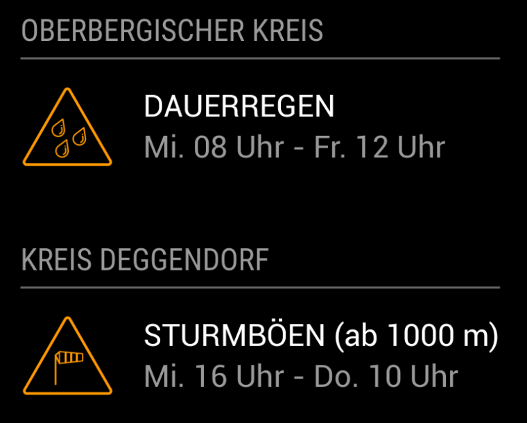
It’s using the default header functionality now.
To have more than one region you have to put the module two times in your config like{ module: 'MMM-DWD-WarnWeather', position: 'bottom_left', header: 'Oberbergischer Kreis', config: { region: 'Oberbergischer Kreis', changeColor: true, interval: 10*60*1000 } }, { module: 'MMM-DWD-WarnWeather', position: 'bottom_left', header: 'Kreis Deggendorf', config: { region: 'Kreis Deggendorf', changeColor: true, interval: 10*60*1000 } }
Hello! It looks like you're interested in this conversation, but you don't have an account yet.
Getting fed up of having to scroll through the same posts each visit? When you register for an account, you'll always come back to exactly where you were before, and choose to be notified of new replies (either via email, or push notification). You'll also be able to save bookmarks and upvote posts to show your appreciation to other community members.
With your input, this post could be even better 💗
Register Login