Read the statement by Michael Teeuw here.
Magic Mirror Redesign WIP :D
-
HI GUYS,
Sorry I’ve been MIA. Recently moved to a new condo, so I’ve been busy with that. Finally have some time to take a look at this, so expect some updates in the near future.
Thank you all for the interest ☺
-
@dbinott @jcmd13 @RuKeBo @Mykle1
Add
.top.bar > .container {
    grid-column: 1 / -1;
}
to your
main.css.I think that’ll do the trick. I don’t have any modules with notifications installed atm, so if somebody could post a screenshot of how that looks (after adding the above CSS), it would be a big help
-
@aarish could you post some screenshots?
I’ve updated the main.css file here:
https://github.com/foundations-design/WhiteLight/blob/master/css/main.cssI think the part that’s relevant to your issue is from “Layout Stuff” down (line 144 in the main.css file)
-
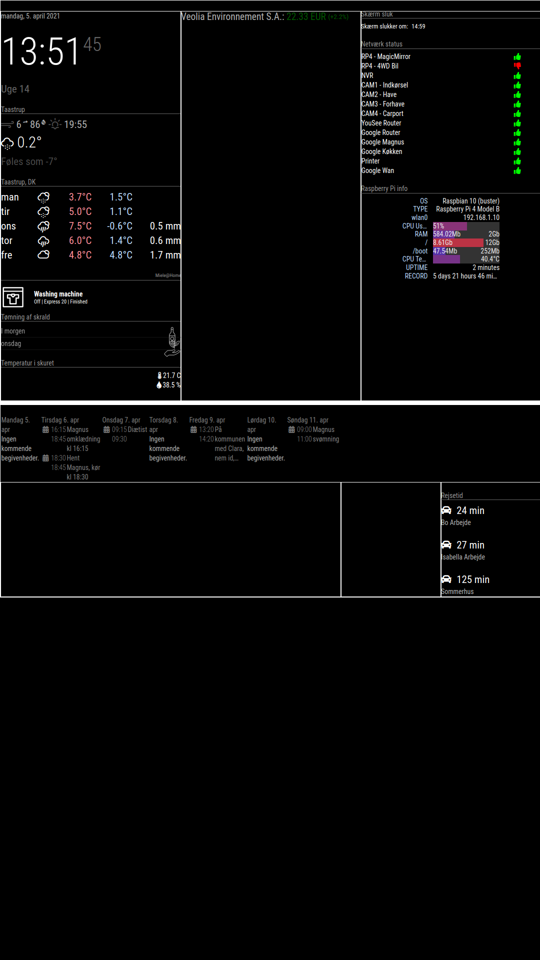
As you can see, the top_bar and bottom_bar dosent work.
The calender should be in the bottom_bar and the stock should be in the top_bar
-
thanks for the screenshot. try using this css for your
main.css:root { /**** COLOR ****/ --color-text: #fff; --color-background: black; /**** TYPOGRAPHY ****/ --font-primary: "Roboto Condensed"; --font-secondary: "Roboto"; --base: 20px; --text-scale: 1.5; --text-xs: calc(var(--base) / var(--text-scale)); --text-sm: var(--base); --text-md: calc(var(--text-sm) * var(--text-scale)); --text-lg: calc(var(--text-md) * var(--text-scale)); --text-xl: calc(var(--text-lg) * var(--text-scale)); --text-2xl: calc(var(--text-xl) * var(--text-scale)); --text-3xl: calc(var(--text-2xl) * var(--text-scale)); /**** SPACING ****/ --grid-gap: 1rem; --outside-margin: 4rem; } html { cursor: none; overflow: hidden; background: var(--color-background); user-select: none; font-size: var(--base); } ::-webkit-scrollbar { display: none; } body { background: var(--color-background); color: var(--color-text); font-family: var(--font-primary), sans-serif; font-weight: 400; line-height: 1.5; margin: 0; -webkit-font-smoothing: antialiased; } /** * Default styles. */ .dimmed { color: var(--color-text); opacity: 0.4; } .normal { color: var(--color-text); opacity: 0.7; } .bright { color: var(--color-text); opacity: 1; } .xsmall { font-size: var(--text-xs); line-height: 1.4; } .small { font-size: var(--text-sm); line-height: 1.4; } .medium { font-size: calc(var(--text-md)); line-height: 1.4; } .large { font-size: calc(var(--text-lg)); line-height: 1; } .xlarge { font-size: calc(var(--text-xl)); line-height: 1; letter-spacing: -3px; } .thin { font-family: var(--font-secondary), sans-serif; font-weight: 100; } .light { font-family: var(--font-primary), sans-serif; font-weight: 300; } .regular { font-family: var(--font-primary), sans-serif; font-weight: 400; } .bold { font-family: var(--font-primary), sans-serif; font-weight: 700; } .align-right { text-align: right; } .align-left { text-align: left; } header { text-transform: uppercase; font-size: 1rem; font-family: var(--font-primary), Arial, Helvetica, sans-serif; font-weight: 400; border-bottom: 1px solid #666; line-height: 15px; padding-bottom: 5px; margin-bottom: 10px; color: #999; } sup { font-size: 50%; line-height: 50%; } /** * Module styles. */ .module { margin-bottom: 30px; } .region.bottom .module { margin-top: 30px; margin-bottom: 0; } .no-wrap { white-space: nowrap; overflow: hidden; text-overflow: ellipsis; } .pre-line { white-space: pre-line; } /** * * LAYOUT STUFF * */ .region { width: 100%; } .region.fullscreen { position: absolute; height: 100vh; width: 100vw; top: 0; left: 0; right: 0; bottom: 0; z-index: -1; pointer-events: none; } .region.fullscreen * { pointer-events: auto; } .region table { width: 100%; border-spacing: 0; border-collapse: separate; } body { display: grid; grid-gap: var(--grid-gap); grid-template-rows: repeat(5, minmax(0, max-content)); padding: var(--outside-margin); place-items: stretch; height: 100vh; } .top.bar { display: grid; grid-gap: var(--grid-gap); grid-template-columns: repeat(3, 1fr); } .top.bar > .container { grid-column: 1 / -1; } .bottom.bar { display: grid; grid-gap: var(--grid-gap); grid-template-columns: repeat(3, 1fr); } .bottom.bar > .container { grid-column: 1 / -1; } .left { grid-column: 1 / 2; } .right { grid-column: -1 / -2; } .region { /* for testing */ /* border: 1px solid white; */ } -
@earlman
Tryed the new main.css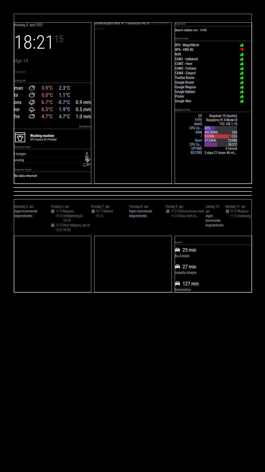
Stock i working, it should be “top_bar”.
Calender should be position: “bottom_bar”, under travle time, but bottom_bar is over bottom_left, bottom_center and bottom_right -
@bravooscar
try this::root { /**** COLOR ****/ --color-text: #fff; --color-background: black; /**** TYPOGRAPHY ****/ --font-primary: "Roboto Condensed"; --font-secondary: "Roboto"; --base: 20px; --text-scale: 1.5; --text-xs: calc(var(--base) / var(--text-scale)); --text-sm: var(--base); --text-md: calc(var(--text-sm) * var(--text-scale)); --text-lg: calc(var(--text-md) * var(--text-scale)); --text-xl: calc(var(--text-lg) * var(--text-scale)); --text-2xl: calc(var(--text-xl) * var(--text-scale)); --text-3xl: calc(var(--text-2xl) * var(--text-scale)); /**** SPACING ****/ --grid-gap: 1rem; --outside-margin: 4rem; } html { cursor: none; overflow: hidden; background: var(--color-background); user-select: none; font-size: var(--base); } ::-webkit-scrollbar { display: none; } body { background: var(--color-background); color: var(--color-text); font-family: var(--font-primary), sans-serif; font-weight: 400; line-height: 1.5; margin: 0; -webkit-font-smoothing: antialiased; } /** * Default styles. */ .dimmed { color: var(--color-text); opacity: 0.4; } .normal { color: var(--color-text); opacity: 0.7; } .bright { color: var(--color-text); opacity: 1; } .xsmall { font-size: var(--text-xs); line-height: 1.4; } .small { font-size: var(--text-sm); line-height: 1.4; } .medium { font-size: calc(var(--text-md)); line-height: 1.4; } .large { font-size: calc(var(--text-lg)); line-height: 1; } .xlarge { font-size: calc(var(--text-xl)); line-height: 1; letter-spacing: -3px; } .thin { font-family: var(--font-secondary), sans-serif; font-weight: 100; } .light { font-family: var(--font-primary), sans-serif; font-weight: 300; } .regular { font-family: var(--font-primary), sans-serif; font-weight: 400; } .bold { font-family: var(--font-primary), sans-serif; font-weight: 700; } .align-right { text-align: right; } .align-left { text-align: left; } header { text-transform: uppercase; font-size: 1rem; font-family: var(--font-primary), Arial, Helvetica, sans-serif; font-weight: 400; border-bottom: 1px solid #666; line-height: 15px; padding-bottom: 5px; margin-bottom: 10px; color: #999; } sup { font-size: 50%; line-height: 50%; } /** * Module styles. */ .module { margin-bottom: 30px; } .region.bottom .module { margin-top: 30px; margin-bottom: 0; } .no-wrap { white-space: nowrap; overflow: hidden; text-overflow: ellipsis; } .pre-line { white-space: pre-line; } /** * * LAYOUT STUFF * */ .region { width: 100%; } .region.fullscreen { position: absolute; height: 100vh; width: 100vw; top: 0; left: 0; right: 0; bottom: 0; z-index: -1; pointer-events: none; } .region.fullscreen * { pointer-events: auto; } .region table { width: 100%; border-spacing: 0; border-collapse: separate; } body { display: grid; grid-gap: var(--grid-gap); grid-template-rows: repeat(5, minmax(0, max-content)); padding: var(--outside-margin); place-items: stretch; height: 100vh; } .top.bar { display: grid; grid-gap: var(--grid-gap); grid-template-columns: repeat(3, 1fr); } .top.bar > .container { grid-column: 1 / -1; } .bottom.bar { display: grid; grid-gap: var(--grid-gap); grid-template-columns: repeat(3, 1fr); } .bottom.bar > .container { grid-column: 1 / -1; grid-row: 2; } .bottom.bar > .bottom { grid-row: 1; } .left { grid-column: 1 / 2; } .right { grid-column: -1 / -2; } /* for testing */ .region { /* border: 1px solid white; */ } -
This post is deleted! -
@earlman The redesign looks really cool and I love the concept you are going for. I wanted to try it on my mirror however I could not access the notion page with the set up instructions as it says I don’t have access. Is their another place with the instruction?
-
@earlman Can we get that wallpaper :astonished_face: ?? (with the mountain)
-
-
@mdlefevere Thank you!
-
-
Appreciate the interest! Here’s the Notion page.
Let me know if something’s not working. The instructions haven’t been updated in a while.
-
@earlman hi, i cant access the guide
-
@earlman great work, this looks really good.minimalist and clean
Hello! It looks like you're interested in this conversation, but you don't have an account yet.
Getting fed up of having to scroll through the same posts each visit? When you register for an account, you'll always come back to exactly where you were before, and choose to be notified of new replies (either via email, or push notification). You'll also be able to save bookmarks and upvote posts to show your appreciation to other community members.
With your input, this post could be even better 💗
Register Login