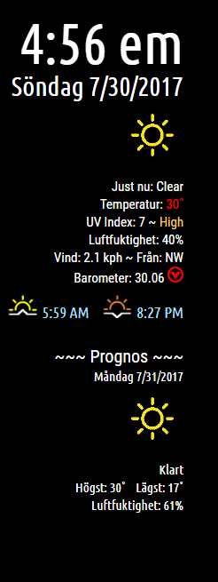
Read the statement by Michael Teeuw here.
MMM-NOAA - Another Weather Module
-

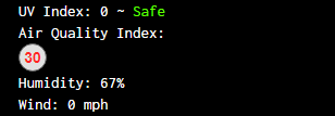
Just a thought… I prefer the numbers… the icons don’t really tell me anything…
-
Editorial
It dawned on me, after reading through the 154 posts in this topic, that people may not know what they are asking of a developer. Yes, this is an open format, and you’re supposed ask for a module, ask for features, voice your opinion (that’s what I’m doing) etc… But think about it. What seems like a simple request might mean hours (or more) of work for someone who does this for the fun of it. Someone who worked all day and came home to a list of requests. It’s like being married twice. Now, who the hell wants that? :^)
The beauty of this format is this. You can fork any repo of any module. Now it’s yours! You can make, or attempt to make, any modifications you like. After all, all the work is already done, right?
I think at this point, if you became stuck with a modification, you could ask for help on how to proceed. I did just that the other day. I worked for 4 days on a problem and could not solve it. It was only then that I asked for help and I felt rewarded knowing that I did all of the work. I was also deeply appreciative of help that was given me.
Where am I going with this?
The hell if I know!
Peace!
-
@cowboysdude said in MMM-NOAA - Another Weather Module:
Just a thought… I prefer the numbers… the icons don’t really tell me anything…
Those are cool. The number makes it immediately apparent what the conditions are. Nice work! And thank you.
-
@cowboysdude Looks perfect. The biggest issue I had was the dark red not having contrast on the black screen. Thought the icons may be a viable fix, but this is honestly the better way to go.
All this being said. If you are seeing be numbers and colors I was last week, you’re having a bad day. Maybe the best solution is just to color those readings the same as the orange tier. I don’t want to mess up your simple (and well-liked) format.
As @Mykle1 stated below, Its easy to overlook how much time you put into this. I definitely appreciate and applaud your work.
Thanks again.
-
@Reotch2 Thanks …
I was thinking about putting the UV AQ as header in one line then the circles and numbers under each corresponding header…
-
Description:
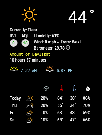
Updated layout as it IS hard to see the color red on a black background :)
Do a ‘git pull’ to update!
Please follow Readme on Github!
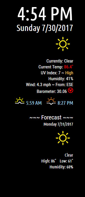
Screenshots:
English
Version 1.1.0
Download:
[card:cowboysdude/MMM-NOAA]
-
-
Since I’m the one that asked for it… I’ll be the first to say “I was wrong”. got a “yellow” reading this morning, and it was almost impossible to read on the white background.
Cowboysdude… you’re awesome… and I’m sorry to waste your time, but think you had it right the first time…
Anyone else want to chime in on their preference?
-
Sorry i agree with @Reotch2 i also dont like this new version, the text was much better cause i use the module on the right side now it took too much space.
-
@tbbear Yes that’s a css issue that I have to look at… dumb me only tested the left side :)
-
@Reotch2 said in MMM-NOAA - Another Weather Module:
Since I’m the one that asked for it… I’ll be the first to say “I was wrong”. got a “yellow” reading this morning, and it was almost impossible to read on the white background.
Cowboysdude… you’re awesome… and I’m sorry to waste your time, but think you had it right the first time…
Anyone else want to chime in on their preference?
Well we can always change the red to a shade off of red so it’s easier to read :)
And you’re not bothering me nor are you wasting my time… I was brought up this way… if someone needs your help 100 times you help them 100 times… :)
I want to try something and I"ll post it you guys let me know what you think… it’ll be a little bit later tonight [US EST Time]…
-
@Reotch2 How about this?
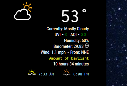
If the colors are an issue we can always use different shades to make it more readable :)
-
this looks good
-
@tbbear What do you also think about putting the Humidity and Barometer on the same line as well?
-
@cowboysdude thats ok as long as its not too big
-
@tbbear I’ll come up with a prototype you can check it out :)
-
i will !!!
-
Think for now we’ll see how they like the change I just made above and let the other stuff stay as is :)
-
@cowboysdude Looks solid… It’s definitely more streamlined. I’d say IF you decide to combine Humidity and BARO, you may need to use a “teardrop icon” for humidity and shorten Barometer to “BARO”, that should make the line length manageable.
But again, that’s an IF you decide to make further changes. I’d wait on more feedback than just me. We saw where my last input got us… haha…
Passing thought on RED AQI/UV. Maybe it’s another opportunity for the flash? just a thought.
-Rich
-
@cowboysdude said in MMM-NOAA - Another Weather Module:
Think for now we’ll see how they like the change I just made above and let the other stuff stay as is :)
Keep changing it. I’ll let you know when to stop.
:^)
Hello! It looks like you're interested in this conversation, but you don't have an account yet.
Getting fed up of having to scroll through the same posts each visit? When you register for an account, you'll always come back to exactly where you were before, and choose to be notified of new replies (either via email, or push notification). You'll also be able to save bookmarks and upvote posts to show your appreciation to other community members.
With your input, this post could be even better 💗
Register Login