Read the statement by Michael Teeuw here.
MMM-NOAA - Another Weather Module
-
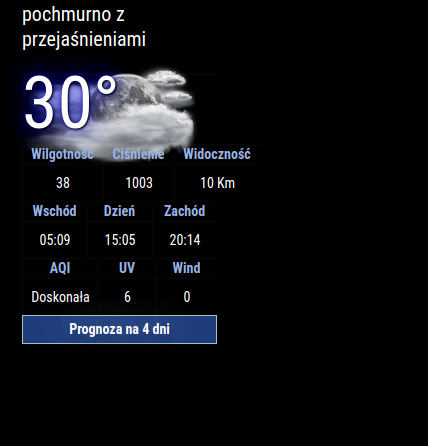
No problem, not much time. Do you know maybe what can be a solution to my problem showing only 3 results, please?
-
@Lagmin said in MMM-NOAA - Another Weather Module:
Do you know maybe what can be a solution to my problem showing only 3 results, please?
Have you installed the dependencies?
-
@Mykle1 Ok, I got it, it is “working”.
I used this simple config:module: 'MMM-NOAA3', position: 'top_left', config: { provider: "must be in quotes", // From list above apiKey: "YOUR API KEY", // From one of the providers listed above airKey: "YOUR API KEY", css: "NOAA3", // THIS MUST CONTAIN A CSS STYLE NAME userlat: "xxxx", //MUST HAVE BOTH userlon: "xxxx" //MUST HAVE BOTH } },But:
- I don’t have % for Humidity, inHg for Pressure…
- How I can translate WIND? I don’t have it in translation file (same for AQI, UV).
- I don’t have forecast for 4 days below.
Do you know what can be the problem?

-
I’m guessing that the data is not complete for all locations so you may not see % for Humidity, inHg for Pressure… or that information is not present in the data (for some reason).
How I can translate WIND? I don’t have it in translation file (same for AQI, UV).
You can add “Wind” to the translation file of your language and put in the translation. I’ve given an example below. Then send a PR to the author and he will add it to the repo.
"Sun":"Sun", "No Wind": "No Wind", "Wind": "Yours", "Humidity": "Humidity", -
Just spoke with the author. Some of the providers are not supplying the data they once were or they’ve changed the way they provide the data. This module uses several different providers so try another one and see if you get better results.
Keeping this module functioning using all the different providers must be a monumental task. It may take a long time for the author to fix any of it, assuming he has the time.
-
@Mykle1 Well I tried changing coordinates for our capital city of Poland - Warsaw, but it is still not showing forecast. I also tried to change for weatherbit (previously used openweather) but with weatherbit it doesn’t even show forecast - (Prognoza na 4 dni).
-
Yes, understood. I’m using my darksky api key until it is no longer valid. Like you, my OpenWeather api key doesn’t show the 4 day forecast. I spoke with the author and he is extremely busy with work so he doesn’t have much time to troubleshoot his modules. You can fork the repo and fix it if you like. :-)
-
@Mykle1 yeh hourly for 4 days, or daily for 7 days are in the openweather free apikey access, but ONLY by using the one all api
-
Yes, I know. I’m using it in my MMM-BMW-OW module. :-)
-
@Mykle1 I know. we did it at the same time.
was adding info for others


