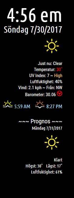
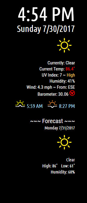
Read the statement by Michael Teeuw here.
MMM-NOAA - Another Weather Module
-
Description:
Updated layout as it IS hard to see the color red on a black background :)
Do a ‘git pull’ to update!
Please follow Readme on Github!
Screenshots:
English
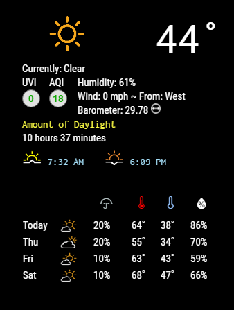
Version 1.1.0
Download:
[card:cowboysdude/MMM-NOAA]
-
-
Since I’m the one that asked for it… I’ll be the first to say “I was wrong”. got a “yellow” reading this morning, and it was almost impossible to read on the white background.
Cowboysdude… you’re awesome… and I’m sorry to waste your time, but think you had it right the first time…
Anyone else want to chime in on their preference?
-
Sorry i agree with @Reotch2 i also dont like this new version, the text was much better cause i use the module on the right side now it took too much space.
-
@tbbear Yes that’s a css issue that I have to look at… dumb me only tested the left side :)
-
@Reotch2 said in MMM-NOAA - Another Weather Module:
Since I’m the one that asked for it… I’ll be the first to say “I was wrong”. got a “yellow” reading this morning, and it was almost impossible to read on the white background.
Cowboysdude… you’re awesome… and I’m sorry to waste your time, but think you had it right the first time…
Anyone else want to chime in on their preference?
Well we can always change the red to a shade off of red so it’s easier to read :)
And you’re not bothering me nor are you wasting my time… I was brought up this way… if someone needs your help 100 times you help them 100 times… :)
I want to try something and I"ll post it you guys let me know what you think… it’ll be a little bit later tonight [US EST Time]…
-
@Reotch2 How about this?
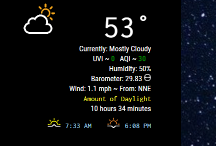
If the colors are an issue we can always use different shades to make it more readable :)
-
this looks good
-
@tbbear What do you also think about putting the Humidity and Barometer on the same line as well?
-
@cowboysdude thats ok as long as its not too big
-
@tbbear I’ll come up with a prototype you can check it out :)
-
i will !!!
-
Think for now we’ll see how they like the change I just made above and let the other stuff stay as is :)
-
@cowboysdude Looks solid… It’s definitely more streamlined. I’d say IF you decide to combine Humidity and BARO, you may need to use a “teardrop icon” for humidity and shorten Barometer to “BARO”, that should make the line length manageable.
But again, that’s an IF you decide to make further changes. I’d wait on more feedback than just me. We saw where my last input got us… haha…
Passing thought on RED AQI/UV. Maybe it’s another opportunity for the flash? just a thought.
-Rich
-
@cowboysdude said in MMM-NOAA - Another Weather Module:
Think for now we’ll see how they like the change I just made above and let the other stuff stay as is :)
Keep changing it. I’ll let you know when to stop.
:^)
-
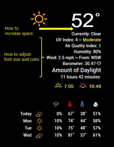
@cowboysdude I have question in MMM-NOAA.css
i try to adjust many time but can’t do it, can u help me,please?- how to increase space? (as photo)
- how to adjust font size and color?(as photo)
-
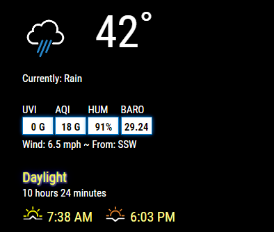
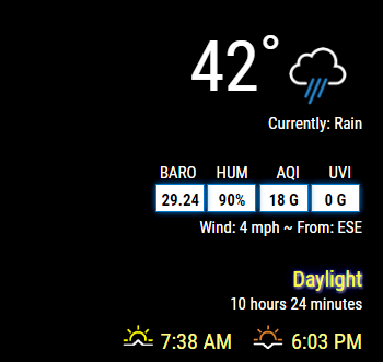
This is what it will look like after I make the rest of the changes later tonight…right now I have to go to my real job ;)
left:
right:
There may be some changes to the language files that I will ask each of you to do…as I just really don’t have time… :) BUT you are building a mirror so your active participation is required :)
-
Real nice work. That is sublime.
-
@cowboysdude nailed it.
-
Sorry guys…it’ll have to be tomorrow night… friend just got back from Ukraine so we had dinner and visited :)
Hello! It looks like you're interested in this conversation, but you don't have an account yet.
Getting fed up of having to scroll through the same posts each visit? When you register for an account, you'll always come back to exactly where you were before, and choose to be notified of new replies (either via email, or push notification). You'll also be able to save bookmarks and upvote posts to show your appreciation to other community members.
With your input, this post could be even better 💗
Register Login