Read the statement by Michael Teeuw here.
MMM-NOAA - Another Weather Module
-
@BD0G said in MMM-NOAA - Another Weather Module:
Here is what I get
Ok, well we know it’s not the config entry so lets check:
-
Did you run
npm installin the MMM-NOAA3 directory? -
Tried deleting and recloning the module from guthub?
-
Disabling your other modules?
-
-
@BD0G said in MMM-NOAA - Another Weather Module:
Headed to Lake Tahoe today for the best Thanksgiving buffet at Harrahs Casino (Forest Buffet).
Nice. Enjoy your holiday.
-
@Mykle1
Did you run npm install in the MMM-NOAA3 directory? Yes - appeared to install correctly.Tried deleting and recloning the module from guthub? No. Next on the list of things to do.
Disabling your other modules? Thats another great suggestion. Gotta try that after a reclone and reinstall.
-
Did you run npm install in the MMM-NOAA3 directory? YES
Tried deleting and recloning the module from guthub? YES!
Still not working at this point
Disabling your other modules? YES! Disabled every other module and restarted Magic Mirror.
Now the MMM-NOAA3 module is displayed !
So there appears to be a conflict with another module.Next steps are to enable each module one by one and restart after doing so with each one.
I wonder which one it is?
-
@BD0G said in MMM-NOAA - Another Weather Module:
Next steps are to enable each module one by one and restart after doing so with each one.
You only need restart MM, not your entire system. That shouldn’t take too long. Let me know your findings.
-
@Mykle1 Yup. I just do a PM2 restart 0. :)
-
Hope you’re having some success getting a fresh config.js.sample. Remember never to modify this file. Only use “copies” of it that you rename to config.js.
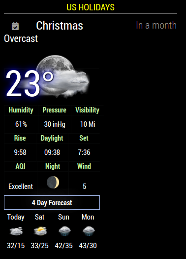
Here you can see that the calendar and noaa3 run happily together. Talk tomorrow. Peace.
-
Good things happen when your config.js is working ;)
-
What’s a config.js?
-
Now that I have scrapped my Pi Zero W and have done a fresh install of “Buster” and MM on my Pi 3 B Plus everything is playing together nicely!
-
@BD0G said in MMM-NOAA - Another Weather Module:
everything is playing together nicely
Well done sir!
-
I’ve juste update with ‘git pull’
and look what arrived at the name ‘today’ ☹️
Lien vers mon image
any idéa ? -
This post is deleted! -
Description:
Added a new condensed format for NOAA3 … it uses MMM-NOAA5.css file. To set that please see readme~
Please follow Readme on Github!
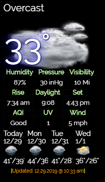
To update just do a ‘git pull’ in the MagicMirror/modules/MMM-NOAA3 directory
Version 3.4.2
Download:
[card:cowboysdude/MMM-NOAA3]
-
Still the best weather module. No others come close. Not even mine. I hate you for that. :-)
-
sorry
my upgrade was not complete
tomorrow i will post you a photo -
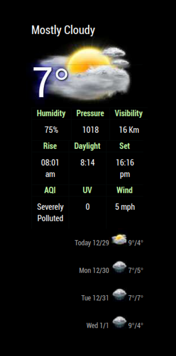
I ran the upgrade this morning which worked great, however the 4 day forecast seems to have moved vertically. it was default and no custom changes made.
Is there an easy way to revert it?
-
-
now i’ve got the same trouble as doogy_rev
-
@doogy_rev said in MMM-NOAA - Another Weather Module:
I ran the upgrade this morning which worked great, however the 4 day forecast seems to have moved vertically. it was default and no custom changes made.
Is there an easy way to revert it?

Yes just use one of the other css files ;) That’s MMM-NOAA5.css file … it may be interferring with other css for some reason.
Hello! It looks like you're interested in this conversation, but you don't have an account yet.
Getting fed up of having to scroll through the same posts each visit? When you register for an account, you'll always come back to exactly where you were before, and choose to be notified of new replies (either via email, or push notification). You'll also be able to save bookmarks and upvote posts to show your appreciation to other community members.
With your input, this post could be even better 💗
Register Login